The shoelace was great. So. this year the expectations are higher. Can I pull it off?
On 11-Apr-2010, IISc Alumni Cell is organising ‘Science & Technology Run’ or better known as ‘SnT Run.’ I got a chance to do the branding work. I have handled the branding of SnT Run of 2008. People liked the banners and posters very much: especially the ‘shoelace’ one. Read the full story here.
So here I am, trying to outrun myself.
I am doing three separate designs for SnT Run 2010. They are:
- Logo Design
- Poster Design for publicity
- Banner design for the event
In this post, I am explaining only about the item 2: ‘Poster Design for publicity.’
Initial Ideas
I exactly know what I am NOT going to do this year. I am not going to use the imagery of a robot running. I am not going to use shoelaces. Although the run happens in the green campus of IISc, I am thinking about a race track. I am thinking about the markings on the turf. Then I have a view of somebody running towards the camera. He is running to me as if there is not much time left for the event. Wait, can ‘he’ be the date on which the SnT Run is happening?
The setting of the stage

This photo is taken by Sanja Gjenero (Lusi) from Croatia. Thank you Sanja for allowing me to use this photo.


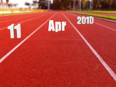
3D rendering of ’11 April 2010’ in SolidWorks

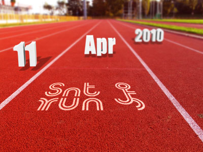

The idea was that the date of SnT Run is approaching, so don’t be an onlooker, be a part and so ‘Better run…’
This is the finished poster. Click to enlarge.
Environment friendly posters are Green!
‘Run for science, run for environment’ is selected as this year’s SnT Run theme. Nowadays whenever people think of environment or eco-friendliness, the ‘green’ colour fills their imagination. So I am told to come up with a green version of the poster.

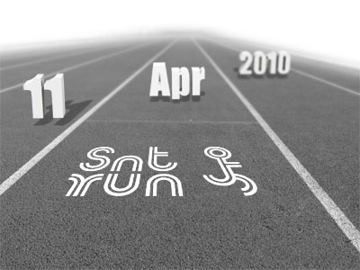


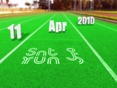
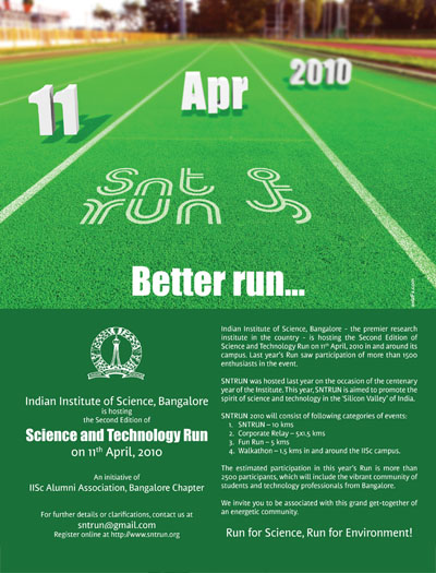
I will be writing about the other two designs (logo and banner) soon.

More Photos of SnT Run 2010 are uploaded here.
Design Date: 07-Feb-2010


AnasKA, I liked the explanation of how you came up with the poster. “The Run (date) is approaching, Better Run”.
Superb
This is a great post and a Great poster (The RED one only, the green one is crap) and people should read this….A classic example of How the Designer Client Interaction and clichéd Ideas can sometimes ruin a potentially great design…
Again, I love the RED poster Design… its Great.. Great work as always, Anaska.
…it’s really nice poster……to be frank i liked green one…..
…..explanation u have given is like tutorial; for me …..
great work
i love the design,it looks sooo awesome!
(P.S. The green one isn’t crap!):)