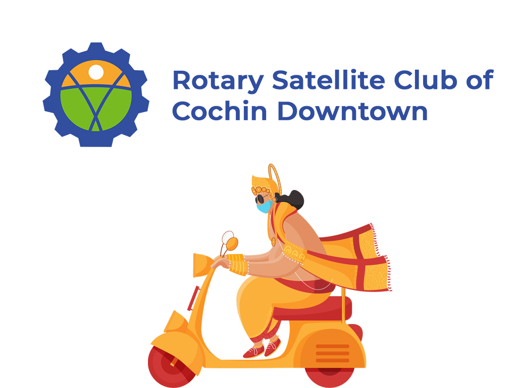
The newly formed Rotary Satellite Club of Cochin Downtown required a brand identity. The identity as well as the design language will help to sharpen fundraising activities for noble causes including cancer care. One basic requirement was that the new logo should inherit the lineage of the Rotary International logo.
The rotary wheel features six spokes and 24 cogs. So the starting point for the logo was a cogged wheel — a couple of cogs fused together to form a base. The outline, very loosely, represented an ‘idea bulb.’

The base is shortened to fit the overall circular envelope. Three arcs and a circular disc formed an abstract human figure inside the wheel.

Addition of colors rendered the same arrangement of elements to represent ‘nature.’ Now we have a green ground, a sunset yellow sky and a bright, white, moon.

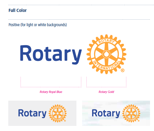
The color codes strictly followed the same of Rotary logo — ‘Rotary Royal Blue’ and ‘Rotary Gold.’
The name ‘Rotary Satellite Club of Cochin Downtown’ is added to the logo in the ‘Montserrat‘ font.

To make the logo visible and legible on various background colors, three more options are created.

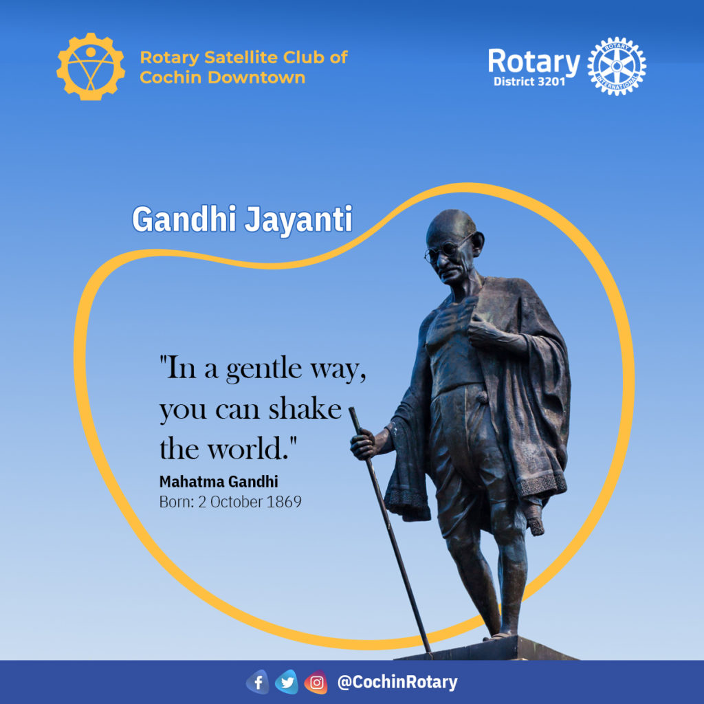
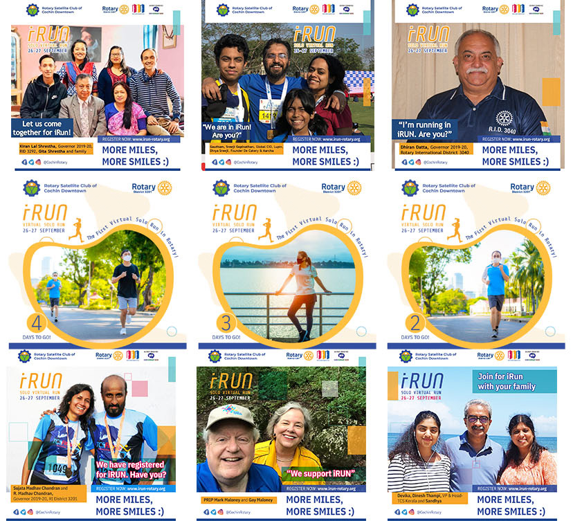
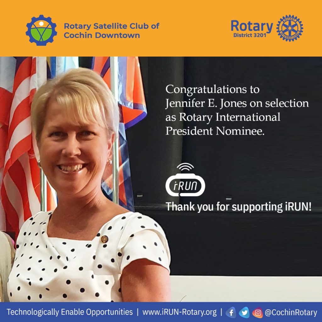
The new logo was used along with the Rotary logo for iRUN marketing and social media posters.
