Have you ever seen any self promotional ads done by advertising agencies?
This is a Disclaimer
A commonly mouthed phrase in advertising field is that “Yes, we know the ad is just an average one. It is because the client does not share our vision and the budget was not enough. It is a pity. When are we going to have a perfect client?”
Go out and see (that means, do a ‘Google’) a self-promotional ad done by an agency. I am 90% sure that you will find it equally bad and non-creative. Tell me, what is the reason for this ‘no-show’?
Just now I designed and uploaded a website promoting myself. I am 100% sure that you will find it as boring, lacks content, lacks animated stuff and not a ‘new-age’ thing. And the website claims that I am the only designer in this whole universe who is capable of doing wonderful and creative designs. Blah!
The beginning
I start every design on a white paper. So, for the website, I fixed the background color as White (#FFFFFF). I decided that I will have a simple and clutter-free interface. All the text and graphics will be static (no roll-over images and no flash animations). The text and images will be laid out in tables of fixed row heights and column widths. There will be minimum text and most of the website content will be images. The colors used for text and background will be: Red, Black, Green, Yellow and White. No images will be used in the navigation bar and in the name/logo.
If you are still interested, read on…
Layout
The widescreen format fascinates me. Technically speaking, the aspect ratio is 16:9. That means, for a width of 16 units, the height of the screen will be 9 units. I wanted the website in such a way that it looks like a projected image on a widescreen. To represent the curvature of the screen as seen in cinema theatres, I decided to add upper and lower shadows leaving the right and left edges for the viewer’s imagination.
Many people are still using 800X600 pixels of screen resolution in their PCs. So I fixed the maximum width as 750 pixels. Applying the 16:9 rule, the height will be 400 pixels approximately. A three column X three row table with 750 X 400 pixels is used as the template. Other parameters are: CellPad = 0; CellSpace = 0 and Border = 0.
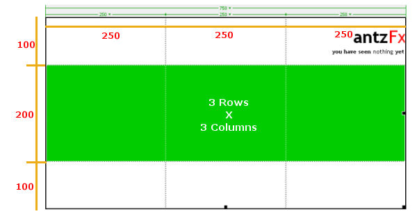
The first row is designated for the name/logo. The second row has a Green background color where images will appear and the third row is where the text content will appear. The three columns of the second row can feature three images.
Navigation Bar
Navigation bar is placed in the bottom of the widescreen table. No rollover images. So I added the following code to the pages.
A:link { color: #009900; text-decoration: none; }
A:active { color: #009900; text-decoration: none; }
A:visited { color: #0066FF; text-decoration: none; }
A:hover { color: #FF0000; text-decoration: underline; }
This piece of code simply tells the browser that all the links are in Green color. When the cursor hovers over it, the style should change to Red underlined text. A visited link should appear in a pale Blue color.
Internet Explorer obeys these commands faithfully, but it seems that Mozilla Firfox has its own way.
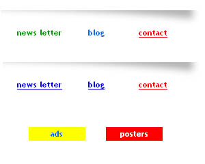
The first row shows the navigation bar in Internet Explorer (Ver.6). ‘Newsletter’ is an unvisited link in Green, ‘Blog’ is a visited link in Pale Blue, ‘Contact’ is Red underlined text because the cursor is stationed over it.
The second row shows the navigation bar in Mozilla Fiefox (Ver. 2). All links are blue and are underlined in default. There is no distinction between an unvisited link and an active link. Cursor hovering effect is OK.
Links denoting a page are disabled in the corresponding pages only. The white text appears in a red background which visually conveys the idea to the viewer. When he is in a submenu page showing one example of work, links are retrained in a Yellow background. See the third row in the above image.
Vertical Scroll Bar
One page has some text in a table cell that is too long to contain in the designated height of 200 pixels. The following code ensures that a vertical scroll bar appears for the rescue.
<td width=”500″ td height=”200″ colspan=”2″ class=”style4″> <div style=”width: 500; height:200; overflow: auto”> <p>
/* The long text appears here*/
</p> </div> </td>
An attempt was also done to alter the look of the scroll bars by placing the following code.
SCROLLBAR-FACE-COLOR: #FFFFFF;
SCROLLBAR-HIGHLIGHT-COLOR: #D9D9D9;
SCROLLBAR-SHADOW-COLOR: #808080;
SCROLLBAR-3DLIGHT-COLOR: #D9D9D9;
SCROLLBAR-ARROW-COLOR: #000000;
SCROLLBAR-TRACK-COLOR: #FFFFFF;
SCROLLBAR-DARKSHADOW-COLOR: #808080;
SCROLLBAR-BASE-COLOR: #FFFFFF;
Again Explorer and Firefox responded differently.
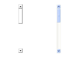
The scroll bar on the left appears in Internet Explorer and the other is in Mozilla Firefox.
It is voting time!
That’s all folks! Visit the website and I am ready for the brickbats. I am an average person in the art of dodging, though. Yes, you may find one or two Easter eggs…
Second thoughts
A flash based version of this website is under construction.
Useful links for the ‘really interested’ people
A Favicon is a small icon that appears in the address bar of your browser along with the website address. It is an icon with a dimension of 16 X 16 pixels and is also displayed in the saved website links in your ‘bookmarks’ or ‘favorites’. Steps on creating a favicon in Photoshop, the plugin needed to save the icon in *.ico format and the html coding needed to make the browser display the favicon are explained in detail at:
A feedback form is used widely in websites to establish an instant communication link between the website visitor and the website owner. To add this feature to your website, you need:-
- An html page showing the feedback form
- A feedback form script in PHP that collects, formats the data and e-mail to an ID specified by you
- A web hosting service who allows to run the script in their server. This is usually a paid service.
- An html ‘Thank you!’ page indicating a successful submission
- An html ‘Error!’ page asking the visitor to re-enter the data
Since I am not at all good in explaining technical stuff to you, it is better to visit the pages:
- ‘Dreamweaver Tutorial: How to Add a Feedback Form to Your Website in Dreamweaver CS3 (Part 6)‘
- ‘Free Customized Feedback Form Wizard‘
Software: Macromedia Dreamweaver MX 2004, Adobe Photoshop CS2, GIMP 2.4.5
Design date: 29-June-2008
UPDATE: 07 October 2021
Read the story of antzFx Website Ver.2.0
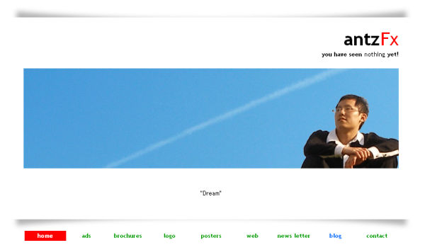
The version 1.0 of the website was last updated in May 2010 and stayed so for 11 years. This was how the homepage looked like when it was finally taken down in October, 2021.

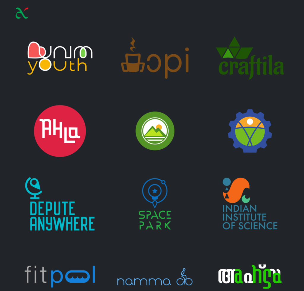
On its place, antzFx v2.0 website is launched now. This website serves as a portfolio of all the logo designs that were attempted by me over the years.
Take a look at antzFx website v2.0 whenever you have some time.
This new website layout is mobile friendly and is a customized version of ‘Agency’ theme by StartBootstrap. I have used only the ‘Portfolio’ section of the theme. If you would like to know more about this website redesign, click here to read the design story in this blog.
Cheers!


Very nice clean and professional designs. Well done!