The biggest dilemma of the ‘work from home’ era

“Do you want to view Peppa Pig? Or is it Doraemon that you want?”
“Peppa Pig, Peppa Pig…”
“Here. Let me help you with the TV remote control.”
This conversation with my younger kid was telecasted to a dozen people in three continents because I forgot to mute! A Microsoft Teams conference call was going on while I was working from home. But I’m lucky compared with some souls who became the subject of viral ‘Zoom Fails’ during this Covid 19 lockdown.
Why are we finding it difficult to determine whether the video feed is ON or OFF? Mic mute or unmute? How hard can it be?
UI Toggle Button
Buttons allow users to take actions, and make choices, with a single tap. A toggle button allows the user to change a setting between two states.
‘Next State’ Toggle Button
Life is very simple when toggle buttons indicate the next upcoming state. Example? The ubiquitous ‘Play/Pause’ toggle button.
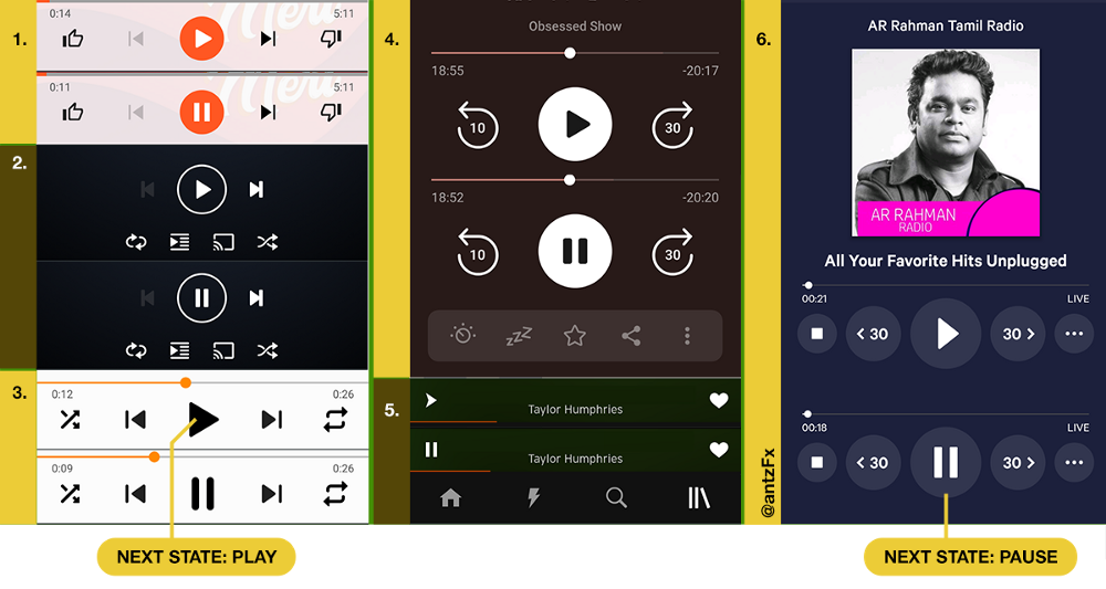
The moment music starts playing, the ‘Play’ button toggles to ‘Pause’ button. This indicates the next available action for the user — pause the music.
Another example of the ‘next state’ toggle button is the ‘List/Map’ view button. If you are looking at a list of places in an app like OYO, you can change to a map view by tapping on ‘Map View’ button. The button instantly toggles to ‘List View’ once you are in map view.
‘Current State’ Toggle Button with Static Icon
These toggle buttons always indicate the ‘current state,’ rather than the ‘next state’ discussed earlier. This toggle button says that “You are here.” Most of the time, the next state is very obvious for the user. Example: next state is OFF if the current state is ON.
Take a look at the Android 10 notification drawer below.
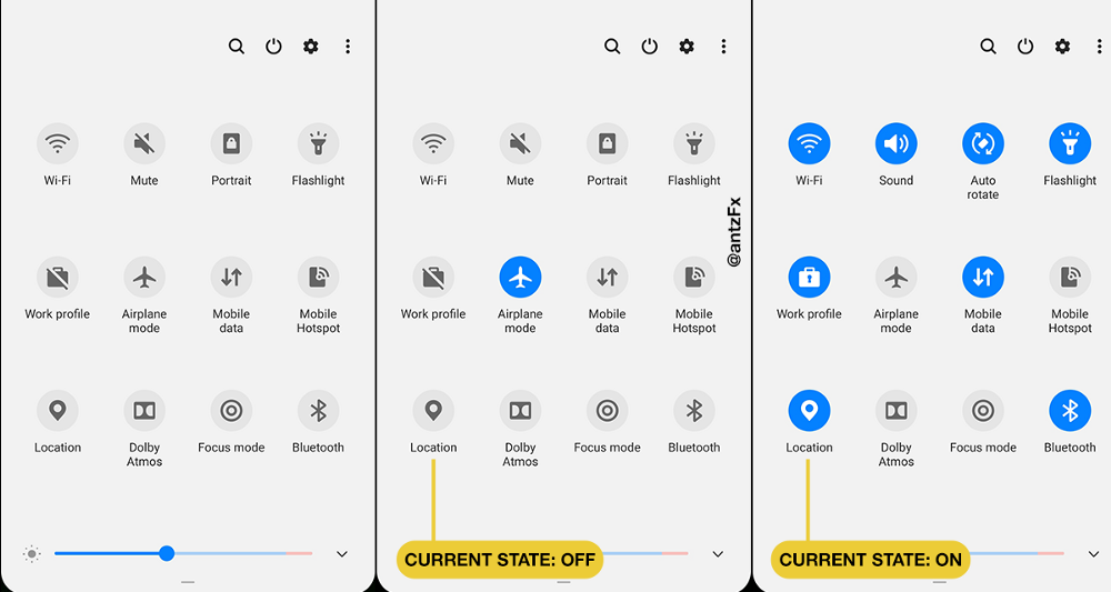
Because of the contrasting color between the ‘enabled’ ON state and the ‘disabled’ OFF state of the toggle button, it is very easy for the user to understand “where am I?”
‘Current State’ Toggle Button with Changing Icon
There is also one more variation where the ‘disabled’ OFF state is represented by a new icon. A diagonal line, striking off the corresponding icon, is the most popular icon change.

Because of the unmistakable icon style (presence or absence of the diagonal line) for OFF and ON states, the dependency on contrasting highlight color is minimal.
Mic Mute and Unmute
Let’s now look at how six of the popular video calling apps are handling the toggle buttons for muting and unmuting the mic.
1. Google Duo
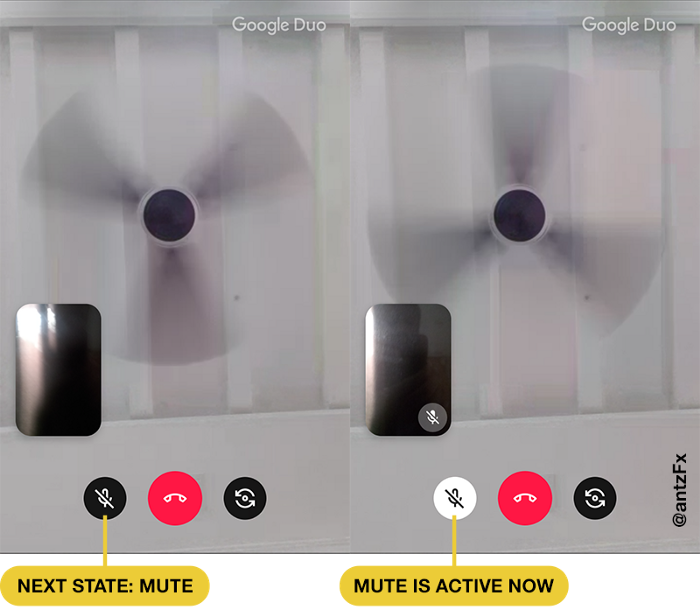
Google Duo is a little confusing at first when muting the mic. Technically, it is enabling and disabling a ‘mute’ toggle button from OFF to ON. Just by looking at the button, it is difficult for a user to understand whether the button is in enabled (Mute ON) or disabled (Mute OFF) state. The ‘mute’ icon used is the same in both the states. This gives a higher cognitive load to the user and people might mute or unmute inadvertently.
2. Whatsapp
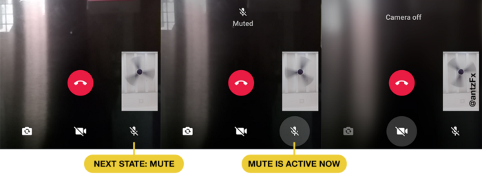
Facebook owned Whatsapp is also following the Google Duo way. A button highlight differentiates the states: enabled (Mute ON) or disabled (Mute OFF). Here too, the ‘mute’ icon is the same in both the states.
3. Webex Meetings

Webex Meetings app clearly highlights the ‘mute’ toggle button in red color when it is enabled (Mute ON). The ‘mute’ icon is the same in both the states.
4. Facebook Messenger
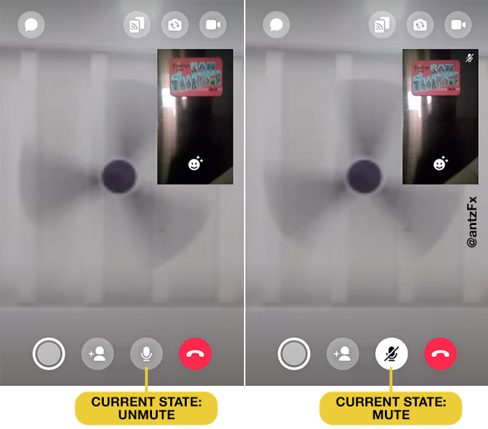
This second video calling app from the Facebook family has a different approach compared to Whatsapp. The ‘mute’ toggle button always shows the current status with an appropriate ‘mic’ icon. When ‘mute’ is enabled, the icon changes to ‘mute mic’ visually and the toggle button is highlighted using a color as well.
5. Microsoft Teams
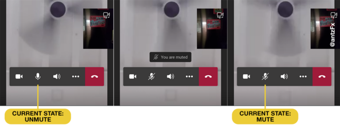
The ‘mute’ toggle button of Microsoft Teams always shows the current status by an appropriate ‘mic’ icon. When ‘mute’ is enabled, the icon changes indicating that the mic is muted. There is no color highlight of the button in any state.
6. ZOOM Cloud Meetings
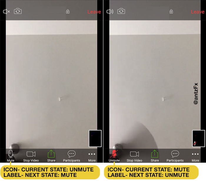
ZOOM is complicated. Stay with me on this, OK?
A label is always a welcome addition to an icon-only-toggle button. A button label clearly instructs the user about the next state that is possible. Remember the ‘Play/Pause’ toggle button of music player apps?
So, the label ‘Mute’ means ‘the user can mute the mic by tapping on the button.’ When you tap on the ‘Mute’ labelled toggle button, the label correctly changes to ‘unmute’ showing the next state; but the icon shows the current state of ‘mute.’ Unfortunately, ZOOM app uses the ‘unmute’ icon along with the ‘Mute’ label. A red highlight color is also thrown into the mix.
No wonder, people are having trouble with this ‘mute/unmute’ toggle button of ZOOM. When the same situation happens to ‘camera on/camera off’ toggle button, hilarity ensues as illustrated in the BoredPanda article on ZOOM fails.
What Should We Do to Help Users?
Dear designers of video calling apps, the simple answer to the above question is to use the ‘Current State’ toggle button with a visually changing icon.
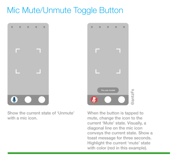
When muted, change the icon visually; highlight the current ‘Mute’ state with a color; provide a short toast message (“You are muted”) on the current state change to the user.
When unmuted, toggle back the icon visually; remove the highlight color; provide a short toast message (“Your mic is ON”) on the current state change to the user.
What is your view on this whole ‘mute/unmute’ experience? How should it behave? Do comment below.


