Where do I search? Help me…
I was flipping through some hand-drawn low fidelity screens of a bill payment mobile app (Yes, some of us still prefer the old-fashioned way of drawing on paper first, than a pixel perfect, auto aligned digital version on Adobe XD). Then I saw it on the bottom tab bar.
“No, no, no. I believe we cannot do this.”
“What, the ‘Search’ function? Why?”
“Well. ‘Search’ is an action — much like ‘compose an email’ or ‘delete.’ An action shouldn’t be placed on a tab bar because tab bars are for navigation. Do you know what Apple Human Interface Guidelines (iOS) talk about tab bar?”
“Enlighten me!”
Use a tab bar strictly for navigation. Tab bar buttons should not be used to perform actions. If you need to provide controls that act on elements in the current view, use a toolbar instead.
“Since you mentioned iOS, what about Android?”
“Aha! The name of a tab-bar-equivalent in Android is ‘bottom navigation.’ A separate bottom app bar and Floating Action Button (FAB) take care of actions in Android.”
“Any citation from Google Material Design Guidelines about this?”
Bottom navigation bars display three to five destinations at the bottom of a screen. Each destination is represented by an icon and an optional text label. When a bottom navigation icon is tapped, the user is taken to the top-level navigation destination associated with that icon.
“Let me break the news to you. If what you say is correct, then the popular apps like Instagram, Twitter, Tik Tok, Amazon Prime Video… will never be approved by Apple or Google in their respective app stores. Even the Apple App Store has a ‘Search’ on tab bar. They all violate this ‘law’ apparently. Now explain that to me.”
“Wait, What?”
It appears that I have to do another round of a ‘highly unscientific study’ among the Android apps installed in my phone and some iPad apps.
‘Search’ Disguised as ‘Explore’ or ‘Discover’
Most common occurrence of ‘Search’ functionality in a tab bar is as ‘Explore,’ ‘Discover’ or ‘Browse.’
- Irrespective of the tab bar label, a ‘magnifying glass’ icon will be used on the tab bar to denote a surrogate action of ‘Search.’
- On tapping the tab bar ‘magnifying glass’ icon, a new section opens up with pre-filled content that a user might be interested in.
- In this new section, there will be another traditionally placed ‘Search’ action on the top of the page .
- Tap again on this top search bar to launch the keyboard and to enter your search query. So, an erstwhile simple search is now always a ‘two-taps-affair’ on apps.

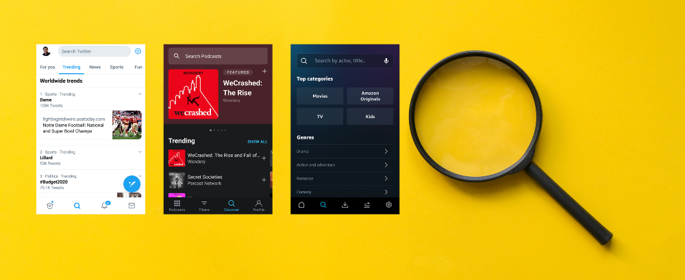
Instagram doesn’t have labels on the tab bar. On tapping the ‘Magnifying Glass’ icon on the tab bar, you will be greeted by a section of dynamic content with the ‘Search’ on top of the page with another ‘magnifying glass’ icon. Now we have the classic case where there are two occurences of the same icon, on the same page, that represents two different actions (although related). Notice how two taps are required to search anything.
Amazon Prime Video
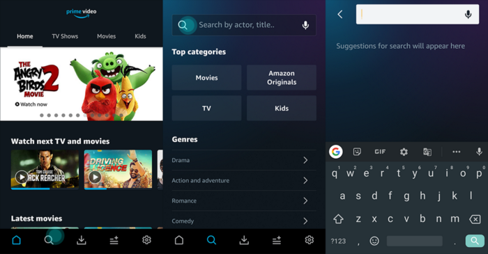
Once you tap on the ‘magnifying glass’ icon, the ‘Search by actor, title…’ section appears showing top categories and genres for the user. Two ‘magnifying glass’ icons on the same page. Two taps are needed to search a custom query.
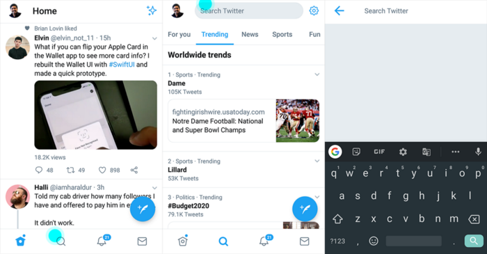
Twitter strictly follows what Instagram is doing. Thankfully they are not repeating the ‘magnifying glass’ icon on the same page twice. Again two taps are needed to launch a ‘Search Twitter’ page with keyboard.
Amazon Music
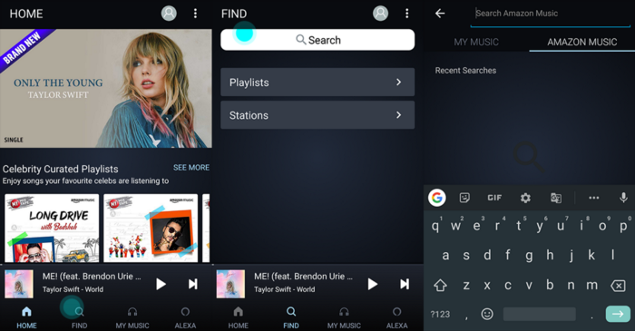
“Let’s rename ‘Search’ as ‘Find,’ place this ‘Find’ on the tab bar, display two icons that appear very much alike on the same page and make the user tap twice to search a custom string!”
Udemy for Business

“Let’s rename ‘Search’ as ‘Discover,’ place this ‘Discover’ on the tab bar, display two icons that appear very much alike on the same page and make the user tap twice to search a custom string!”
Pocket Casts
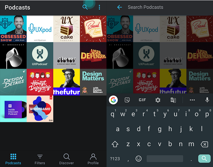
Pocket Casts is an application that I use regularly for listening podcasts. The ‘Universal Search’ is placed on the top app bar and works as intended — only one tap is needed to search anything.
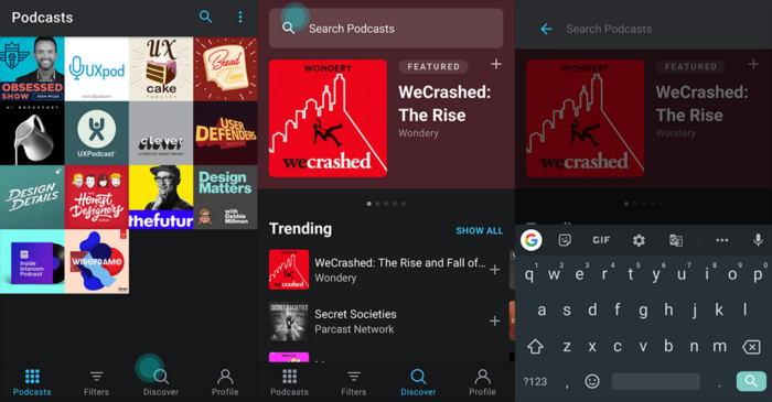
The whole thing gets complicated the moment you see the ‘Discover’ tab flaunting the same ‘magnifying glass’ icon as the ‘Search’ on top! When you tap on the ‘Discover’ tab bar, a page showing featured and trending podcasts appears. ‘Search Podcasts’ is available at this page top with the ‘magnifying glass’ icon. In this workflow, the ‘Search’ is two taps away.
Behance, Pinterest and Airbnb
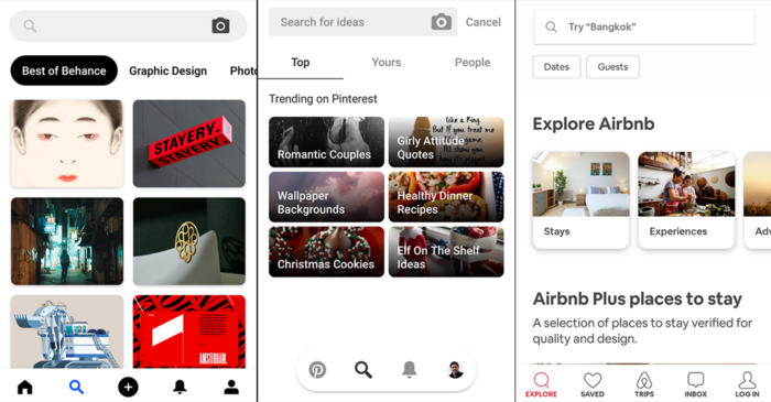
The third screen on the above image is the Airbnb app and it is quite interesting. Unlike any other apps described here, Airbnb does not have a separate ‘home’ and ‘search’ on the tab bar. When the app gets launched, the default selected tab is ‘explore’ with the ‘magnifying glass’ icon instead of the usual ‘Home.’ The top search bar flaunts one more ‘magnifying glass’ icon. Now, only one tap on the top search bar will launch the keyboard for custom search string entry, which is the desired experience.
Tik Tok, CNN and Udemy
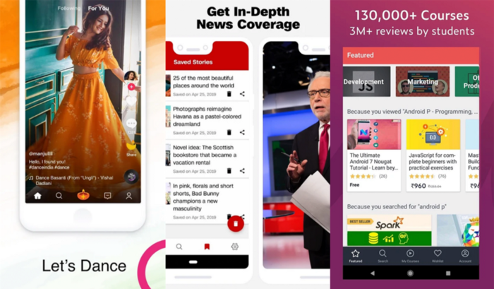
I’m sure that there are many apps out there who are placing ‘Search’ on tab bar. The above screenshots are from Play Store as I haven’t installed them in my mobile phone.
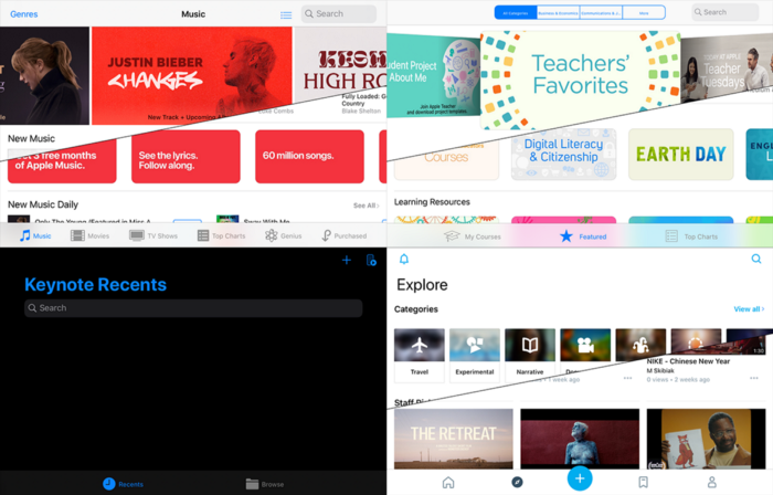
The Curious Case of iPadOS Apps
All the following iPadOS apps have ‘Search’ on the tab bar with ‘magnifying glass’ icon as well as another ‘Search’ bar on the top of the screen with the same icon. So, two taps are needed for performing a custom string search. All are published by Apple.
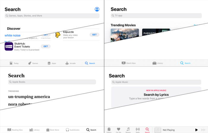
But the same Apple also maintains native iPadOS apps with the classic universal ‘Search’ bar at the top. In these apps, only one tap is required to launch the keyboard for typing in a custom string search.
Why iTunes Store and App Store in iPadOS have different ‘Search’ experiences? Apple only knows…
Is ‘Search’ More Reachable Now?
As screen sizes of mobile phones started increasing, one-hand-operation of the phone became more and more difficult. Try accessing a traditionally placed hamburger menu (top left corner) or a universal search icon (top right corner) on a phone with a display size exceeding 6″.
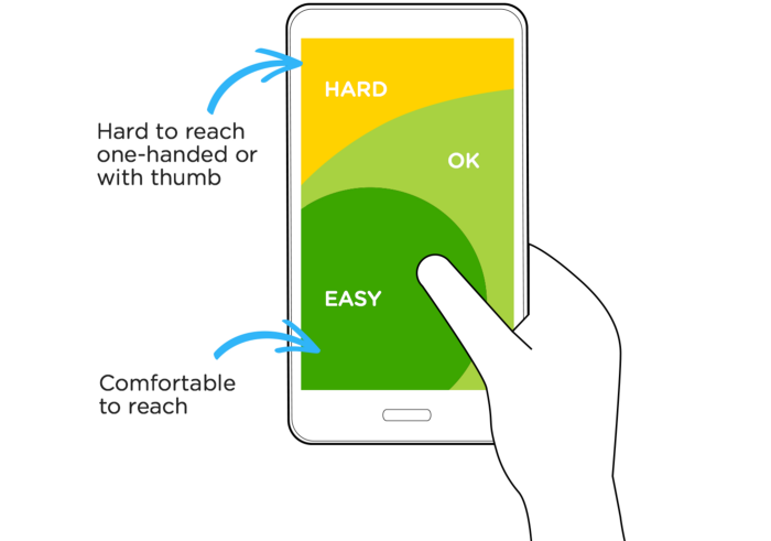
As a solution, iOS and Android provide ‘reachability’ feature — displaying a scaled down screen triggered by a gesture by the user so that all navigational controls are easy to access during a one-hand-operation of the mobile phone.
Tab bar ‘Search’ is good for reachability, but it won’t help us further if we are showing a page with dynamic content, without the keyboard triggered and the next ‘Search’ positioned at the topmost area of the screen.
What Should We Do for a More Reachable ‘Search?’
‘Search’ is one of the most used features in any app. Placing ‘Search’ on tab bar, compared to the traditional placement on the top or top right corner immediately solves the reachability issue.
Once ‘Search’ is invoked, the app should display the keyboard with the search bar in focus — ready to take the search string from user. This page can have some dynamic content in the available real estate (like current trending items or genres/categories or search history). None of the apps discussed above does this.
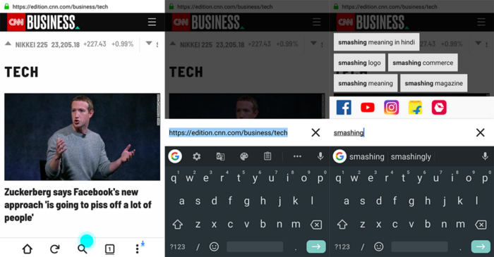
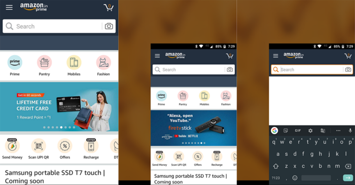
Take a look at the above screenshot of Firefox Lite. Tapping on the ‘Search’ tab bar icon will immediately launch the keyboard. The search/address bar comes down, with the current address string pre-selected. Any keystroke will reset the selected search string to null. Based on the user input, tappable suggestions appear on the available real estate. Contextual search in selected applications (Facebook, YouTube, Instagram…) are also enabled.
Note that only one tap is required on the ‘Search’ tab bar icon to trigger the keyboard. Search bar, suggestions, clear button for search string… are very much reachable for the thumb in a one-hand-operation of the mobile phone. Also, the problem of displaying two instances of the same icon on the same screen goes away.
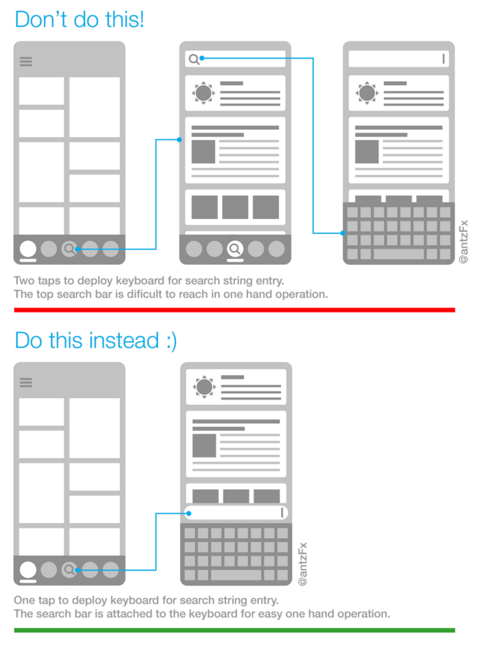
The following image sums up what we discussed so far.
What is your view on ‘Search’ appearing in tab bar? How should it behave? Do comment below.