“Why is this logo a bit complicated? Can I design a much simpler logo for ‘NOT A Wheelchair?’ — Maybe something like the ubiquitous, universally recognized ‘wheelchair’ icon?”
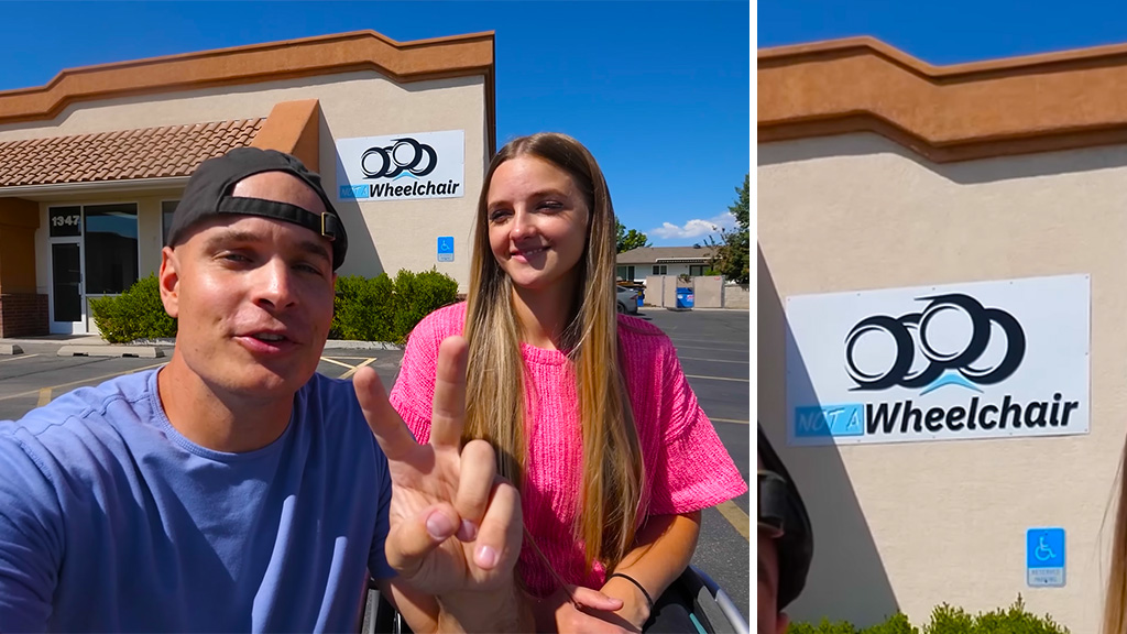
This thought always comes to my mind whenever I see an update of ‘The Rig’ — an electric, motorised quadricycle wheelchair — under the brand ‘NOT A Wheelchair’ by the popular YouTuber Zack Nelson of ‘JerryRigEverything’ channel.
Today is the day I’m going to redesign the ‘NOT A Wheelchair’ logo. So, let’s get started!
DISCLAIMER— This is an unsolicited design attempt and is not an official commissioned work from Zack. I have no access to the original brief of the logo design from him. There is absolutely no research to back the observations I have made here. No disrespect is intended to the designer/designers of the original logo. Peace!
Before and After
Here is a comparison of the present logo and the redesigned logo by me.
The New Logo Introduction Video — ‘NOT A Wheelchair’
It took some time for me to mimic the motion of ‘NOT A Wheelchair’ traversing the step on the ground. Animation and editing were done in MS PowerPoint!
‘NOT’ + ‘A Wheelchair’
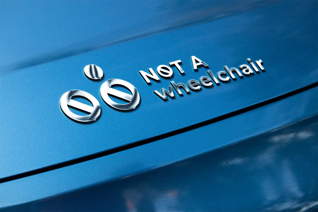
Now I would like to disclose that the ‘test audience’ also recognized two slotted screw heads and a hole, BB-8 droid (Star Wars)… from the logo!
The Redesigned ‘NOT A Wheelchair’ Logo
The redesigned logo has a flat and simplistic look mimicking a wheelchair icon.
The typeface used is Montserrat. The sky blue color of the original logo is retained here.
My Inspiration
‘The Rig’ and the present logo served as the inspirations for the new logo.
I have a feeling that Zack might have given these requirements to his logo designer for the original logo…
- Logo should show four off-road wheels
- To highlight the off-road feature, one of the wheels can be shown traversing a small boulder
- Speed-lines on the logo to convey the speed of ‘the Rig.’
Well, I haven’t included any of these points in my redesign exercise!
Logo Logic
Will Zack ever adopt my logo?
I don’t think so. Because the current branding was done three years ago. The present logo has appeared in countless places — ‘The Rig’ decals, website, merchandise, marketing collateral, YouTube videos, the signage on the shop, collectors coins… And, my design definitely hasn’t hit the brief set by Zack.
I tried my best to reach out to Zack via e-mail, Instagram and a YouTube comment under one of the ‘JerryRigEverything’ video, but nothing happened. Finally, I managed to find the ‘JerryRigEveything subreddit’ and posted there about this ‘NOT A Wheelchair’ logo redesign. Let’s hope Zack will see this!
But for me, this whole exercise was fun! That’s what matters in the end… And, I will see you around!
UPDATE: 16 APRIL 2024
I’m happy to receive a comment from Scott Cameron of 2BPencil who created the original logo. According to Scott, his logo of ‘NOT A Wheelchair’ is inspired by the Olympic rings. It conveys a sense of possibility without highlighting the negative.
Fantastic design, Scott!


I am the person who design the NOA logo, though your version is stereo typical design. Why we as designers need to focus on the disability by using the negative symbol not only 2 times but 3.
Your version is interesting but the crossbars in the wheels and the text. It would Convery a sense of possibility without highlighting the negative
The design I created is inspired by the Olympic rings and you have several points correct, off road and speed.
Scott, I’m happy to receive your comment. Thank you for explaining your logo logic and critiquing my version.
Design is always subjective and I respect your perspective. Keep inspiring us…
🙂