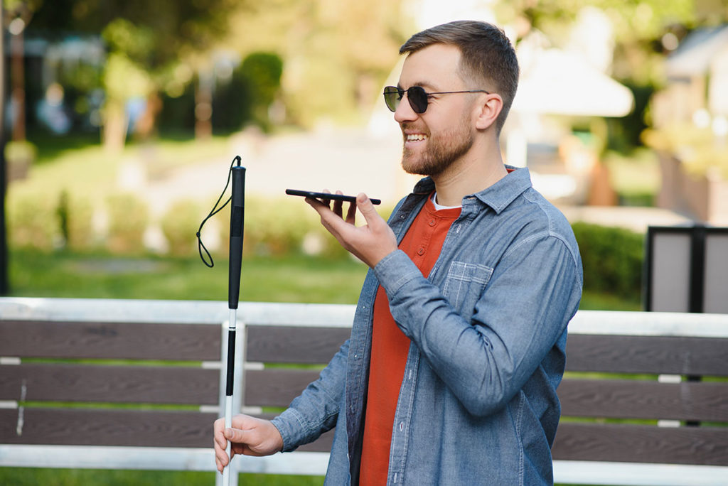
“DAISY Player? What’s that?”
“DAISY stands for Digital Accessible Information System. DAISY Players are used by people with print disability to listen to audio content like books, magazines, newspapers… The device, depending on the make and model, can playback content from CDs, SD cards, special USB cartridges and online.”
VisAbility Library, Perth
I was visiting the VisAbility Library in Perth to discuss a volunteering position. They are one of the Southern Hemisphere’s largest talking book libraries for people living with blindness, vision impairment or a print disability. I had no clue about the effort involved in converting a book into audio cartridges and sending them to subscribers across the country.
I’m impressed with the infrastructure at VisAbility like the recording studio and the editing facilities. The library converts audio files to many formats specified by the DAISY standard. They curate more than 70,000 titles and keep them accessible to the people in need.
Perth Web Accessibility Camp 2024
During the conversation at VisAbility, I was told about the Perth Web Accessibility Camp 2024. It is a one day event hosted by Perth Web Accessibility Meetup Group in partnership with the W3C Australia Western Region Chapter. Many experts on the subject of accessibility will be speaking at VisAbility, Perth on 29th of February, 2024. You can attend this event virtually as well. I will be attending this event at the venue.
Poster Design: DISCLAIMER
I thought of designing a few posters for this event. This is an unsolicited design work as I was not officially asked to do this. So the following posters are not official. I’m sharing them here to give you an idea about the thoughts and design decisions that go in creating posters like this. Kindly visit the official event webpage to know the latest info.
The Anatomy of a Poster
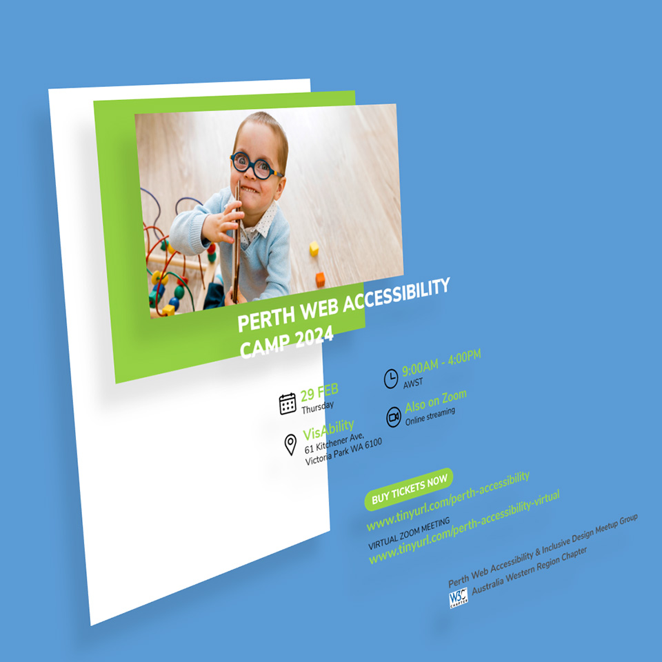
- Canvas
The canvas size and ‘width to height’ ratio are set based on how the posters are eventually distributed. A Square 1:1 canvas is preferred for social media posts like Instagram; a Portrait 3:4 canvas is preferred for viewing on a mobile device when the posters are sent as an email or WhatsApp attachment; a Landscape 16:9 canvas is preferred to view on a wider screen of a personal computer.
I went with the portrait 3:4 canvas with the size of 2480 x 3508 pixels (300 dpi). This resolution ensures that, if needed, we can take a physical print-out of the posters. - Primary Color Highlight Band
I wanted to create five posters with unique highlight colors. One way to do this efficiently is defining a shape and filling it with primary colors as needed.
In the above example, I used a rectangular shape with a green color fill that acts as a ‘highlight band’ for the event title. - Hero/Anchor Image
The very first thing viewers are going to notice is the hero image. So the image should be very close to the message that we intend to convey through the poster.
I managed to download photos of a few happy faces from the stock image site, FreePik. - Masthead
In our design, the name of the event itself is the masthead. Generally in advertising, masthead is the ‘hook’ that grabs viewers’ attention.
The typeface used is ‘Nunito Sans‘ with a ‘Black’ weight. - Body copy
Body copy communicates all the information to the viewers. Body copy conveys the date, time and place of the event. It also includes a ‘call to action’ (CTA) section that nudges viewers to purchase tickets to the event.
The typeface used is ‘Nunito Sans‘ with ‘Regular’ and ‘Bold’ weights. Since the URL of the ticketing page is longer, I used TinyURL, a URL shortening service, to create custom links that are easier to read and remember. On second thoughts, I should have included a QR code to the ticketing webpage URL! - Footer
The footer shows the name of the organizers and supporters. Usually this is the place where we display the logos of sponsors.
Five PWAC 2024 Posters
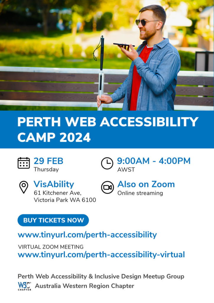
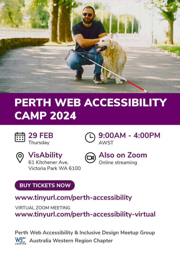

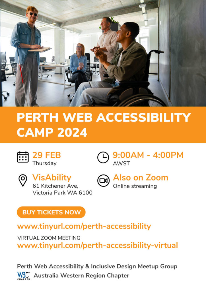
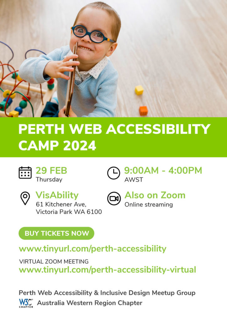
If you are planning to attend the PWAC 2024 event virtually over Zoom, kindly buy your tickets from this dedicated Humanitix Link.

