I always wanted to create a good brand recognition for this blog that you are reading right now. This blog started as a subdomain of my website antzFx.com in 2008. Over the years, I observed that there are a few repeat readers for this blog and I started publishing this blog under its own unique URL (antzFxWay.com).
Since that website address was not ‘memory-friendly,’ I renamed it as ‘DESIGNpuli.com.’ ‘Puli’ as a slang in Malayalam language that means an ‘expert.’ So, ‘DESIGNpuli’ means ‘an expert on design!’ Kindly note that the word ‘puli’ actually denotes ‘വരയൻ പുലി’ meaning ‘tiger’ (കടുവ). The only thing the new name of this blog was missing is a ‘tongue-in-cheek’ logo!
But not anymore…
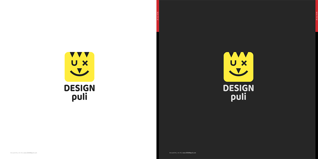
DESIGNpuli Logo

Well… what do you think? Are you getting some ‘DESIGNpuli’ vibes?

Fortunately everything worked together to bring out the ‘tiger’ness from the DESIGNpuli logo! I should add that my kids first identified the face of a cat rather than that of a tiger by looking at the logo. With proper ‘staring down’ from me, they finally saw the tiger too!
😉
My Inspiration

A few years ago (was it 2017?), I designed a smiley logo for ‘UXley’ (An internal initiative). It was a winking smiley face — with ‘U’ and ‘X’ in the place of eyes and a big smile on a yellow, rounded-edge square. It was redrawn in 2018, adding some shadows, to be used for ‘UXpuli’ Medium channel.
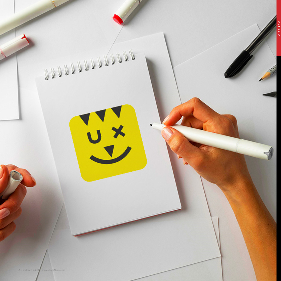
Today the thought was a to add a pencil that ‘draws’/brings the smile on the logo. The task at hand was also to add elements of a tiger — the stripes, facial features…
Logo Logic

This logo was redrawn from scratch rather than editing previous versions.
- The ‘smiley’ yellow canvas of rounded-edge square shape was retained rather than going for a circular canvas. It also embodies the ubiquitous yellow sticky notes, a primary tool of designers for ‘design thinking!’
- The ‘U’ and ‘X’ alphabets represent ‘UX’ (User Experience). The main aim of this blog is to give a good understanding of UX concepts and ensure the best learning experience for readers like you.
- ‘U,’ ‘+’ and ‘)’ characters in ‘Montserrat’ typeface are used to draw the smiley face. Yes, the ‘x’ eye (the winking eye) is actually a ‘+,’ rotated 45 degrees!
- The three stripes of a tiger as well as its nose are all using the same triangular shape. By making use of the ‘Gestalt Principle of Closure,’ I was able to bring in an abstract ‘pencil.’ It is very evident when you look at all the four triangles and imagine them as a single unit.
- The pencil tip is drawing the smile on the logo. The motto of “We are bringing you a smile — a positive user experience” is aptly conveyed.
- The typeface for the logotype is Baloo Chettan 2 from Google Fonts. It is a Malayalam language typeface. I liked the organic, curvy stem ends!
The first attempt on this logo design had more visual elements like side stripes, chin stripes, whiskers… of a tiger. The current simplified version retains the right amount of ‘tiger’ness as well as the playfulness of a smiley.

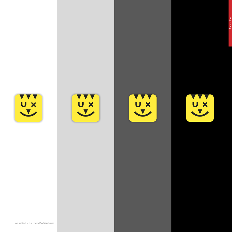
The yellow-black color combination and the form factor of the logo definitely stands out.

What do you think? Do you like this? Do comment below.


2 Responses
[…] DESIGNpuli logo (hyperlinked to this blog entry itself), copyright info, links to my social media profiles on LinkedIn, Twitter, Medium, Instagram and the current version of ‘AnasKA.in’ website are given here. […]
[…] slide features antzFx logo, DESIGNpuli logo and AI&ML […]