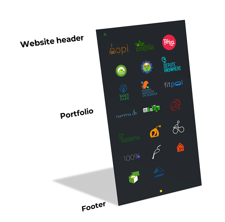
My antzFx.com Ver.1.0 website has just turned 13 years old in this July! So I wanted to do a redesign and convert the website into a portfolio featuring all the logo designs I have done in all these years. The idea is that you click on a logo thumbnail and you will be redirected to the corresponding design story at DESIGNpuli.com. Simple!
The Inspiration
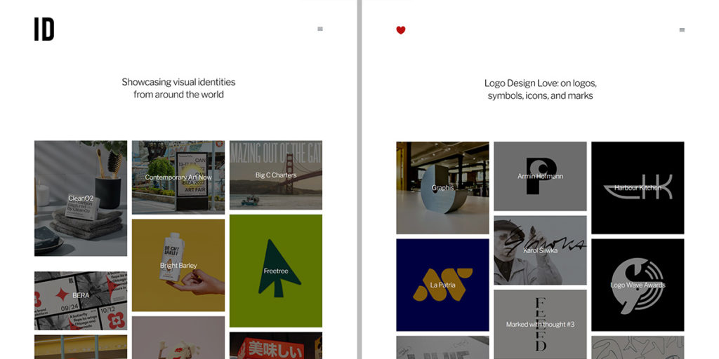
I’m a big fan of the graphic designer David Airey and I have been following his work for more than a decade. The way in which David explains the logic and thought process behind his works had a great influence in me. This is one of the main reasons why I also started writing this ‘DESIGNpuli.com’ blog to tell my design stories. Thank you, David!
IdentityDesigned.com and LogoDesignLove.com are the two websites on logo designs curated by David Airey. The layouts of both the websites, as you can see above, are very similar. The homepage features thumbnail images of different sizes representing the stories, with the titles written across them and tiled seamlessly in three columns. There is a subtle mouse hovering effect and on clicking a thumbnail, you will be taken to the corresponding story page.
I badly need a design like this!
Content Design
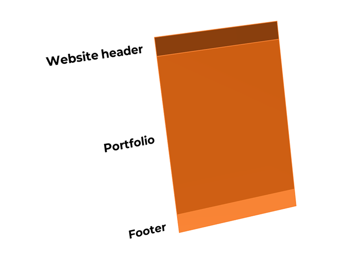
No rocket science here… A website header featuring the name/logo; a portfolio section featuring the logo thumbnails arranged as three column tiles; and a footer with copyright and version information — that’s all!
Website Template
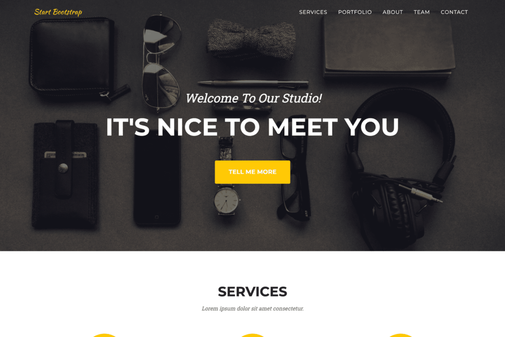
For any static website, I use free themes from Start Bootstrap. ‘Agency’ is a very flexible theme that has some very useful placeholder sections. It is mobile friendly and has a slow scroll feature while clicking on HTML anchors on the page.

Out of the nine placeholder sections available in the theme, I used only three — ‘Navigation Bar,’ ‘Portfolio’ and ‘Footer.’ All icons used in this theme are from FontAwesome and it is very easy to find and use the required icons from their website.
Tools
I usually customize the HTML templates using Notepad++ on a Windows machine. I also use WinMerge when I need to compare between different versions. Both are free. I don’t usually use any WYSIWYG (What You See Is What You Get) HTML editors like Adobe DreamWeaver. I used to use Komodo Edit (Free version); but not anymore.
Image editing and logo designs are always done in Adobe Photoshop and Adobe Illustrator. To create a favicon from a PNG file, I used the free online service of Favicon.io. Although I haven’t used any stock free images in this project, following are the websites I usually go to find the right image.
antzFx.com Website Ver.2.0
- antzFx.com website is using a dark theme. I feel that multicolored logos appear best on darker backgrounds.
- Website header: The antzFx logo is sitting alone on the left corner of the website header and there is no title!* You can click on the antzFx logo to go to the top of the page.
- Portfolio: All logo thumbnails are of equal sizes, arranged neatly in three columns. When viewed on a mobile phone browser, everything arranges themselves into a single column layout.
- There are no names/titles with the logo thumbnails. Everything is kept ‘secret’ for a sweet surprise!
- The primary color is redefined as green — the default color of the ‘Agency’ theme is yellow. So on mouse hovering a thumbnail, a green overlay appears showing a ‘globe’ icon indicating a hyperlink.
- When you click on a logo thumbnail with the green ‘globe’ icon overlay, the design story of that particular logo opens up in a new browser tab. All the logo design stories are hosted on this DESIGNpuli.com blog.
- Footer: Only the DESIGNpuli logo is there at the footer!* The logo is hyperlinked to the ‘Contact Me’ page of DESIGNpuli.com blog.
*Shhh… A Couple of Easter Eggs!
In reality, there is a title on the website header. Version information and a couple of sentences are also there on the footer. They are hiding in plain sight!

The title ‘antzFx’ on the website header is written using the same dark color as the background. So it is revealed only by selecting the ‘invisible’ text using the cursor. Or, the easiest way is just by pressing ‘Ctrl+A’ (Select All) on the keyboard!

Click on the above image for a larger preview.
Similarly, the website version information and a special image for you are revealed by pressing ‘Ctrl+A’ (Select All) on the keyboard!
I hope you all will like my new antzFx.com website!
🙂
UPDATE 22 SEP 2022
404 Error Page
If we accidentally try to access a wrong URL of a page inside a website, a 404 error page will be displayed. Rather than showing the standard plain vanilla 404 error page, we can customize it so that people can recover from this error state by clicking a button that will take them to the home page of the website. This is done by adding the following line to the ‘.htaccess‘ file in the webserver.
ErrorDocument 404 /errorpage.html
where ‘errorpage.html’ is the customized 404 error page I have created.
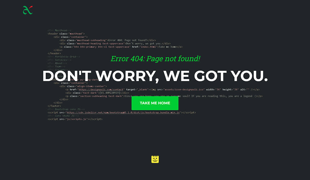
As you can see, I used only the design of ‘Mast head’ section of Agency Theme (Free) from Start Bootstrap. The header background image is a transparent screenshot of the HTML code of this 404 page itself! There is a big message of “Don’t worry, we got you” plastered across the webpage giving assurance to the visitor. You can click on the green CTA (Call to Action) button with the label “Take me home” to navigate to the homepage.

