Here are two stories from my experience on using Disney+ and Youtube apps in a ‘not-so-ideal’ way. Although the experience can be classified as outliers, these stories give a unique perspective on the actual users.
1. The Dungeon

I had at least five hours of waiting in front of me. I was in the basement of a hospital building and the cellular network was nearly non-existent. But I came prepared; I once had a 16-hour flight where my in-flight-entertainment system was not working. I opened Disney+ Hotstar Android app (INDIA) on my mobile. Before venturing out that day, I had downloaded a couple of movies from my home WiFi.
First, the nice splash screen of Disney+ animation appeared (Fun fact: the shooting star is travelling clockwise unlike Walt Disney Studios’ counter-clockwise flight path). Then a preloader animation started.
I waited.
Waited.
And waited more…
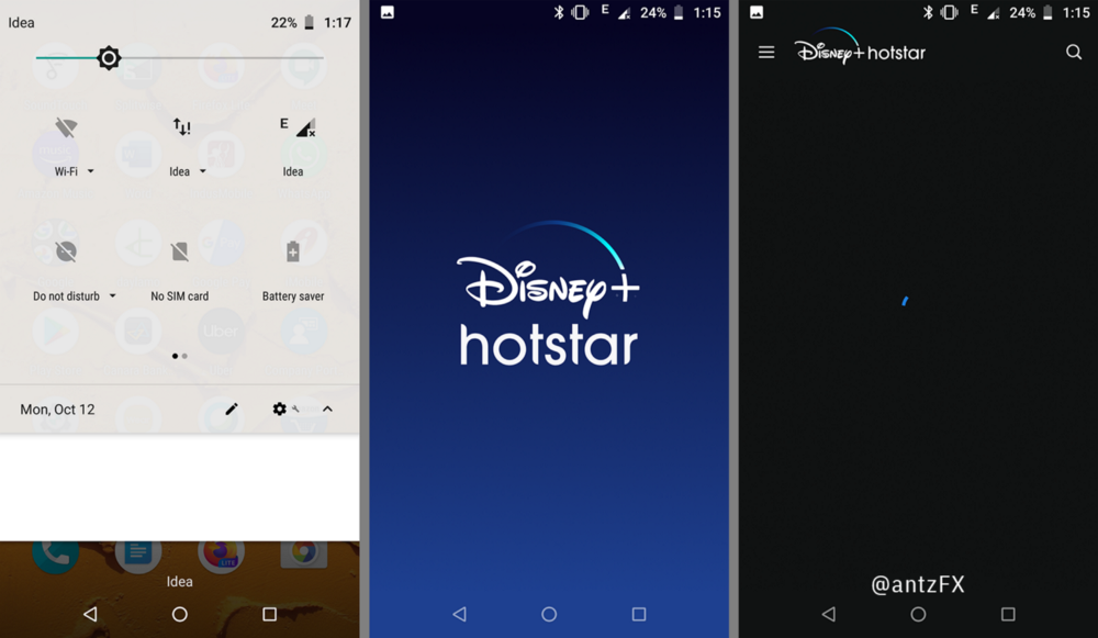
After an ‘eternity’ of two minutes, nothing seemed to be happening. The hamburger menu of the app is ‘frozen’ and I was not able to navigate to ‘Downloads’ to access my already downloaded movies.
Then it dawned on me. Disney+ Hotstar app might be looking for internet before showing the menu. The whole point of ‘Downloads’ is to enable people to watch the ‘already-downloaded content’ without internet. I’m sure the app is brought out by some wonderful designers and engineers who know how to do an outstanding job. What am I missing here?
I was saved on that day by their rival product Amazon Prime Video app. Under the same circumstances, in the same device, I opened the app and I could tap ‘Downloads’ on the bottom navigation bar to access my movies saved in the device.
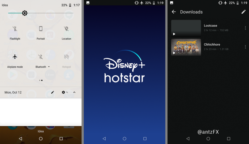
When I reached my home hours later, I did three more ‘highly unscientific’ experiments on the app by turning on the airplane mode, turning off data services and turning off the SIM card altogether. I also did the same on Amazon Prime Video as a control.
And long story short, I learned a workaround for Disney+ Hotstar.

Moral of the story: For us
If you are planning to be in a place where the internet is sketchy, Amazon Prime Video will be your best friend. For Disney+ Hotstar, to get out of the “infinite” preloader state, quit the app, switch ON airplane mode, re-launch the app and then the app goes straight to ‘Downloads.’ I should say, I’m impressed — that is a nice touch!
Moral of the Story: For Disney+ Hotstar designers
Please continue to do user research and tests even after launching an app— some people will definitely use the product in different ways, in different environments than envisioned by the creators.
2. Reading Comments While Watching a Video
“No, not again!”
I accidentally closed the comments on the YouTube Android app, for the seventh time consecutively, while trying to navigate out of a comment thread.
A bit of background: Many people are content with one type of device to connect to internet — mostly their phones. But there are also people who use many devices seamlessly to browse the net depending on the time of the day, intent and content!
I belong to this ‘rare’ group of people. My primary source of video content is YouTube. I’m using YouTube on three devices depending on the content and length:

- Any video link in social media, if it is short (say, a duration of 10 minutes or less), I watch it on my Android Phone.
- I watch longer video content (TED talks, design-related videos, general entertainment…) on my desktop computer — YouTube in the Chrome browser.
- Every night, I watch the news and late-night shows, by lazily lying down, on an iPad.
In all the three devices above, the YouTube app behaves differently for showing comments on a video. And this creates a big problem for me when I switch between devices.
We are all obsessed with multi-tasking and I have this habit of watching a YouTube video while reading the comments.
I never watch a YouTube video in full screen. Reading comments, while watching videos, gives me a better context and the world’s perspective on the topic.
YouTube iPadOS App
I always use the iPad in portrait mode. Video ‘Comments’ usually appear as an infinite scroll after the video description and recommended videos.

A tap on ‘Replies’ under a comment will load its own view, below the video, with a ‘Close’ button placed on the view’s top right corner. When I tap ‘Close,’ I will move out of ‘Replies’ and will be directed back to the infinite scroll of ‘Comments.’
It is very simple.
YouTube Mobile Phone App (iOS and Android)
In the mobile phone app, ‘Comments’ usually appear between video description and recommended videos as an Accordion collapse/expand list.

A tap on the accordion will open up ‘Comments’ as its own view, below the video. Now a ‘Close’ button appears on the view’s top right corner. A tap on ‘Replies’ under a comment will load its own view, with a new ‘Back’ button and the ‘Close’ button is still there on the view’s top right corner.
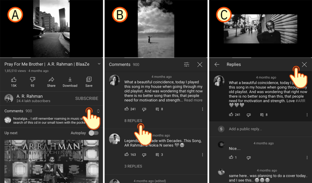
My habit (of using the YouTube iPadOS app) adds to my cognitive load while using the mobile phone app!
I always end up tapping ‘Close’ for closing the ‘Replies’ thread rather than using the ‘Back’ button. Then I inadvertently close the ‘Comments’ view altogether and find myself back on the Video page.
Hence the “No, not again!” at the beginning of this story.
YouTube in Two Google Chrome Windows
In Google Chrome, the workaround I employ for reading comments while watching videos is to open two windows — both pointing to the same YouTube video URL.
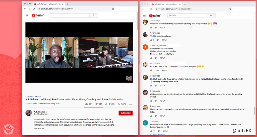
The windows are resized and tiled side-by-side on the desktop. I always use the left Chrome window for watching the video; the right one to read the comments. Also, the video will be on pause and muted on the right window.
The functions of the Chrome windows will interchange if I happen to click on a hyperlinked timestamp on any comment. Then the right Chrome window will auto-scroll to the video frame, it will start playing from that particular time-stamp and I will unmute the video. Now I have to pause and mute the video on the left Chrome window.
Moral of the story: For us
None, really.
Accept the ‘cognitive load’ before closing ‘Replies’ while in mobile devices. Think twice about the device (mobile phone or iPad) we are using and do a mental calculation on whether to tap ‘Back’ or ‘Close!’
Moral of the Story: For YouTube designers
Please talk among yourselves — the iOS Team, Android Team and the Web team — to arrive on a common standard navigation theme in YouTube ‘Comments’ and ‘Replies.’ Kindly give us a uniform experience in mobile phone, tablet (both iOS and Android platforms) and web. Please make the comments scrollable while watching YouTube videos in a browser.
User research and tests are very important even after launching an app. Because, some people will definitely use the product in different ways, in different environments than envisioned by the creators.
* It is not my intention to promote or demote any brands mentioned in the article. I’m just highlighting the need for more user research and tests for products out in the market. Peace!


