When I floated the idea of writing this article, my friends implored me to start the narrative with a couple of ‘disclaimers’ upfront. So here goes…
This article is about the design/visual representation of the US Presidential Election results covered by various media outlets. This article is NOT a political analysis. The absolute numbers in the images below are screenshots taken on 10th November, 2020 and they may not reflect the current status— and in our context, the numbers don’t matter anyway. The ten news media outlets mentioned below are selected at random from a Google search for “US news organizations.” And, I’m not an American; currently I’m not in the US.
Tabular Data is fun?
Data Visualizations help people to easily understand trends and statistics of an event. If you are like me, I find it very difficult to manually ‘decode’ data presented to me in tables (spreadsheets of MS Excel). So, I love and always embrace insights presented to me visually.
‘WH’ Questions
Now let’s talk about the US Election 2020. To understand the trends and results, the following attributes have to be highlighted while telecasting for the viewers.
What?
US Presidential Election 2020
When?
‘Data last updated’ should accompany the data visualizations. If this information is absent, people might assume that the data is ‘live/developing.’
Where?
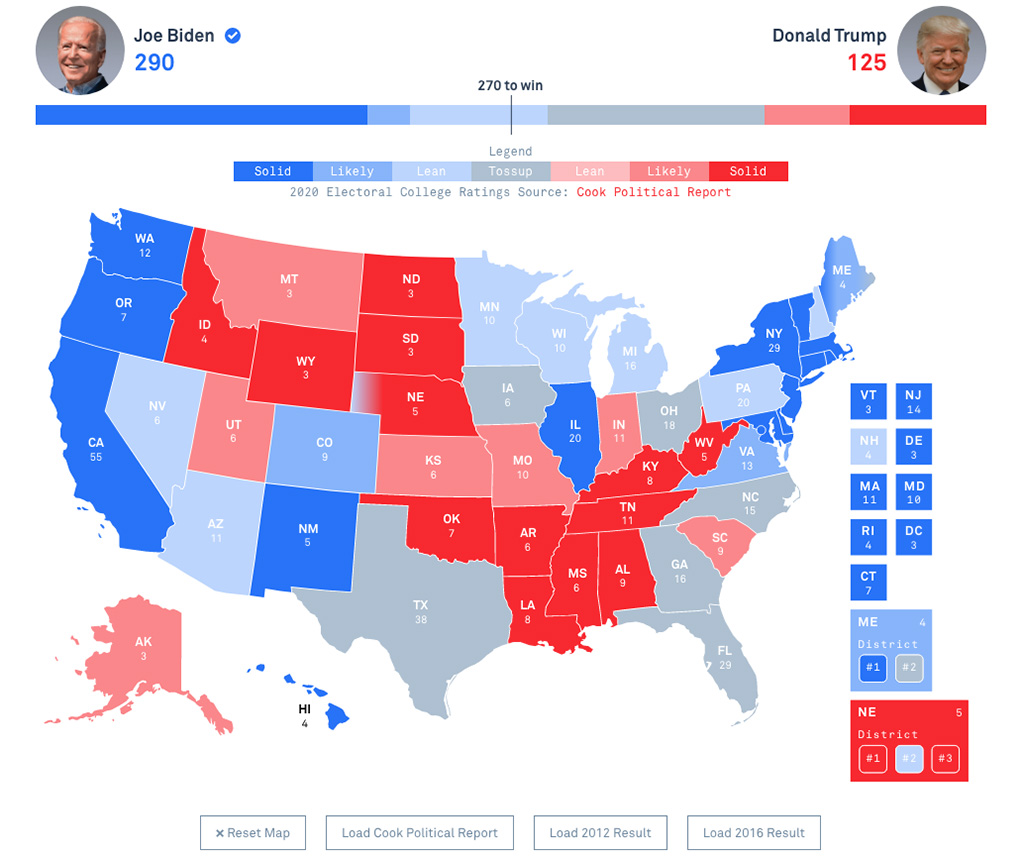
For all practical purposes, states (rather than counties) are the places of action. A geographical map representing the country and its states highlighting the number of electoral votes is commonly used.
Who?
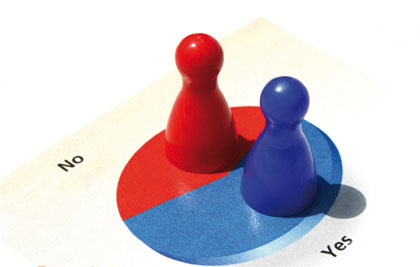
The two main political parties or presidential candidates representing those two parties are the key stakeholders. Red and Blue — representing the political parties, are used for color coding.
How?
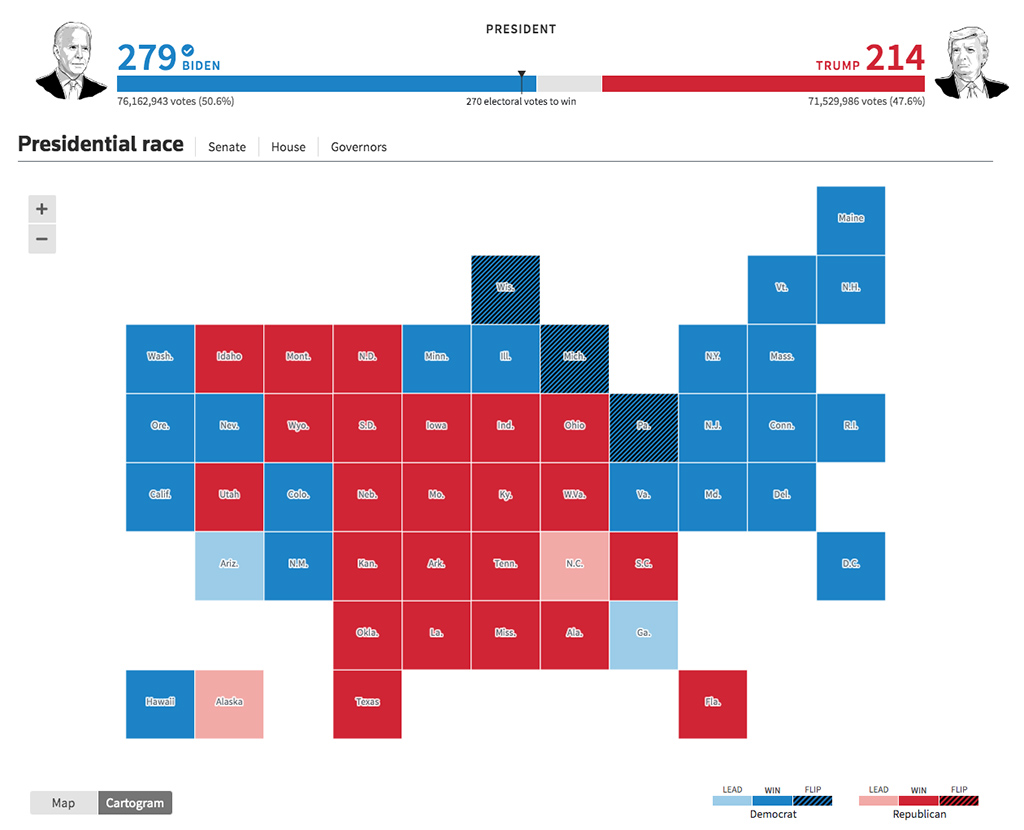
The logical conclusion of the election is the moment when one party/candidate crosses the threshold of 270 electoral votes. Progress bars, analog dials… are usually used to show the trend towards a simple majority of 270.
Let’s see how ten news media outlets visualized the election results.
Red and Blue Maps
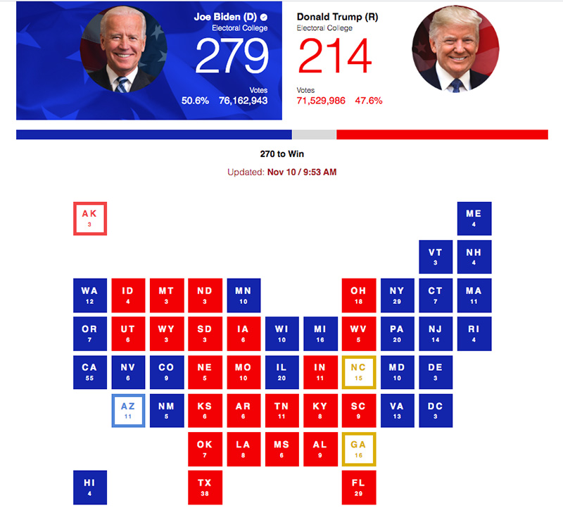
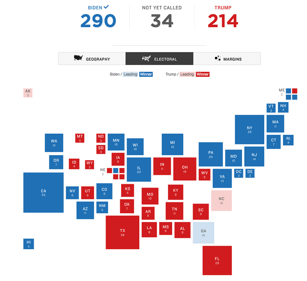
1. ABC News
- Progress bar on top with the projected votes, 270 mark at the middle.
- Political map of the country showing states in respective party colors of three saturation levels (lean, likely, solid) and a grey for ‘toss-up.’ This color coded map is the most widely used visualization and technically, this is known as ‘Unique Values Thematic Map.’
- Electoral votes belonging to a state is shown along with the state name label.
- No mouse hover functionality, but clicks are enabled to create our own ‘what-if’ scenarios.
- Alaska and Hawaii are shown together at the south end of the map.
2. Associated Press
- Progress bar on top has a vote split up into ‘safe,’ ‘lean’ and ‘toss-up.’ Midpoint is marked representing the 270.
- Political map of the country showing states in respective party colors of two saturation levels and a neutral color for ‘toss-up.’
- No mouse hover functionality, but clicks are enabled to create our own ‘what-if’ scenarios.
3. CBS News
- Progress bar on doesn’t have a clear midpoint of ‘270.’ The card view of the candidates on the top demarcates the midpoint in a subtle way.
- The country is visualized as an aggregation of squares, each square representing a state in respective party colors of three saturation levels (won, likely, lean) and a golden yellow for ‘toss.’ Looks more like a Periodic Table of Elements. I believe this representation is a variation of ‘Waffle Grid Cartogram.’
- Electoral votes belonging to a state is shown along with the state name label of two letters. Again, Periodic Table influence?
- Vote percentages are shown on mouse hover on each state. No clicks on the states.
- Alaska is shown at the north and Hawaii is at the south end of the map.
4. CNN
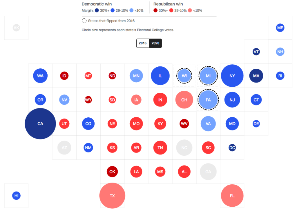
- No progress bar — probably because the page title says the perceived winner.
- The country is visualized as an aggregation of bubbles representing states. The area of a bubble represents the number of electoral votes of that state. Three saturation levels (margin 30%, margin 29 to 10%, margin < 10%) of the respective party colors are given to the bubbles. A very pale grey for ‘toss’ doesn’t help as the two-letter name labels in white color are not at all readable. I believe this bubble chart is a variation of Dorling Cartogram.
- A dotted outline of a bubble shows that the state has flipped from the 2016 results.
- No mouse hover functionality, and no clicks on the states.
- Alaska is shown at the north and Hawaii is at the south end of the map.
5. FOX News
- Progress bar on top itself is divided into segments representing the total electoral votes of states. A clear midpoint of ‘270’ is marked.
- Political map of the country showing states in respective party colors of two saturation levels (leading, declared).
- Vote percentages are shown on mouse hover on each state. A click on a state will zoom it showing counties and respective vote percentages.
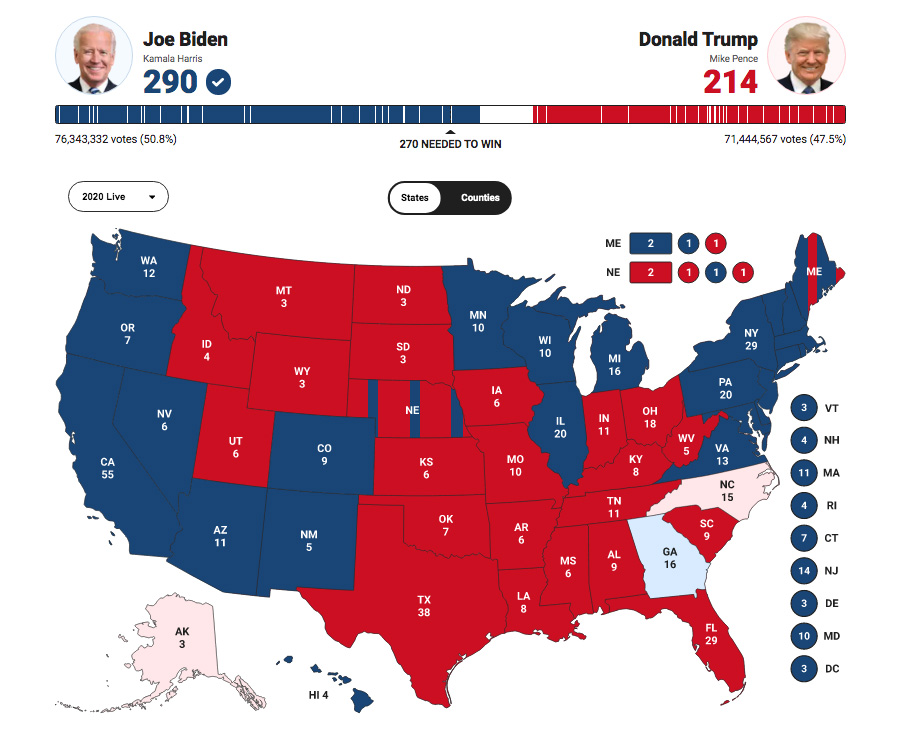
6. NBC News
- Political map of the country showing states in respective party colors (Projected/Apparent winner) and grey color for ‘toss-up.’
- Electoral votes of a state is revealed only on mouse hover. Clicks are enabled only on ‘toss-up’ states to create our own ‘what-if’ scenarios.
7. NPR
- The country is visualized as an aggregation of squares representing states. The area of a square represents the number of electoral votes belonging to that state. Two saturation levels (leading, winner) of the respective party colors are used. I believe this square chart is a variation of Demers Cartogram.
- Vote percentages are shown on mouse hover on each state. A click on a state will zoom it showing counties and respective vote percentages.
- Alaska is shown at the north and Hawaii is at the south end of the map.
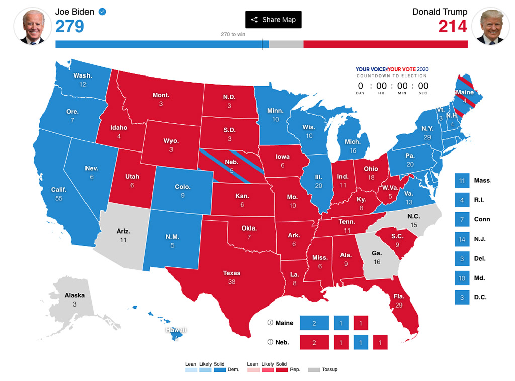
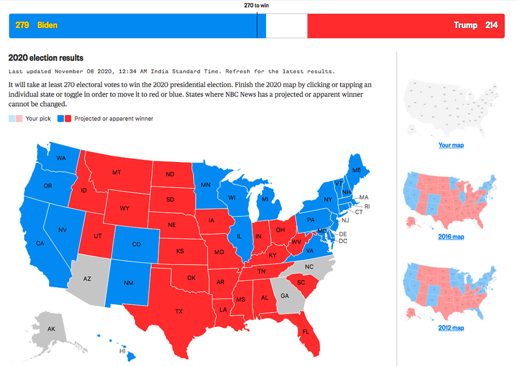
8. The New York Times
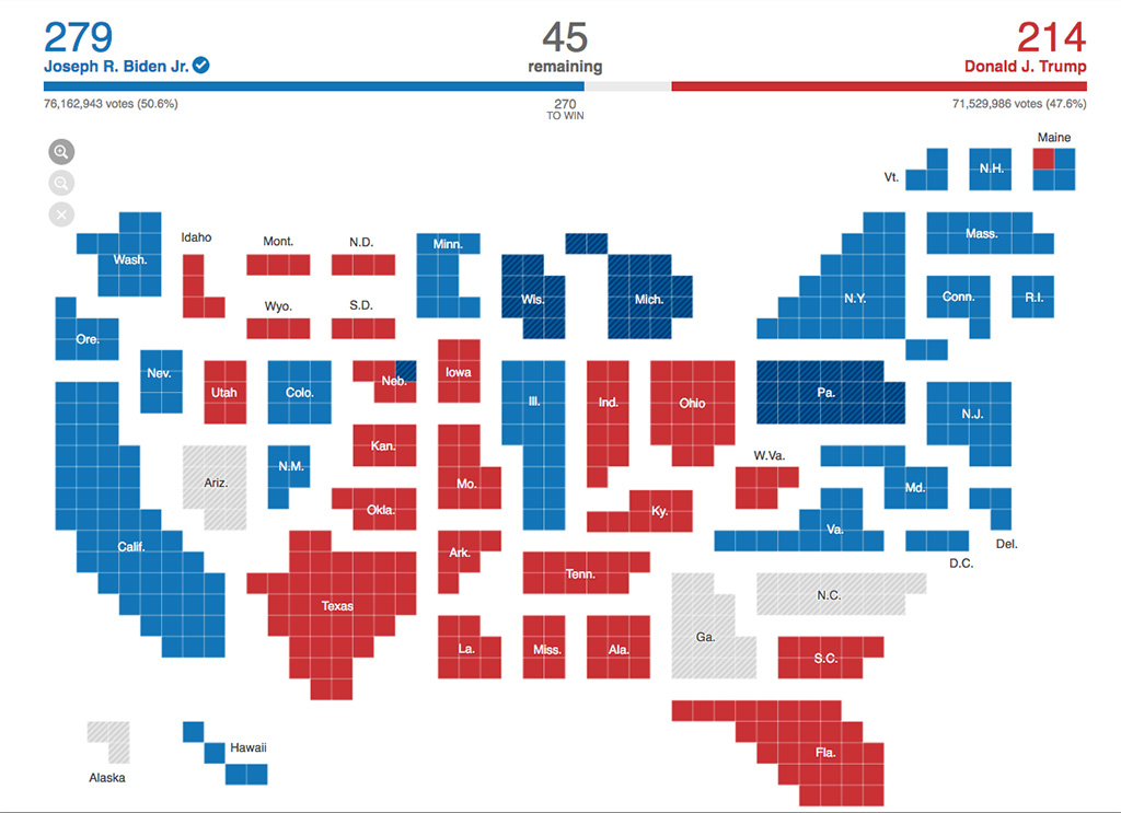
- The progress bar on top shows the remaining electoral votes that are too close to call. Midpoint is marked representing the 270 to win.
- The country is visualized as an aggregation of squares representing electoral votes that are clustered into the approximate shape of a state. One square represents one electoral vote. Part colors are used to denote ‘win’ and a grey color is used to represent ‘Reporting votes.’
- A cross-hatch shading on a state shows that it has flipped from the 2016 results.
- Vote percentages are shown on mouse hover on each state. No clicks on the states.
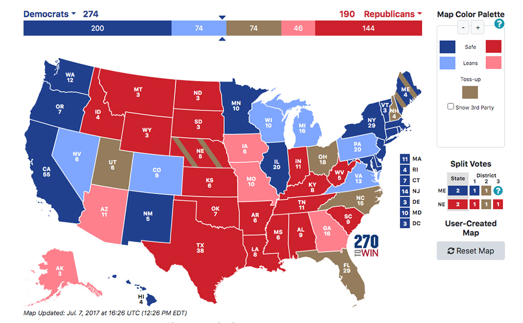
9. PBS
- Progress bar on top has a vote split up into ‘solid,’ ‘likely,’ ‘lean’ and ‘toss-up.’ Midpoint is marked representing the 270.
- Political map of the country showing states in respective party colors of three saturation levels and a neutral color for ‘toss-up.’
- No mouse hover functionality, but clicks are enabled to create our own ‘what-if’ scenarios.
10. Reuters
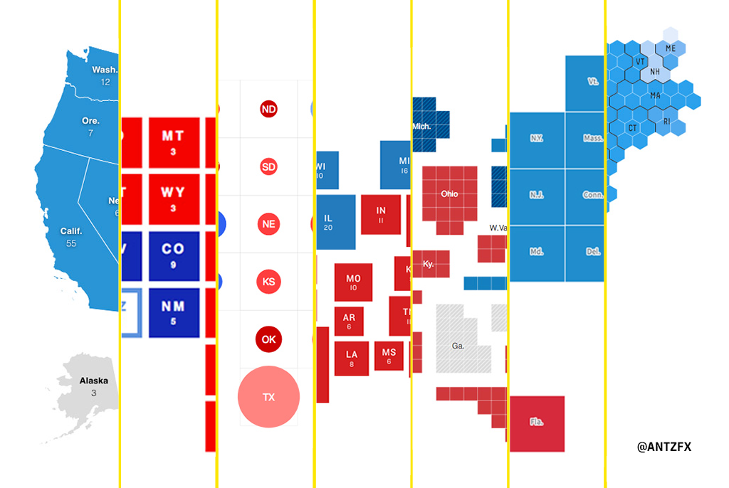
I have reasons to believe that The US Election 2020 results map of Presidential Race cartogram used by BBC is also from Reuters. The appearance and functionalities are the same for both.
- The country is visualized as an aggregation of squares, each square representing a state in respective party colors of two saturation levels (lead, win) and a cross-hatch shading for ‘flip.’ This topology looks similar to the ‘Periodic Table of Elements’ approach from CBS News, mentioned earlier. Again, I believe this representation is a variation of ‘Waffle Grid Cartogram.’
- Electoral votes belonging to a state is shown on mouse hover only along with the vote percentages of the candidates. A click on a state will zoom it showing counties and respective vote percentages.
- Unlike the CBS News Presidential Results map, Alaska and Hawaii are shown together at the south end of the map.
Bonus
FiveThirtyEight
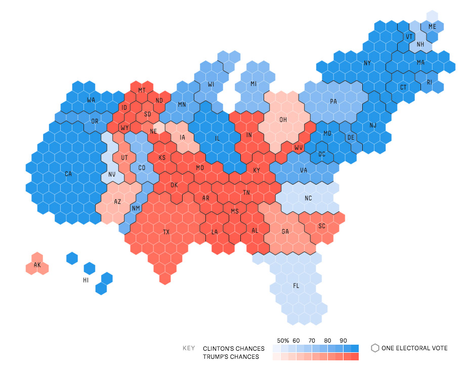
This 2016 ‘honeycomb tiled map’ is very similar to what The New York Times has done now in 2020 — but using squares instead of hexagons. I believe this hexagonal map technique is known as ‘Gridded Cartogram.’
CartoGeek
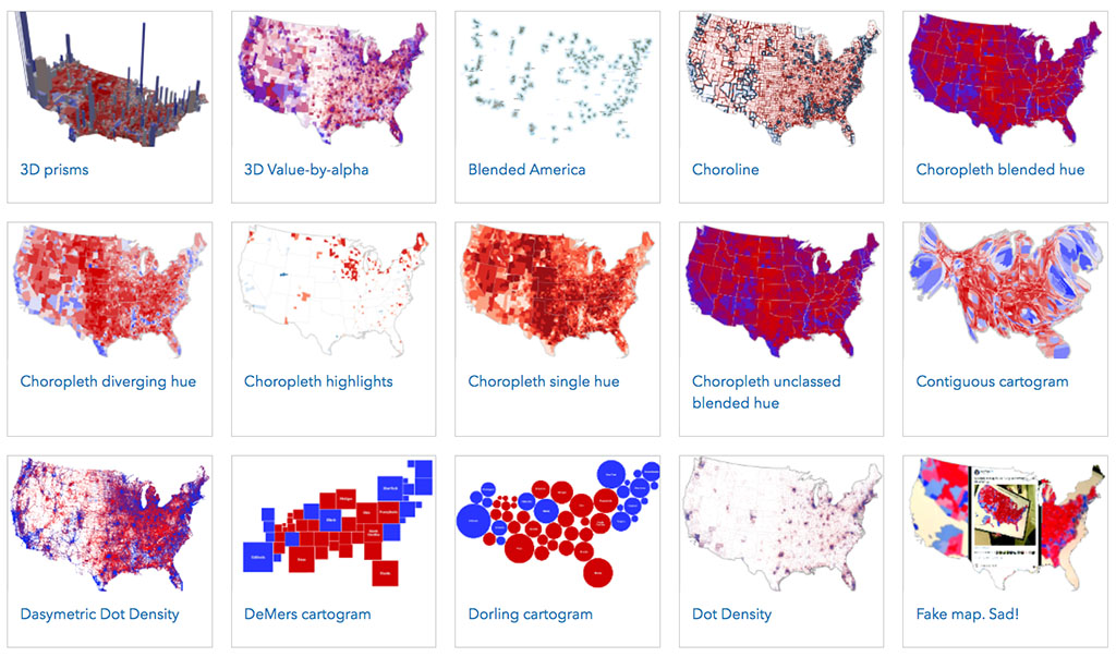
If you are a fan of ‘waffles’ or ‘Lord Vader,’ Kenneth Field has published many maps based on the 2016 Election data.
Karim Douieb, Co-founder of Jetpack.ai
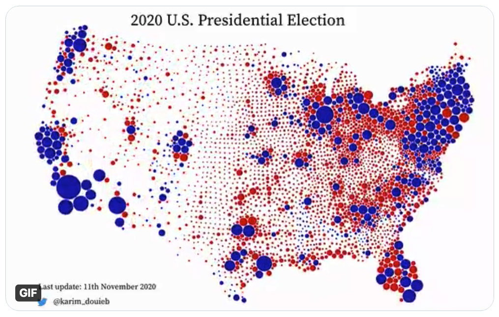
This is the tweet from Karim Douieb that made me to look at various election results visualizations. FastCompany has published the story of Karim Douieb accepting an online challenge and coming up with this visualization highlighting “Land doesn’t vote. People do.” I believe this map technique is known as ‘Graduated Symbol Map.’
I’m from India and I was wondering whether some of these visualization styles can be used for our Parliament Lok Sabha elections (scheduled for 2024). But we have a multi-party system with many national and regional political parties. To complicate matters, there are coalitions of political parties across states. Rather than a simple ‘red-blue’ heatmap, India needs to have all possible combination of colors on an election results map.