Skip to content

designPuli

Design Blog by Anas K A

  • Home
  • Talks
  • Wall Of Fame
  • About
  • Home
  • Talks
  • Wall Of Fame
  • About

Design — Logo for iRUN

August 17, 2020 Anas K A Logo Design
iRUN logo appearing on a digital mock-up of a drawstring bag

An upcoming solo running event needed a logo and I had less than 24 hours only to come up with one. ‘Unstated requirements’ included a connection to technology and sports. The name ‘iRUN’ was chosen for the event.

Exactly a decade ago, I designed the logo and posters for ‘Science and Technology Run’ (stylized as ‘Snt run’) at Indian Institute of Science, Bangalore. I wanted to take the same inspiration of ‘race tracks in a stadium’ for the ‘iRUN’ logo design as well.

3D Logo for Science & Technology Run 2010, 2011.
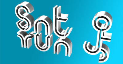
Look at the ‘n’ and ‘u’ alphabets placement of ‘Snt run.’
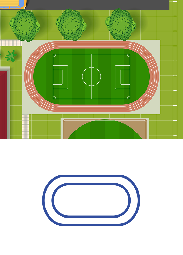
Race Tracks

An aerial view of race tracks in a stadium inspired the outline for the logo.

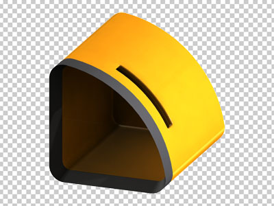
A Cute Robot with a Fitness Band

A color fill with a strategic discontinuity made the logo outline resembling an activity tracker (fitness band).

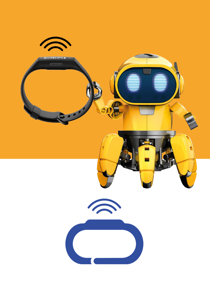
To add more resemblance to a fitness band, three arcs are also added to represent a signal transmission. The robot’s facial outline also resembled the shape that we arrived at, sealing the connection to technology. I named this version as ‘Tech-loop’ logo.

The Logotype

Share Tech Mono from Google Fonts

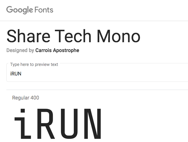
When searching for ‘Tech’ fonts in Google Fonts website, I came across ‘Share Tech Mono.’ When written in this font, the alphabets ‘i’ and ‘U’ of iRUN attracted my attention. To me, the alphabet ‘i’ looked like a person kneeling and the alphabet ‘U’ resembled the shape of a race track. The font is a condensed, tall one that works best even if we apply a ‘faux italic’ treatment.

Evolution of iRUN logotype
  1. This is how ‘iRUN’ appears in default in ‘Share Tech Mono’ font.
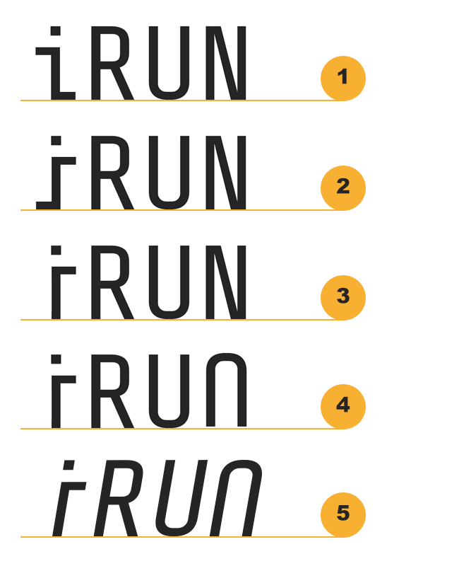
  2. The kneeling person ‘i’ of ‘iRUN’ is mirrored. Let us make him/her moving in a positive direction (left to right).
  3. The kneeling person ‘i’ is trimmed of the legs! Now ‘i’ looks like a standing person.
  4. The alphabet ‘N’ is replaced with a 180 degrees rotated ‘U.’ This is the other half of the shape of race track.
  5. Corrected the baseline of the new ‘N.’ then a ‘faux italic’ treatment is done by distorting ‘iRUN’ to some 10 degrees from the vertical. This is to represent a positive movement from left to right.

iRUN Logo

The final composition by placing ‘iRUN’ logotype inside the ‘Tech-loop’ logo.
iRUN logo animation; Music: Ritam Kaushik

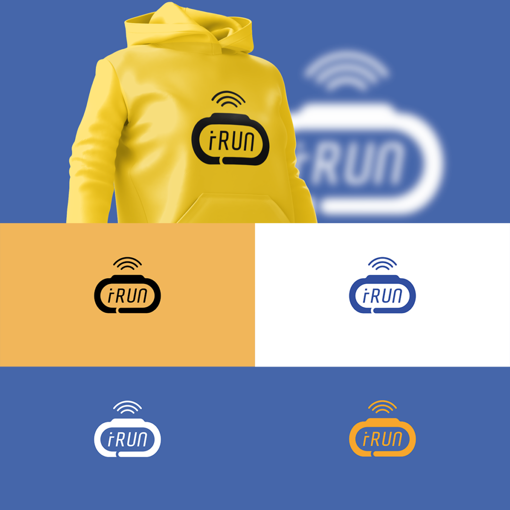
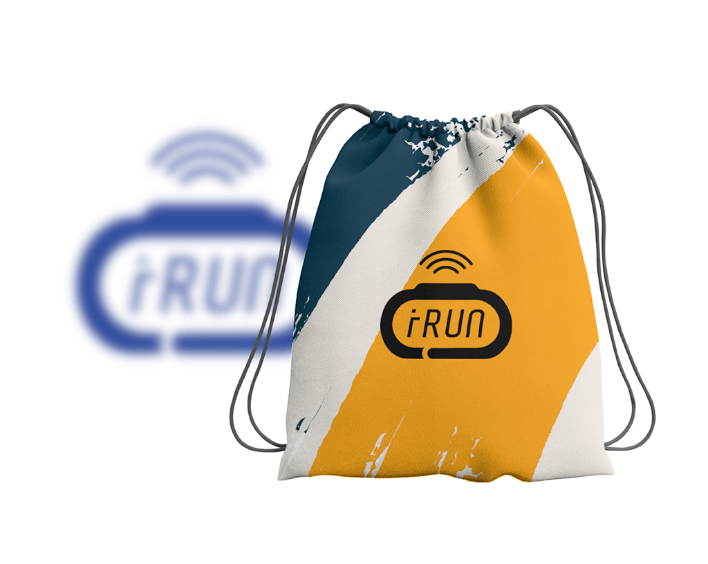
Within the available time-frame of a single day, I believe that this is the best result one could achieve. The event is planned in September 2020. Marketing collateral and merchandise design will all feature this iRUN logo.

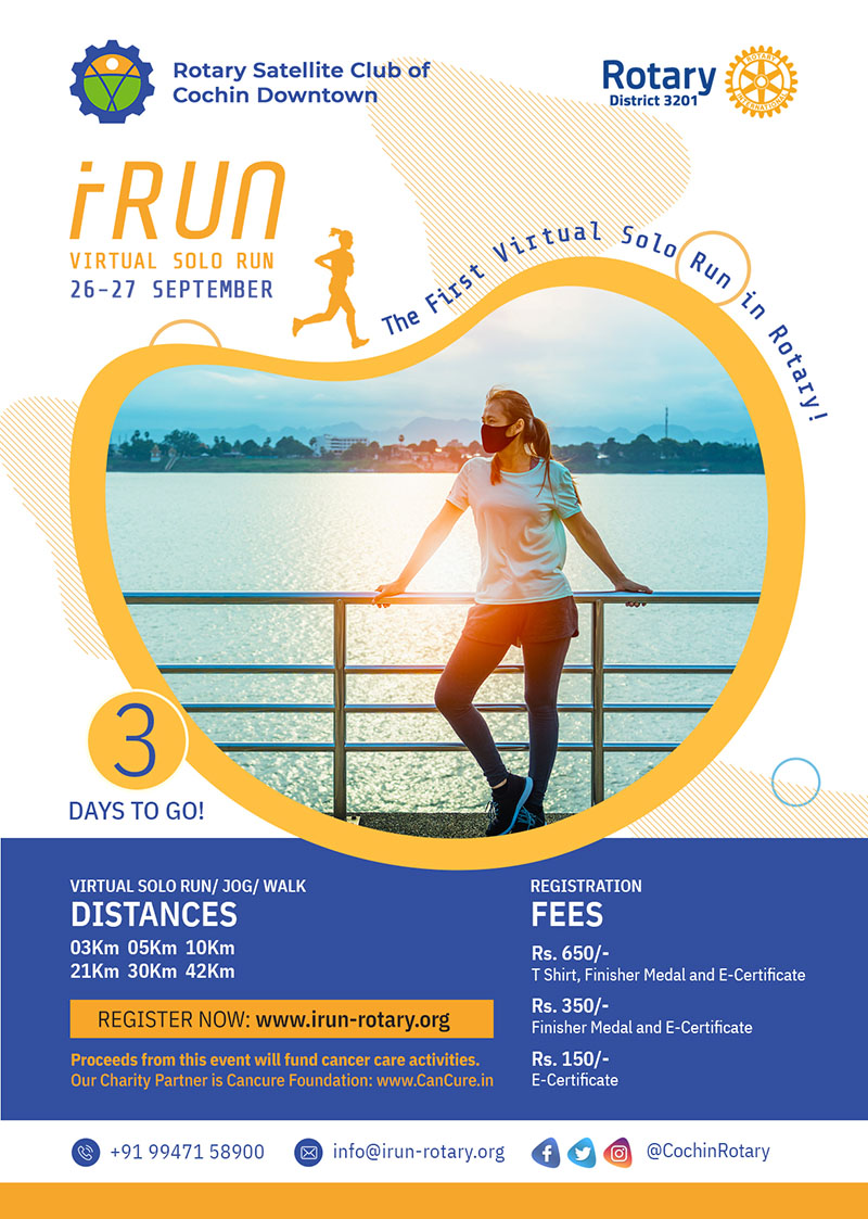
UPDATE 1: iRUN on 26 & 27 Sep 2020

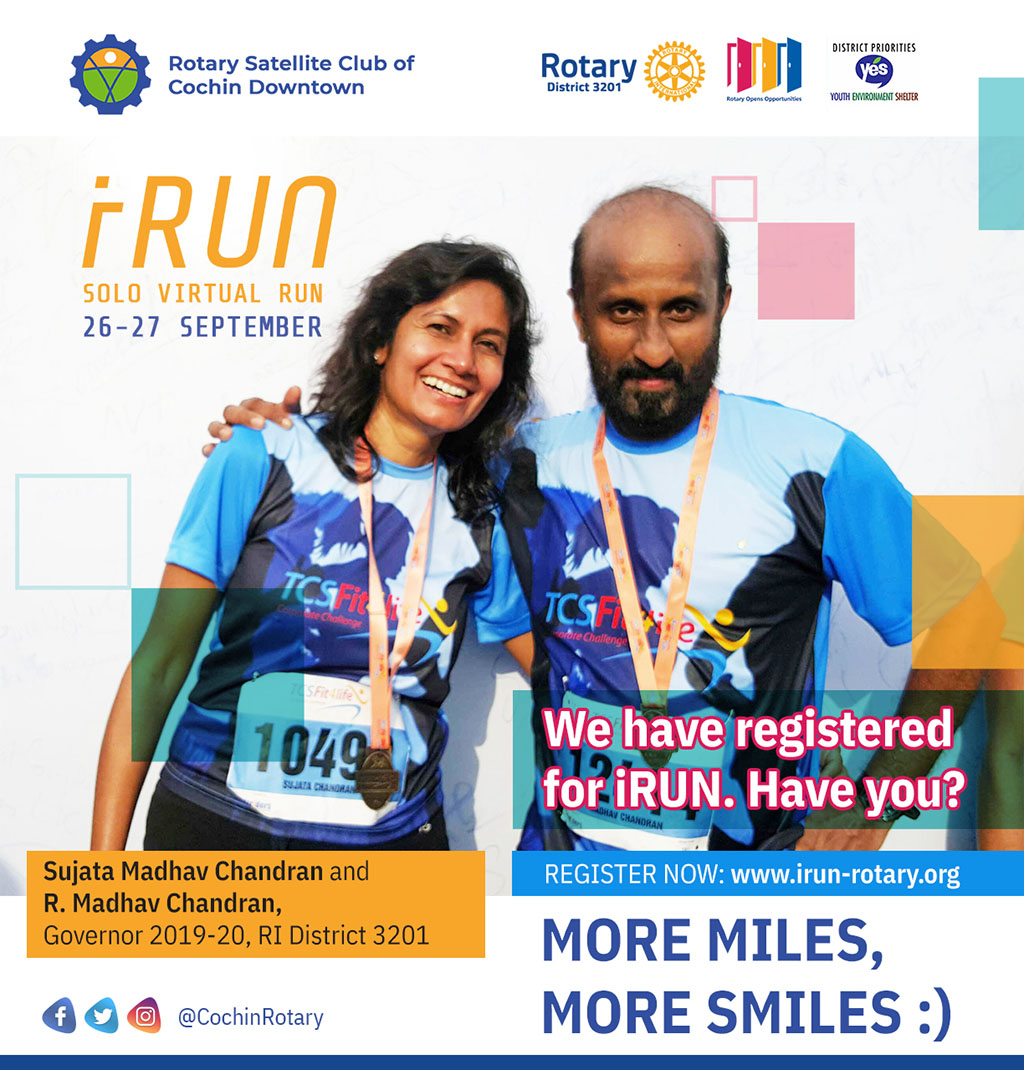
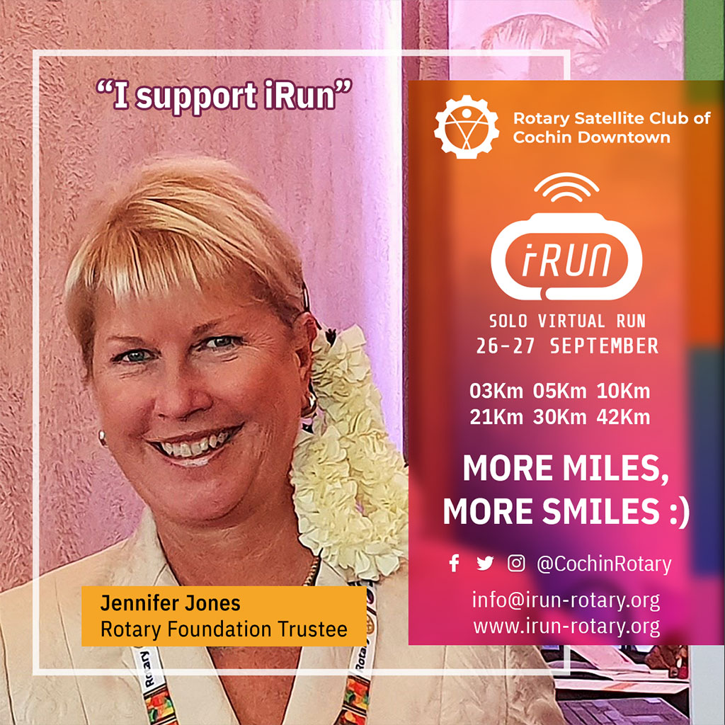
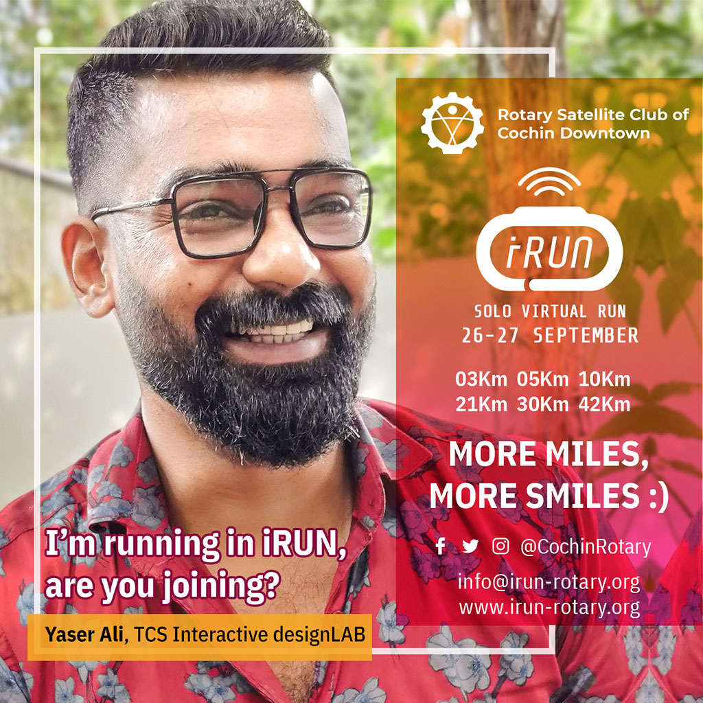
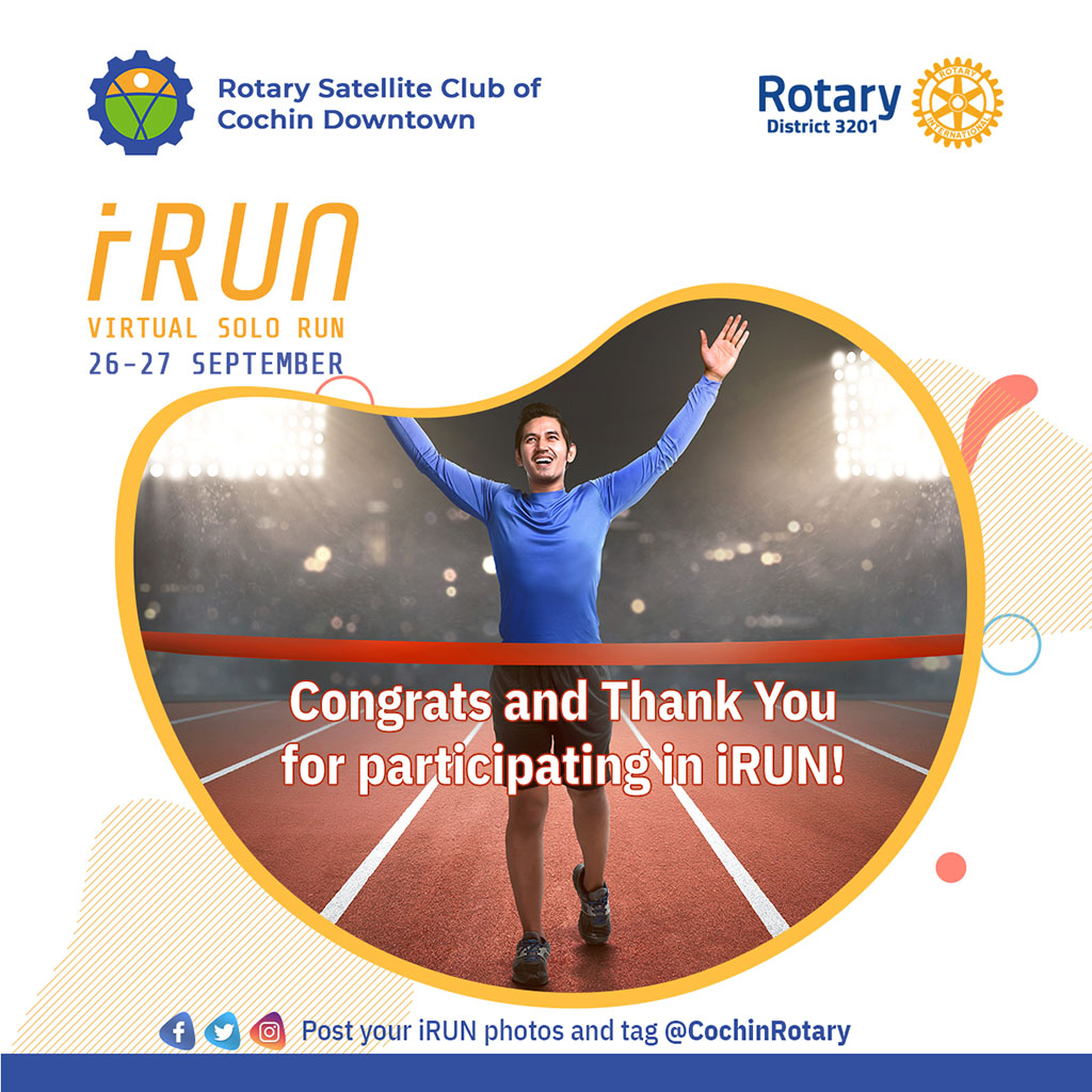
Here are some of the posters created for iRUN 1.0 which was a virtual event due to the pandemic shutdown.

Social media designs for iRUN

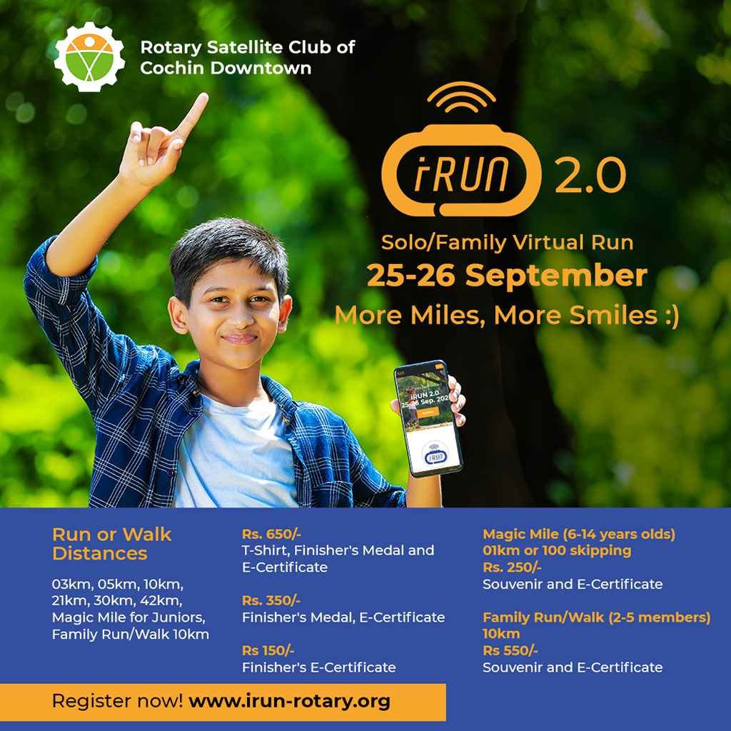
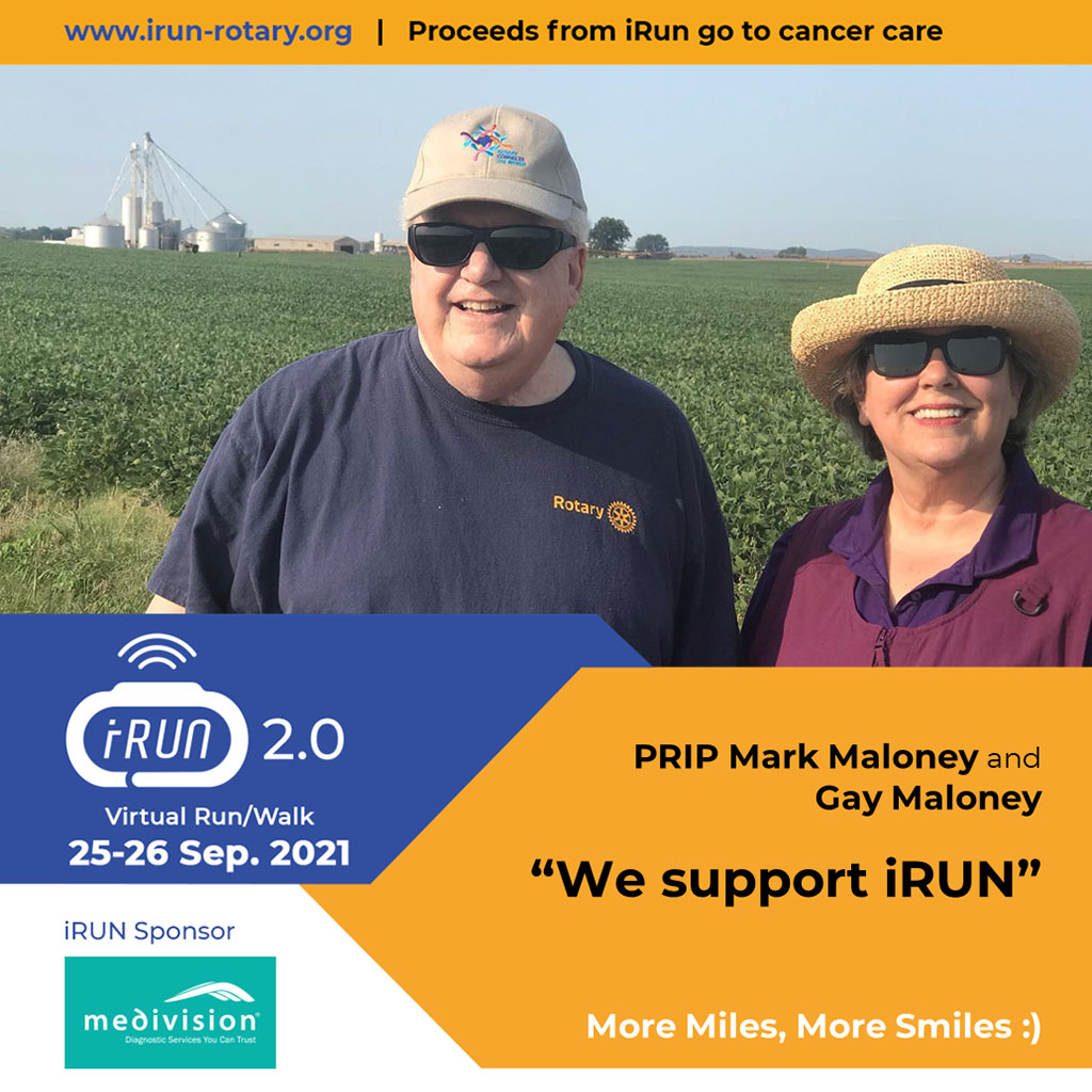
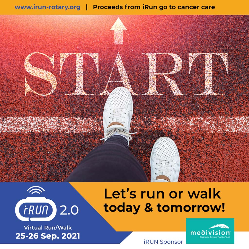
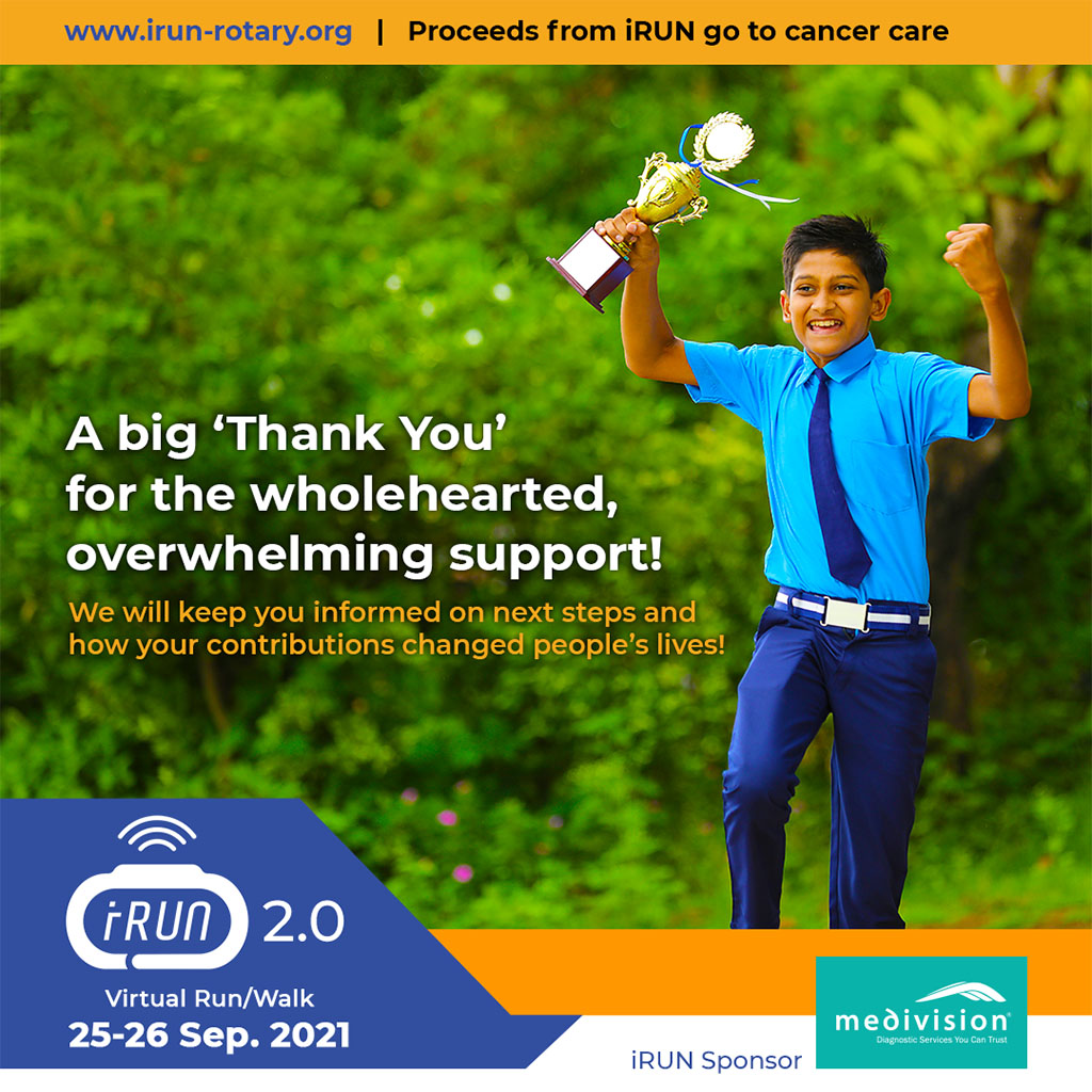
UPDATE 2: iRUN 2.0 on 25 & 26 Sep 2021

Here are some social media designs for iRUN 2.0. which was also a virtual event because of COVID-19 restrictions.

Social media designs for iRUN 2.0

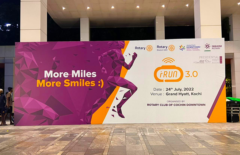
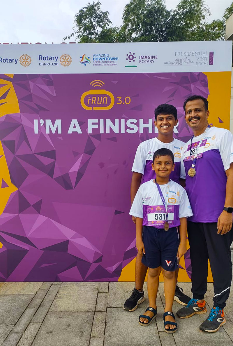
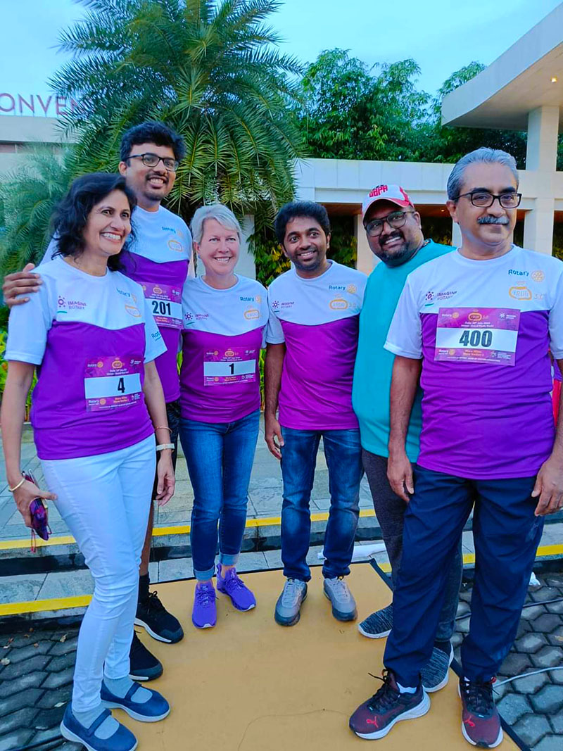
UPDATE 3: iRUN 3.0 on 24th July 2022

Being the first physical run in the iRUN series, a big event was organized at Grand Hyatt, Bolgatty, Kochi. 800+ people participated in the 3km and 10km run in the container terminal road.

Photo: Dinesh Thampi
Photo: Madhu Chandran
Photo: Dinesh Thampi
Photo: Greg Xavier
iRUN 3.0 Photos from the venue
ACV News on iRUN 3.0

Tags: activity trackerdesignfitness bandlogophotoshoprobotrunstadiumtrack

Anas K A

Designpreneur, UX Strategist, Graphic Designer, Design Blogger and Product Designer who is passionate in building delightful experiences. Writes at kiKKidu.com and on social media about design.

  • Next Design — ‘AnasKA.in’ Website for me!
  • Previous Design — Logo for Kaapi Channel

3 Responses

  • Comments0
  • Pingbacks3
  1. Design — Logo for Rotary Satellite Club – designPULI
    October 31, 2020

    […] new logo was used along with the Rotary logo for iRUN marketing and social media […]

  2. How to Easily Design and Execute a Virtual Event – designPuli
    October 10, 2021

    […] race track as well as an activity tracker (fitness band) in the iRUN logo? Very good! The detailed design story of the logo is narrated here. Since iRUN is the initiative of Rotary Satellite Club of Cochin Downtown, the colors used are the […]

  3. Silver Jubilee Celebrations of (CP)DM, IISc Bangalore – designPuli
    March 6, 2024

    […] slide features iRUN logo and NIFFFI […]

Leave a Reply Cancel reply

Your email address will not be published. Required fields are marked *

Calendar Design Print Design

Design – Year Planner 2011: Yellow

  • January 16, 2011
Ad Design

Design – Recruitment Ads

  • April 4, 2009
Tutorial

Transparent Background in SolidWorks Rendering

  • July 9, 2009
Ad Design

Design: Poster — 365 days at work

  • November 7, 2008

Categories

  • Ad Design
  • Art
  • Calendar Design
  • Card Design
  • Cartoon
  • Designer Life
  • Events
  • Furniture Design
  • Interaction Design
  • Interview
  • Logo Design
  • Mobile Apps
  • News
  • Photography
  • Poster Design
  • Print Design
  • Product Design
  • Review
  • Service Design
  • Software
  • Tutorial
  • UX
  • WDILT
  • Web design

Tags

2011 @antzfx ads Advertising Android Bangalore calendar camera Campaign college competition contest CPDM design desktop DSLR green greetings html IISc India interview kochi logo logo design logotype macro Mobile Apps newbie new year Photographer Photography photoshop poster rendering Review SolidWorks tabletop Twitter user experience UX wallpaper Web design wish YouTube

Archives

  • 2024 (7)
  • 2023 (5)
  • 2022 (20)
  • 2021 (15)
  • 2020 (11)
  • 2019 (2)
  • 2018 (1)
  • 2017 (1)
  • 2016 (2)
  • 2015 (8)
  • 2014 (23)
  • 2013 (9)
  • 2012 (22)
  • 2011 (45)
  • 2010 (37)
  • 2009 (44)
  • 2008 (12)
designPuli

DESIGNpuli | www.AnasKA.in