12 years ago while studying design, I had a product design portfolio that existed as a PDF file. It was also uploaded in a couple of websites like Behance, Dribbble… Today, most of the designers working in digital products or services showcase their design expertise in online portfolio websites. This is very helpful when they would like to show samples of their projects to get a new work or when they want to apply for an open position in a company. The intended end-users are prospective employers like hiring managers, recruitment HR persons…
My main reason to set up ‘AnasKA.in’ website is not about getting a new job or a new project. Because this ‘DESIGNpuli.com’ blog you are reading right now, already serves those purposes! ‘AnasKA.in’ is my attempt at giving mentoring to fellow designers, aspiring designers, students as well as anyone who are ready to lend an ear to me!
People Who Inspired Me
Prasanna Gadkari

Prasanna Gadkari, my senior from design school, is an amazing person who maintains the TeaCup Blog for aspiring designers and students to help them to get into design schools. He is also doing mentoring sessions for some time now and many people have benefited by interacting with Prasanna.
I noted the Calendly widget Prasanna was using to schedule upcoming interactions and I too wanted to copy the same! So, this thought made me to create a public website where I can help people to book a one hour Google Meet session with me, on any Sunday morning of their choice. And, just as Prasanna is doing, my sessions are also completely free of cost!
David Airey

I’m a big fan of the graphic designer David Airey and I have been following his work for more than a decade. You should definitely visit the ‘Resources’ page of David’s website. The way in which David explains the logic and thought process behind his works had a great influence on me. This is one of the main reasons why I started writing this ‘DESIGNpuli.com’ blog to tell my own design stories. Thank you, David!
Brian Lovin
‘Design Details’ is a very informative podcast and I’m a VIP (Very Important Pixel — $1/month subscriber!) for some months now. One of the co-hosts of this podcast is Brian Lovin, whose website is full of ‘a-m-a-z-i-n-g’ stuff! It is a treasure trove of articles and resources on design, engineering and product development. He has an ‘AMA’ (Ask Me Anything) section in his website for people to ask questions to him and I wanted to copy that as well!
Content Design
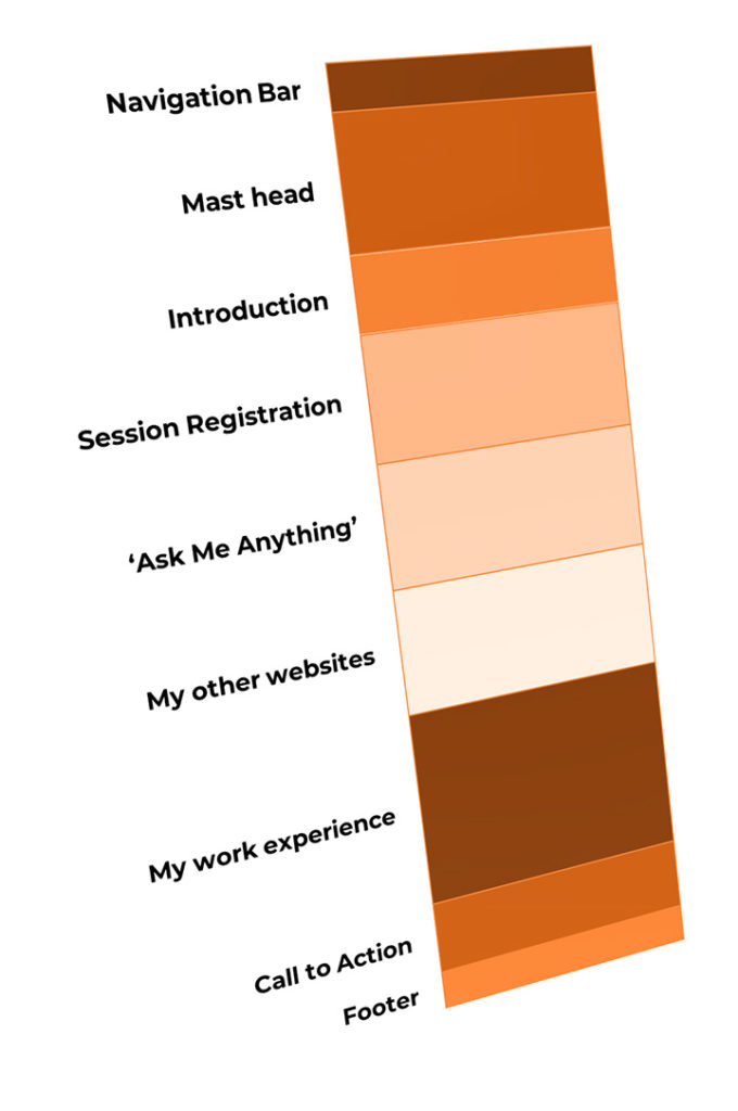
The content design clearly shows how the intended end-users can make of use of my website. The main functionalities of ‘AnasKA.in’ website are:
- To help people to book appointments for a one-on-one interaction with me.
- To help people to ask questions to me so that I can answer them directly.
- To act as a single source of truth for my resume where a small introduction about me, listing out my work experience, the links to the other websites I maintain… are all featured together.
Website Template
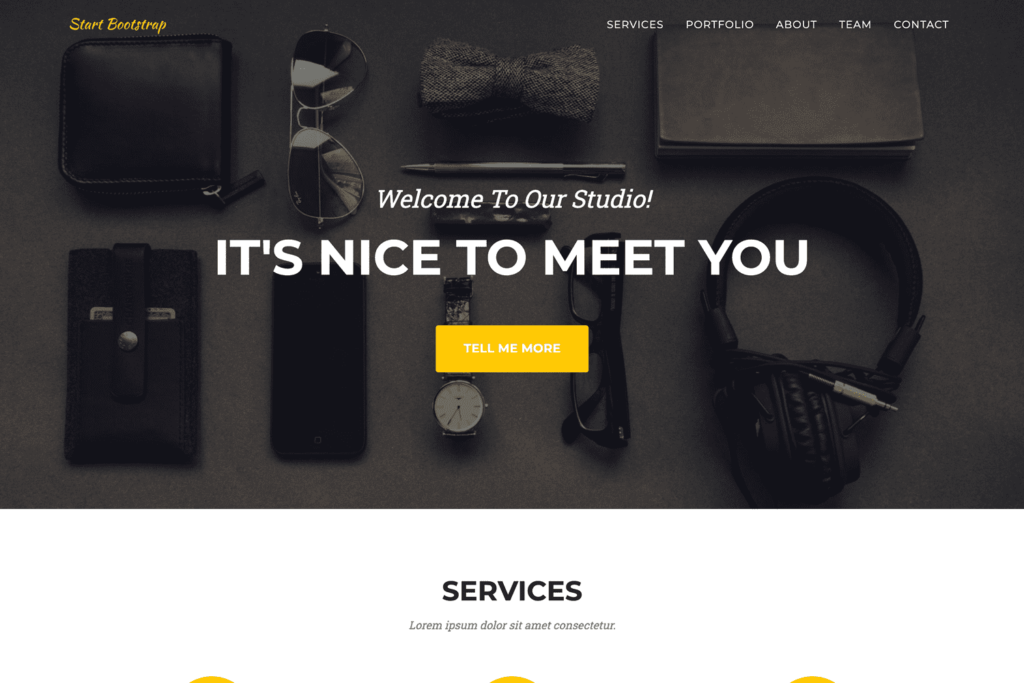
For any static website, I use free themes from Start Bootstrap. ‘Agency’ is a very flexible theme that has some very useful placeholder sections. It is mobile friendly and has a slow scroll feature on clicking the HTML anchors on the page.

Out of the nine placeholder sections available in the theme, I used eight — ‘Navigation Bar,’ ‘Mast Head,’ ‘Services,’ ‘Portfolio,’ ‘About,’ ‘Team,’ ‘Contact Us’ and ‘Footer.’ All icons used in this theme are from FontAwesome and it is very easy to find and use the required icons from their website.
Tools
I usually customize the HTML templates using Notepad++ on a Windows machine. I also use WinMerge when I need to compare between different versions. Both are free. I don’t usually use any WYSIWYG (What You See Is What You Get) HTML editors like Adobe DreamWeaver. I used to use Komodo Edit (Free version); but not anymore.
Image editing and logo designs are always done in Adobe Photoshop and Adobe Illustrator. To create a favicon from a PNG file, I used the free online service of Favicon.io. Although I haven’t used any stock free images in this project, following are the websites I usually go to find the right image.
‘AnasKA.in’ Website
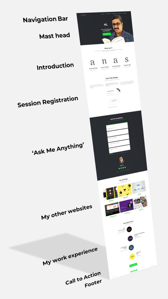
OR, visit ‘AnasKA.in’ website for the latest, updated design.
- Navigation Bar:
“anaska” logotype in‘Arima Madurai’typefaceis sitting on the left corner of the website header and navigation links are on the right corner. - Mast head: A banner showing my photo with a “Hi” greeting and a CTA (Call To Action) button for registering a session with me.
- Introduction: The question “Who am I?” is answered here. This section treats my name as an acronym and offers an expansion for ‘a,’ ‘n,’ ‘a’ and ‘s!’
- Session registration: An <iframe> embedding of Calendly widget helps people to block dates on any Sunday morning of their choice for a one-on-one discussion with me. I will receive a notification email as soon as someone registers for a session. Google Meet link is shared personally.
- Ask Me Anything: A Google ‘Contact Me’ form is <iframe> embedded here so that people can send messages or ask questions to me. Also, here I used the ‘Team’ design of the ‘Agency’ template to showcase links to my social media profiles on LinkedIn, Twitter, Medium and Instagram.
- My Other Websites: All thumbnails of featured websites under the title “My Writings” are of equal sizes, arranged neatly in three columns. When viewed on a mobile phone browser, everything arranges themselves into a single column layout.
This section makes use of the ‘Portfolio’ design from the ‘Agency’ template. The primary color is redefined as green (the default color of the ‘Agency’ theme is yellow). So on mouse hovering a thumbnail, a green overlay appears showing a ‘globe’ icon indicating a hyperlink. When you click on a thumbnail with the green ‘globe’ icon overlay, the URL opens in a new browser tab. - My Work Experience: This section is a timeline view of my association with organizations and educational institutions. This section is making use of the ‘About’ design from ‘Agency’ template.
- Call to Action (CTA): A session registration button is placed here, just above the footer of the website.
- Footer:
antzFxlogo, copyright info, links to my social media profiles on LinkedIn, Twitter, Medium, Instagram and the current version of ‘AnasKA.in’ website are given here.
I hope that all of you will like my ‘AnasKA.in‘ website!
🙂
UPDATE 04 MAY 2022
Video on Mast Head
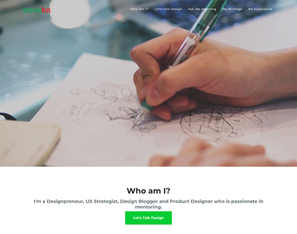
You will notice that the image on the mast head is now replaced with a stock free video that shows someone doing a design on paper. In reality, an image is still there below the video! — the image is the ‘first frame’ of the video. When the website loads, the image comes up first and the heavier video loads in the background. When the video is ready, it will start playing on top of our ‘first frame’ image. People will think that the paused video started playing automatically!
I will definitely replace this stock video with my own video. The video used now is by Distill from Pexels.com.
I should reveal that my efforts to show an overlay of text (“Hi! I am…”) and a CTA button on top of the video failed miserably so far! I’m still working on this…
UPDATE 23 SEP 2022
New ‘anas k a’ Logotype on Navigation Bar
As part of a branding exercise, the ‘antzFx’ logo and the new “anas k a” logotype in ‘Baloo Chetan 2’ typeface are sitting on the left corner of the website header and navigation links are on the right corner.
Footer
DESIGNpuli logo (hyperlinked to this blog entry itself), copyright info, links to my social media profiles on LinkedIn, Twitter, Medium, Instagram and the current version of ‘AnasKA.in’ website are given here.
404 Error Page
If we accidentally try to access a wrong URL of a page inside a website, a 404 error page will be displayed. Rather than showing the standard plain vanilla 404 error page, we can customize it so that people can recover from this error state by clicking a button that will take them to the home page of the website. This is done by adding the following line to the ‘.htaccess‘ file in the webserver.
ErrorDocument 404 /errorpage.html
where ‘errorpage.html’ is the customized 404 error page I have created.
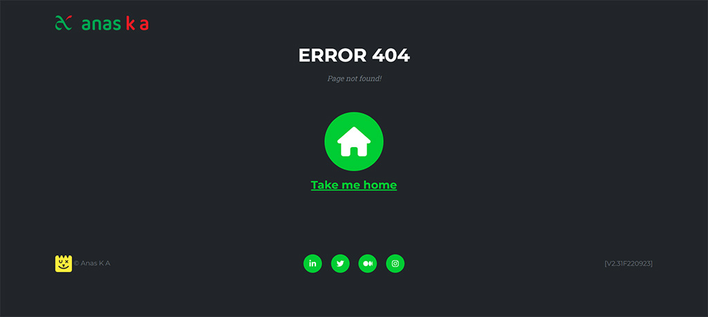
As you can see, I used only the design of ‘Services’ section of Agency Theme (Free) from Start Bootstrap. There is a big, circular home button that screams “Take me home!”


Very kind of you, AnasKA. Thanks for the mention, and I’m glad those resources helped.
😊 Whenever I get a chance to talk to aspiring designers, there are some five to seven links I always share with them at the end of my sessions. Your ‘Resources’ page is always there in that list for many years now! Thank you…
Loved it! Thanks for sharing the organic way of iteration and evolution of a personal brand.
🙂
There are no right or wrong answers for the question “how to build a personal brand?”
I’m interested in reading your story as well — so publish one soon!