“Hello Sir!”
A group of students are waving at me. I’m at the railway platform, waiting for a train to go home.
“Your presentation the other day was very good! Thank you…”
I felt very happy for being recognized in public and getting complimented. That too, by a group of teenage students!
It all started as an invitation from a Humanities & Social Sciences teacher who wanted experts to talk to the Year 10 students at Bob Hawke College so that they can do a multidisciplinary project on the topic “How do we safeguard our future?”

The list of speakers was impressive. The topics were also very diverse. I decided to introduce the basics of Accessibility and User Experience Design to the students. Following are the slides I presented on the day with descriptions and references.
Click here to download a handout version of the PowerPoint presentation (1.6MB).
Introduction
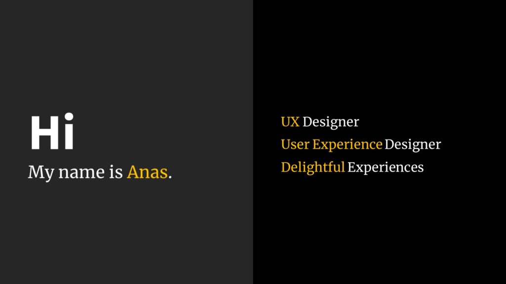
As a User Experience Designer, I always try to ensure delightful experiences for the users of digital products and services I’m part of.
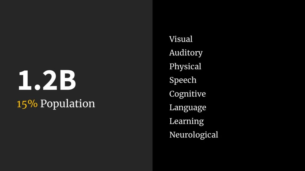
Around 15% of the world’s population suffere from some form of disability (WHO Report 2011). That is more than 1.2 billion people out of the 8 billion souls on the planet.

(click on the image for a larger preview)
Apart from the people suffering from permanent disability, there are also people with temporary and situational disabilities. As an example, a distracted driver suffers from a situational disability of sight since his eyes are not on the road. A person suffering from an ear infection is temporarily disabled of hearing (Micosoft Inclusive 101 Guidebook).
Color Blindness
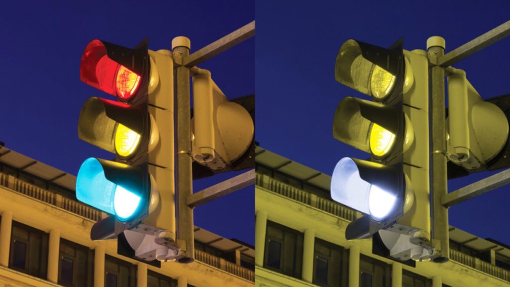
How can we help the color blind people to distinguish between ‘Red,’ ‘Yellow’ and ‘Green’ traffic lights?
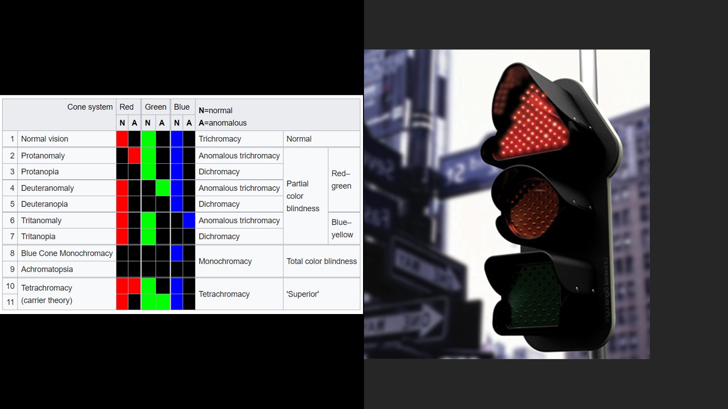
a traffic light with different shapes (image source)
There are many solutions — one method is to label the traffic lights as ‘STOP,’ ‘Attention’ and ‘Go!’ for Red, Yellow and Green lights respectively. Another method is to use icons or differently shaped lights — triangle, circle and square for Red, Yellow and Green lights respectively.
The Concept of Accessibility
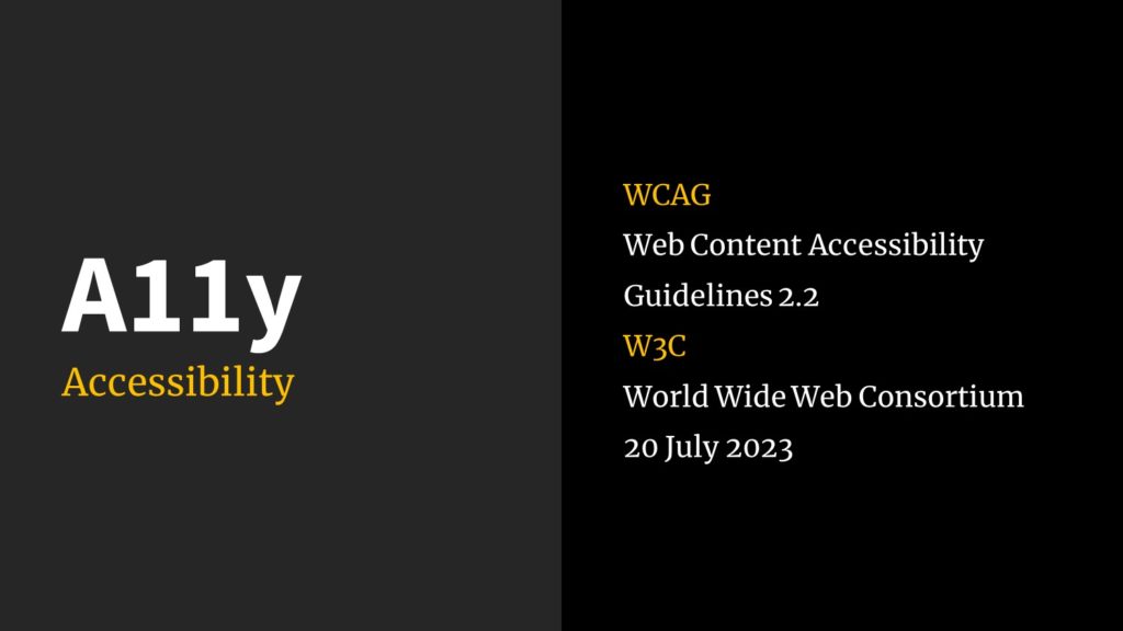
A11y is a widely accepted, yet the least accessible acronym for ‘Accessibility!’ Accessibility is about ensuring anyone can access a content, a place, a product or a service. In this presentation, let us limit it to the content and digital products & services.
For mobile applications, we have accessibility guidelines specified by Apple for iOS apps and Google for Android apps. For websites, W3C (World Wide Web Consortium) is responsible for publishing Web Content Accessibility Guidelines.
Ensuring Accessibility in Digital Design
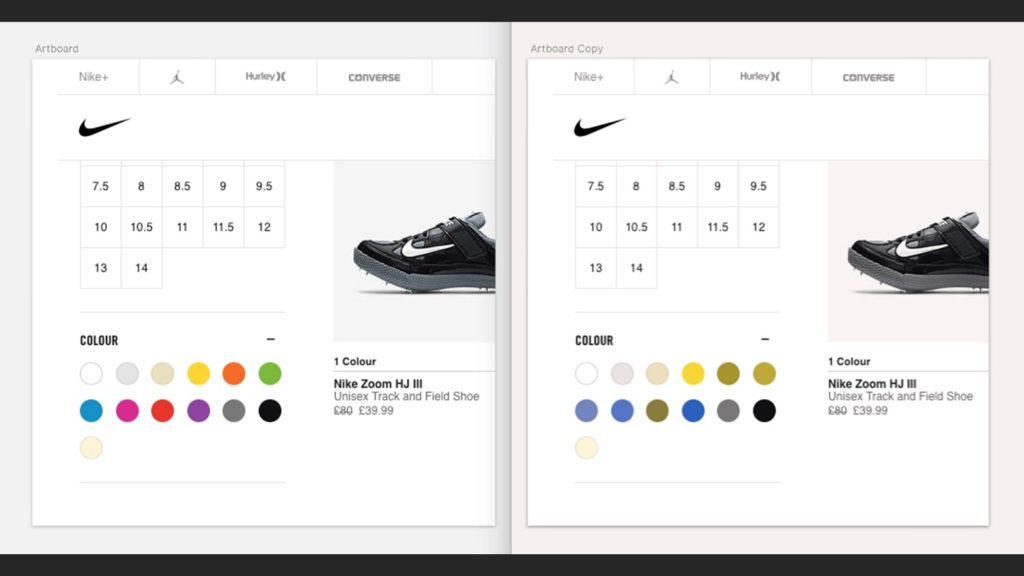
In the above example, selecting the right shoe is a challenge for the color blind person.
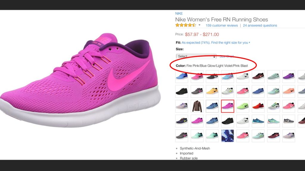
One solution is to display the name of the color when a particular shoe is selected.
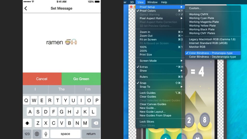
Nowadays, design tools like Adobe Photoshop can simulate different color blindness scenarios. This helps the designers and developers in finding the right combination of colors that are more accessible and work across different channels like web, mobile and print.
buttons with different visual styles
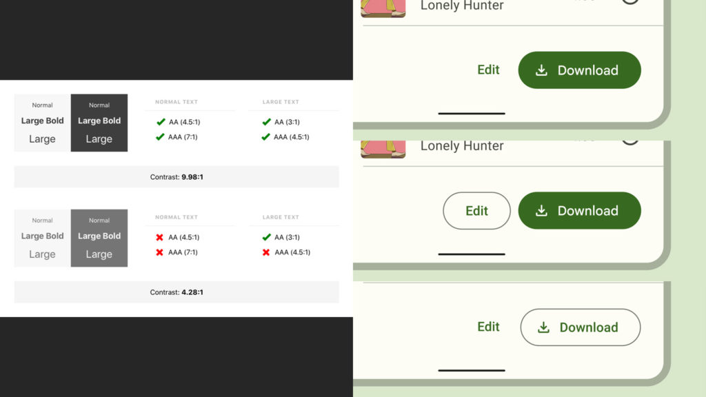
Contrast between the background and foreground elements is essential to maintain a AA (4.5:1) or AAA (7:1) success criteria according to WCAG. Contrast checking tools or plugins are available to designers and developers to ensure this.
One way to help our users in distinguishing between the primary action buttons and other secondary buttons on an interface is by designing them with different styles. We can use filled buttons, outlined buttons and text buttons.
Supporting Screen Readers for the Blind
and a CAT Bus (image source).
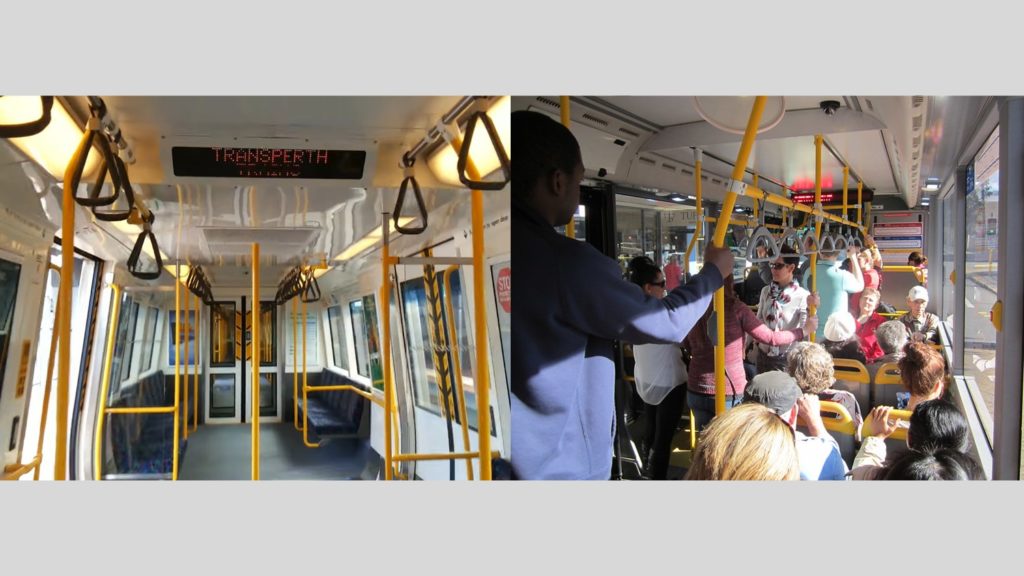
In our Perth trains and buses, the upcoming stop is shown on an LED display along with an audio readout. Since sound is omnidirectional, you don’t have to always look and read the display. Similarly, screen reader applications help blind people by giving them a readout of the web page or the mobile app screen they are visiting. Screen readers are available as standalone apps, plugins to web browsers and sometimes even baked into the operating system of a computer or mobile phone.
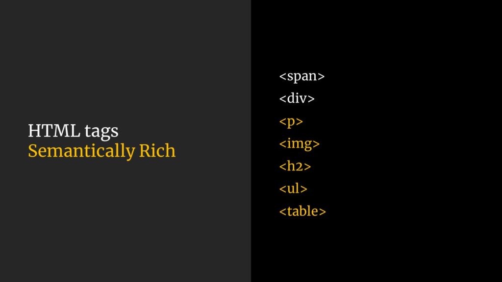
Screen reader apps look at the HTML tags of a website to give a better readout of its content. Semantically rich tags like <p> (paragraph) or <ul> (un-ordered list) give more context to the screen readers.
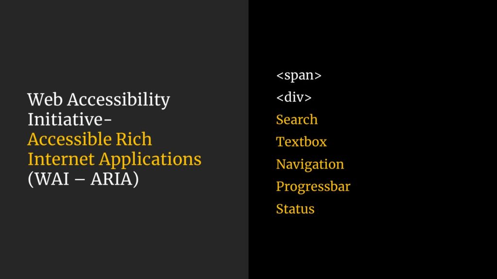
How can we help the screen reader app to distinguish between a text box on a form and another one on a search tool bar? WAI-ARIA tags like ‘textbox’ or ‘search’ add more context to a text input element based on its usage and position on a page layout.
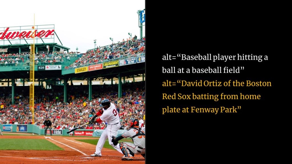
To help screen reader apps to describe an image to a blind person, ‘alt text’ needs to be added to every image. It is important to include as much context as one can into the alt text so that the user experience of the visually challenged person is not sacrificed.
Evolving Best Practices
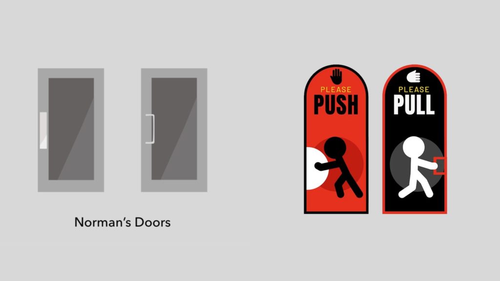
One example of a situational disability is standing in front of a door wondering whether you need to push or pull to open it. The ‘affordance’ of a door handle can indicate how the door can be opened. If there is a prominent door handle that lets you to hold firmly, you might pull it towards you to open the door. If a prominent door handle is absent, people tend to push the door to open. The concept is better explained by Don Norman in his book ‘The Design of Everyday Things.’
If the ‘Push’ or ‘Pull’ sticker on the door is in an unknown language, we may have to figure out how the door opens by trying. An icon or a drawing along with the ‘Push’ or ‘Pull’ sticker will greatly help even a person cannot understand the language.

(click on the image for a larger preview)
Abrahamic languages like Hebrew or Arabic are written from right to left. So how can we design a mobile app screen both in English and Arabic? What about the positions of home button or the menu button? Do we need to design the screens as mirror images (horizontally flipped layout) for the two languages? What if the icon labels are longer in one language compared to the other?

(click on the image for a larger preview)
Irrespective of how a language is written, it is always better to adhere to the accepted standards of the mobile app design. Globally, home buttons on the tab bar is always placed first on the left. Hamburger menu button is also positioned on the top left corner. If the tab bar or navigation bar icons are expressive and recognizable enough, labels can also be removed.
Information Display in Public Places

(click on the image for a larger preview)
There are opportunities around us to improve the designs for a better user experience. Have you seen how the train timings are displayed at the Perth Station?
The information is displayed on this LCD panel as a table with rows and columns. You have the column labels ‘Destination,’ ‘Minutes,’ ‘Platform’ and ‘Pattern.’ Since the minutes and platform numbers are in adjacent columns and are both numbers, one has to carefully read the labels to make some sense out of this display. And the cluttered display with too much information increases the cognitive load for the users.
Yes, train arrival times are announced continuously via the public addressing system. Let’s concentrate only on the information display screen for now.
Compare this display with that of the London Underground. This LED matrix display does not say the station name where the display is placed. There are no column labels. It just shows the platform number, destination, ETA in minutes and the current time. For a passenger in a hurry, this old display is more functional than the LCD panel at the Perth Station that is capable of showing a variety of media.
Designing for ‘Real’ People

(click on the image for a larger preview)
Here is an example of how Perth Transport did an amazing job ensuring a better user experience for the people. Some of the buttons in the city for pedestrians to request a road crossing signal are equipped with contactless sensors. These are a godsend during the COVID-19 times. People were already encouraged to use their elbow rather than their fingers to press the button during those times to minimize exposure to germs that might be present on the button. But the addition of contactless sensors made sure that cross contamination never happens. You just wave your hand in front of the button and your request is registered by the system. I don’t know whether this is an infrared sensor, but it does the job beautifully.
Accessibility and Usability

(click on the image for a larger preview)
A digital product or service provides the best user experience when everyone can access it easily and ensuring delightful experiences to the people.
Peace!
Click here to download a handout version of the PowerPoint presentation (1.6MB).
Acknowledgements
I would like to thank the teachers Emily and Sian of Bob Hawke College for inviting me to the session with Year 10 students. Special thanks to John, the Principal.


So thoughtfully written! If i may add, as a recent dweller in London-
The public transport system here is designed embracing accessibility. The urban transport network was eventually developed from a time accessibility wasn’t even a priority (1970s onwards).
They tackle the issue by clearly labelling (online &offline) which underground/ overground stations have lifts/only stairs. This helps to plan ahead.
The TfL (Transport for London) buses have low ground-clearance with an on-demand ramp system. Exiting passengers can use that. To demand ramp on entry, they thoughtfully designed a switch on the exterior of the bus, near the door, at a height which a wheelchair passenger can press from a hand away distance.
Thankyou for shedding light on this important topic.
Thanks, Riyas!
It appears that we can co-author a blog comparing the accessibility features in Public Transport at London and Perth.
Also I have so many questions regarding the ramp. Can anyone press the button from outside when the bus is stationary? Or, is it geo-tagged to be enabled only at bus-stops? Here in Perth, the bus driver controls the ramp at all times after making sure that the ramp can be deployed without injuring anyone near by.
Let’s collaborate!
😍 sure! Lemme start my data collection then!