“I need a logo for an online international film festival. Our plan is to showcase movies and documentaries featuring Nila river.”
My friend Sreejesh talked to me over a phone call. Time was not there and Sreejesh, himself a designer, needed some ideas.
NIFFFI is being organized by Vayali Folklore Group. So I started with some rough ideas around the Vayali logo.
After seeing this version, Sreejesh suggested to drop the ‘Vayali’ connection and start a fresh idea. After doodling around the alphabets ‘N’ and ‘i’ (Nila), water ripples (Nila is a river) and a movie camera… I came up with the following.
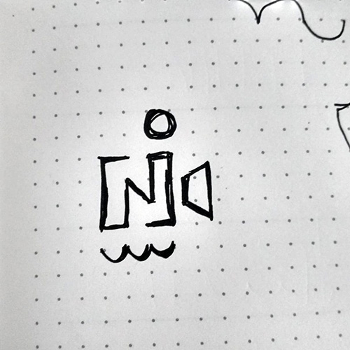
The dot of the alphabet ‘i’ can also be viewed as a moon in the sky. The whole ‘moon-river’ association brought an element of ‘nature’ into the logo.
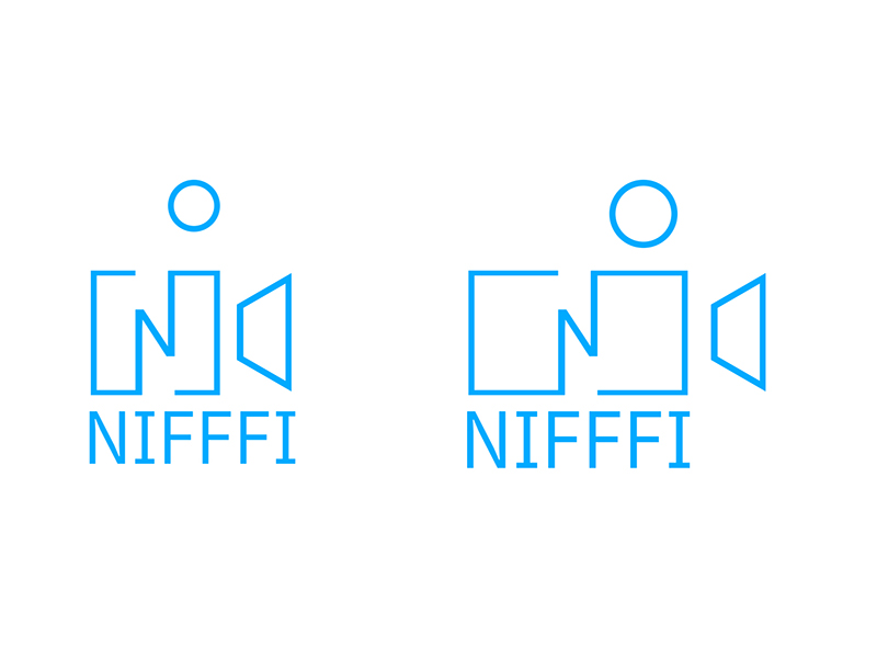
Since the curvy ripples were adding to the complexity of the logo, it was decided to drop that element from the digital version. One more logo option was created digitally with the outline of ‘N’ transforming to a 16:9 aspect ratio of a video frame.
Sreejesh took over from here and designed a unique logo for NIFFFI.
The moon/dot of the alphabet ‘i’ is also removed for reducing the number of elements in the logo. Since the alphabet ‘N’ has open ends, the same approach is taken for the lens hood by making an opening on the triangle.
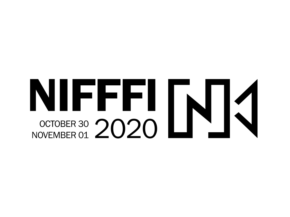
The font used for the logotype is Franklin Gothic. The logo first appeared on the NIFFFI website and social media. The logo is widely appreciated.

I wish all the success for NIFFFI! Keep inspiring us…
Amazing !! Incredible !!