“Which color do you recommend for an app icon? Ours should stand out from the rest of the icons.”
“Don’t you have a brand color?”
“No. We are a start-up company and we are going to launch a mobile app soon.”
A couple of young guys asked me this and so I embarked on a ‘highly unscientific study’ on 90 app icons that happen to come my way.
Insights
Following insights are based on my observations of the 90 app icons I managed to get hold of. The modus operandi is mentioned at the end of this article.
To stand out from the crowd of app icons, don’t follow the crowd in terms of color, name placement, shape of app icon canvas…
App Icon Colors
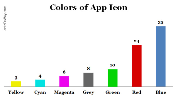
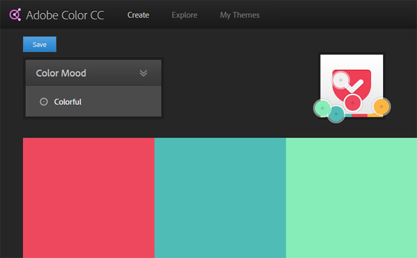
What should be the color of the app icon that you are going to design? Here is the color distribution chart we extracted using Adobe Color from the 90 app icons.
Blue colored app icons dominate — there are 35 app icons out of a total of 90 apps (39%).
If most of the app icons in your mobile phone home screen are blue, red or green, app icons in yellow, cyan, magenta or shades of grey will definitely stand out.

Text in App Icons
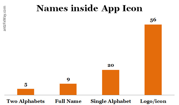
Do we need to place the name of the app inside app icons? Or, is a simple logo good enough?
56 app icons out of 90 apps (62%) have logo/icons without any text. Only a few apps display names inside the app icon. A compelling reason why you should too.

Shape of App Icons
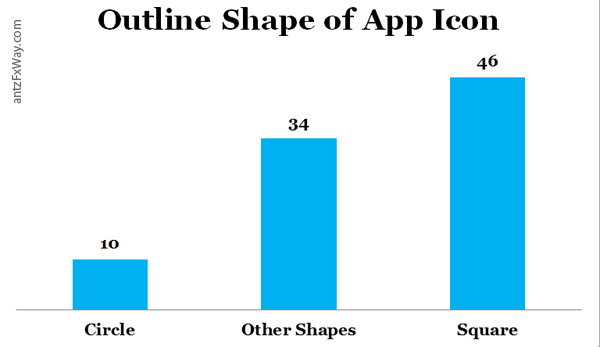
In android, we have the luxury of transparent canvas for app icons. This gives more room for creativity unlike an iOS app icon which is always a round edged square. Here is the current statistics of app icon canvas shapes.
46 app icons out of 90 apps (51%) have square shaped app icons.
Would you like to see one example each for the above?
For a change, design circular app icons.
Family of App Icons
Let us say that we have more than one app in app store under a single brand. How can we show that all the app icons belong to the same family, yet they are unique enough for the user? How can we maintain the brand recognition across apps?
There are four trends in front of us.
Same Graphic, Different Color
Let us take the example of 9GAG.

Because of the prominent graphic/icon, users will instantly recognize the family of apps and understand that they all belong to 9GAG.
Different Graphic, Same Color
LinkedIn family tackles this brand recognition problem by maintaining the uniform blue color across its apps.

In my opinion, the icons don’t exactly belong to the same family. See the stroke width and orientation of the ‘magnifying glass’ icon in ‘Job Search’ app and ‘Recruiter’ app. Ideally, they should be identical.
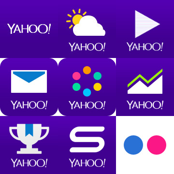
Different Graphic, Same Color, Same Logotype
Yahoo! apps have the same ‘Yahoo!’ logotype (except Flickr) and the same color (except Flickr); but the icons are different for all of them.
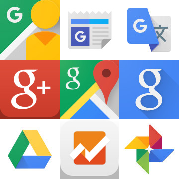
Freestyle
Google generally follows the brand colors in a diverse array of graphics and occasionally throw the “G” here and there.
At the time of writing, Google has changed some app icons to reflect the new logo change (Street View, News & Weather); but others like Google Plus still sport the old “G.”
Moral of the Story
A yellow, circular app icon displaying the name of the app (only in two alphabets) will definitely stand out from the crowd!
😉
Modus Operandi
I downloaded and saved 90 app icons. 28 apps are from #Homescreen ‘Top Apps of this Week.’ The rest are from my mobile phone.
I used Adobe Color (Kuler) to breakdown the color palette and note down the dominant colors.
I filled a spreadsheet with the numbers and created some graphs!
I look forward to hear what you have to say about this exercise. Let’s talk…


Hi Anas
Good study and very useful…. 🙂
Thanks!
Brilliant, as always. Sho!
🙂
Great posts… I willl be around here… keep it coming…
Thank you. Will definitely post more such ‘unscientific studies’ in future…
Well done Anas , something most of the UX guys are really finding difficult to sort out. Kudos.
Probably the same study can be extended to brand logos.
Hi Anas
Well done!! Interesting evidence☺.
Awesome work ! Throws up a lot of very good insights on App Icons.
Hi, I want to make an app for my shop. Will you help?