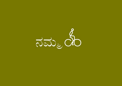
We have designed a logo for Namma Cycle, a Bangalore University Bike Sharing Experiment.
This is essentially a doodle — a single stroke logo — that conveys the idea of a man pedaling a bicycle. I would like to share with you the design process that went behind this logo.
Doodling is fun

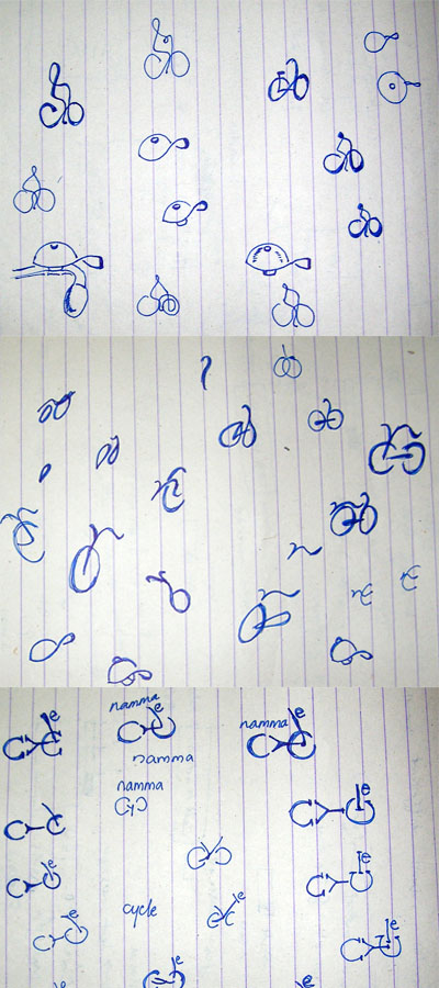
As always, I started out to explore the ideas with pen and paper. Obviously, ‘bicycle’ is the center of the theme.
As you can see, ideas like bicycle bells were also tried before coming up with the following ‘candidates.’
Prospective Candidates


Apart from the selected version, following were the other suggestions from our side.
‘Pedaling’
This logo shows a front view of the bicycle with ‘Namma Cycle’ shown as pedaling it.
‘Typographic’
This logo versions are created only using alphabets in Century Gothic Font.
With a little bit of imagination, you can spell ‘c’-‘y’-‘c’-‘l’-‘e’ in this version.
‘Tangram’
The question of “Is it necessary to picture a bicycle only with circles and curves?” led to the idea of Tangram.
The logo is not created from the seven pieces of a Tangram. A forward tilt of the logo implies a faster pace.
More ideas on the selected Doodle logo


As I have mentioned already, this is a single stroke logo that conveys the idea of a man riding a bicycle.
The color coding and the positioning of the doodle take care that you will see and read ‘Namma Cycle’ instead of seeing ‘Namma’ and a bicycle doodle as separate.
‘Namma’ and the Bicycle doodle share the same base line. Lowercase alphabets are used to write ‘Namma.’ So the diameter of the bicycle tires are kept as the x-height of the font. This will prompt us to consider the riding man as an ascender of the Quadranta Font. This will also give a continuity from the alphabets to the doodle to make us read ‘Namma Cycle’ together.
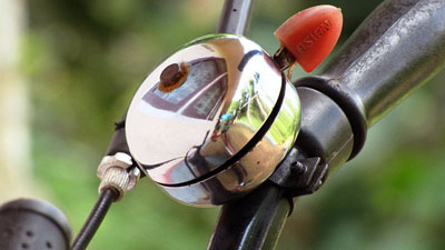
Quadranta Font is a rotund font and is more rounder than Century Gothic. The alphabet ‘a’ is pretty round and the client thought that it looks like a bicycle bell. I too liked this idea and proceeded to give more ‘bicycle bell-ish’ character to the ‘a.’
I added a hexagonal nut to the ‘a.’ But this began to look like something that needs to be avoided in a logo. So we reverted to the original design.
Namma Cycle — Kannada Version

Kannada scripts are generally written using counterclockwise strokes. The bicycle doodle in ‘Namma Cycle’ logo also has this characteristic.
Compliance to 2011 Logo Trends!
After designing this logo, I came across the article ‘2011 Logo Trends’ by Logo Lounge. It appears that the ‘Namma Cycle’ logo belongs to the 2011 trend of ‘Monoline.’
Monoline
An old rule of thumb to the socially adept was you can never to too rich or too thin. There is a certain elegance in an ultra-thin line, and this has never been lost on designers. Challenging as these may be on aging eyes, when designed well and not under-scaled, they will coax a pair of readers from the viewer’s pocket. Note that in the type and illustration solutions, the line is not variable but rather a mono-weight.
That’s all, guys. What are your thoughts on this design?
Namma Cycle Partner Promotion & Collaboration Kit
Logo ID: 110510TU


Cool Logo!. Happy to know your logo got selected 🙂
Nice man, good one 🙂
liked it… And happy to know that it got selected…
It is a lovely logo 🙂
Many congratulations for the selection!
Dear Anish, Ashveen and Vinay,
Thank you for reading the article and posting encouraging words. Happy to know that you guys liked Namma Cycle logo.
Anas, the best thing I liked about it is the way it mirrors the Kannada script, wonderful. Nice post too, liked the “ruled” scrap book pic.
Congrats… For your logo getting selected…
How did you make a kannada logo of it?
Dear Kishore and Ranjan,
Thanks. Murali H. R. of Namma Cycle sent me the Kannada Script in a mail. But Photoshop didn’t render it faithfully. Murali showed me his rendering done in GIMP. So, I turned to GIMP only for the Kannada version.
I am getting other comments in Google Buzz that the bicycle doodle looks like ‘Ha’ in Kannada and ‘ya dhva’ in Gujarati. I must admit that this was unintentional from my side!
Well … to add on the resemblance list, it looks like a ‘ള്’ in Malayalam script!
Really awesome. Minimalistic and elegant. A good work
Thanks! The experience was fun!
Killer logo.
Hence he proved again.
Thank you. Once in a while a good idea appears by itself and the client supports it. This was one such occasion.