Minimalistic Posters

Let us play a game. Can you identify the movies from the following minimalistic posters?
Hint: This is a 2001 animated Hollywood movie that was a huge hit at the time

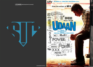
Hint: This is a 2010 Hindi movie that received critical acclaim

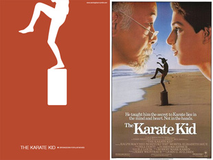
Hint: This 1984 Hollywood movie enjoys a cult status across the world.
Doors, Superman and the beach
Here are the answers (Click on the images for a larger view):

Monsters, Inc.
This poster refers to Boo’s door through which she enters the world of Mike and Sulley.
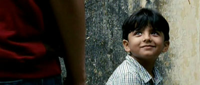
Udaan
This poster refers to the superman toy shared by the siblings Rohan and Arjun and also the fact that they have to address their father as “Sir.”
The Karate Kid
This poster refers to the iconic scene of Daniel Larusso practicing the Crane Pose on the beach.
Masters of minimalism
Neeraj Menon and Soumya Jain are the people behind these creations. They have uploaded all their minimalistic works at Zeroing Down — Less is more.
Let us have a free wheeling chat with Neeraj and Soumya.
Q. What is the idea behind the blog Zeroing Down — Less is more?
A. In a nutshell, our blog features minimal posters of pop culture icons. We started the blog with three ideas. One: to come up with minimal and suggestive artworks for popular stuff; two: to keep our creative cells alive; and three: to have fun!
Q. How did you come up with this fantastic ‘minimalsitic’ idea? How did you two guys become partners?
A. Neeraj: Soumya and I were at college together and we’ve worked together quite a bit. I think Soumya had stumbled upon these posters by someone. The simple hard-impact visual style really appealed to us. And we decided to make a whole series for all that inspires us.
Soumya: We both are movie buffs and college batch-mates. We had some common taste and we used to spend a lot of time just discussing and commenting on movies, games, music and design. Once we were having a random chat and suddenly this Idea was born!
Q. Why do you concentrate on film posters? Why not something like book covers (Eg. The Alchemist) or product labels (Eg. Aquafina Mineral Water)?
A. Initially the idea was to try and simplify everything from games, movies, people, music etc. And there a few games, TV shows on there too. But, being movie enthusiasts, we think it’s understandable that we have an abundance of movie posters.
Q. How do you execute a work? Is it a group activity?
A. We come up with ideas and execute them individually.
Ideas just strike you at an instant, and you have to put it in action immediately.
We do have a plan to put our heads together and come up with a bunch of posters where we both have a hand in.
Q. How do you determine that ‘this is the poster moment/scene’ that defines the movie?
A. It’s already there in our subconscious mind, when we see a movie thoroughly. Sometimes there can be more than one such moments or visuals and then we have to choose between those. If it is really difficult, we try to merge them into one.
Q. Which is the best work you have done till date?
A. Neeraj: It’s a tough call… I love most of them. If I need to pick one, I’d say Inglourious Basterds.
The idea of a film reel that looks like a bomb was a very happy accident. It is an apt one and is closer to the story.
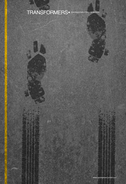
Soumya: I too love most of them, like Transformers.
It is a very clever idea and very well executed.
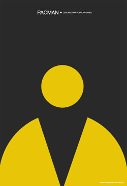
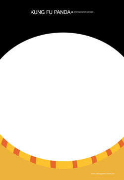
House M.D. was more towards the concept — canes forming the shape of a pill. Kung Fu Panda was just brilliant! But, to pick out one, I am really happy how the Pac-Man poster came out.
Q. Which poster took the maximum time between idea and execution?
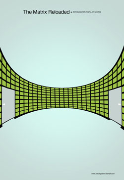
A. Neeraj: The Matrix Reloaded poster.
The idea was simple — The architect’s room. Pulling it off was very difficult.
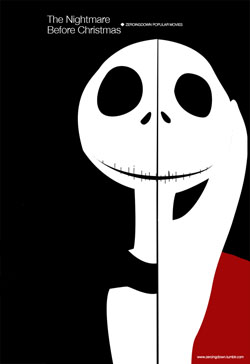
Soumya: For me, it was The Nightmare Before Christmas.
The idea was there since the first time I saw the movie. But for execution, I have to take several screenshots from the movie as a reference for the illustration.
Q. For me, the poster of Inception is very obvious; but the poster for Monsters, Inc. is very clever and subtle. Why is such a drastic change in style?
A. Neeraj: Ah! There, you’ve hit on the key difference between Soumya and my visualization style. His style is more graphic in nature, while I’m illustrative. Most of Soumya’s posters tinker with the idea of the subject. I tinker with the visual. Now you can spend some time guessing which posters are done by whom. 🙂
Q. Are all the posters created by you in software? Have you used any downloaded images from the movie websites?
A. Neeraj: Soumya and my posters contain artwork created entirely by us. A few of our guest contributors have chosen to use photographs for their art.
Soumya: Yes, all of them are digitally executed. We personally make it a point not to use any images for the posters.
Q. What is the font used in the posters? Is there any secret formula to fix the background color of a poster?
A. We use Helvetica Neue font. The background color formula for a poster is a patented secret! 🙂
Q. Do you have plans to extent the minimalistic ideas to areas other than movie posters?
A. Yes, definitely. We had such plans since the beginning. We plan to do posters on popular games, public figures, music bands, designs…
Our Favorite Poster — Kung Fu Panda
Did you see a fat tummy and a pair of low-waist shorts? 🙂
One More Website featuring Minimalistic Movie Posters
Matt Owen maintains a blog ‘BrichHut’ for Minimalistic Movie Posters. Click to visit.


