“I like this green one. I will take it.”
“Good. I am happy to hear that.”
The Work
My friend is getting married next month. After inviting all of us in person, he is planning to send an e-mail three days prior to the event as a reminder. His requirement was simple. He needs a stylish invitation in JPG format to use in the ‘reminder’ e-mail. I agreed to do this for him.
After a couple of days, he gave me more specifications. He sent me a small poem to appear on the invitation. He wanted clutter free and no frill fonts to facilitate easy reading.
Idea!
One fine morning, while I was bathing, the image of the finished invitation dawned in my mind. It was so clear to the very minute detail that I started the work on it immediately. After a few hours, I succeeded in making three variations of the invitation and sent them to my friend. One design had a prominent red tone; the second had a green tone and the third a blue tone.
My friends usually accuse me of using the color ‘Green’ prominently in most of my designs. Nowadays, I consciously try to avoid Green from my designs. That is one of the reasons why this website has a flashy and bright ‘Un-Green’ color! To my surprise, my friend selected the Green version of the invitation!
Design Details
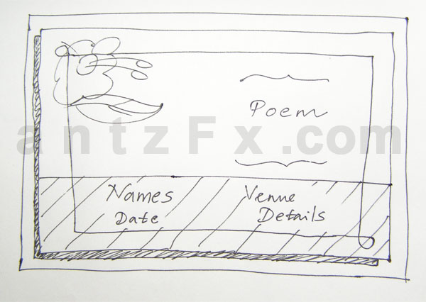
Usually I start a design by drawing the idea on a paper. This case was an exception as everything was shipshape and clear right from the start. But for your advantage, I am giving the line drawing just like the idea appeared first in my mind.
Here is the final version that my friend accepted.

Download this blank template » (JPG, 1024 X 768, 141KB)
You may also want to check this blog entry: ‘10 Free Designs – Wedding Invitation Templates‘
You will notice that there are only a very few changes from the draft drawing. Most noticeable are the change in the position of the poem text and the small tilt of the entire image.
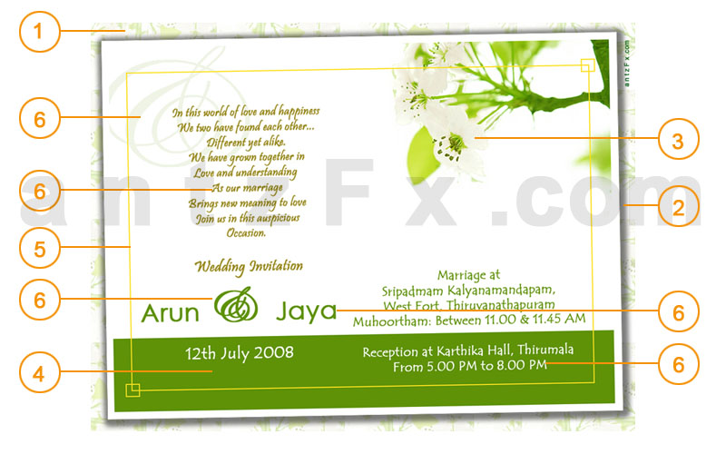
- A base image layer is created by multiplying the flower image. This layer is at 30% opacity.
- The paper edge layer features a ‘Drop shadow’ effect with 50% opacity, angle of light at 120 degrees, distance of 5 pixels, a 50% spread and a size of 20 pixels. The whole image is tilted by an angle of 1 degree in CCW (Counter Clock Wise) direction.
- The white flower image was given a ‘Color Balance’ of +100 Green.
- The Green color used has an RGB value of ‘#5F9207.’
- A yellow border enhanced the overall look and gave a ‘contained’ feel.
- The poem was given a Golden look and the font used is ‘Pristina.’ ‘Century Gothic’ is used for the names. ‘Tempus Sans ITC’ is used for the date and venue details. I really liked the ampersand in ‘Edwardian Script ITC.’ So I gave a bigger ampersand in the background of the poem with 10% opacity.
- The whole design started with a resolution of 72 pixels per inch and had dimensions of 1024 X 768 pixels. The final image is reduced to 800 X 600 pixels with a JPG compression quality of 12.
I hope you find this post useful.
Software: Adobe Photoshop CS2
Design date: 01-June-2008
You may also want to check this blog entry: ‘10 Free Designs – Wedding Invitation Templates‘


The work was excellent and no words to express the flourished greenishness all around….
This was very helpful….
Thank you so much!!! I really use this for my wedding!!!
thanks a lot…..even i was searching of some material of dis kind for my frnd’s wedding…..n i got it right here……[:)]
I like very much.
The work was excellent
I like this one. When are you make one for me 😉
Mohit,
Good to hear that you like our design. Please contact us to make cards of your choice. 🙂