


‘Gubbi’ in Kannada language means ‘House Sparrow.’ Incidentally it is also the name of a place in Karnataka, India. One of my friends contacted me for designing a logo for ‘Gubbi Labs’ – a private research enterprise that works on a host of domains ranging from sustainable ecosystems to livable cities.
Design Brief
The design brief was simple: The logo should look like a house sparrow.
I gave three options for the logo.
The logo given above is an artistic monogram that directly shows an association with knowledge. The logotype is cursive (running writing/joint writing) and looks as if written by hand. This logo is a direct communication of the themes ‘rare knowledge’ and ‘human touch.’
A silhouette of sparrow is used as the logo. The name ‘Gubbi’ appears on the body. The dot of the alphabet ‘i’ is placed such that it also represents the eye of the bird. This logo clearly says that Gubbi = Common house sparrow.
The sparrow is made of three overlapping pieces of brown cellophane sheets. An egg shape can be seen on its body formed by the overlap. This ‘egg’ represents an idea that is going to hatch. The font for ‘Gubbi Labs’ is free flowing without any sharp corners. It appears that the bird is perched on the alphabets ‘bb’ of ‘Gubbi.’ This logo directly communicates the central themes of ‘genesis’ of an idea and ‘futuristic’ solutions.
Refined Concept
We can clearly identify a pelican from its silhouette. But a sparrow does not have a unique shape that clearly tells that it is a sparrow. A silhouette of a sparrow just communicates that it is a bird.

Photo courtesy: Sudhira

So the client asked me to put a one to one mapping of the colors of a sparrow to the logo.
Final Logo
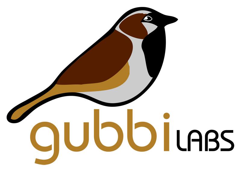
The logo represents a male sparrow perched on the ‘bb’s of ‘Gubbi.’ Bauhaus Medium is the font used in the design.
I really liked the outcome. Any comments? The space below is all yours.
Software: Photoshop, Illustrator
Design Date: 01-Feb-2010

Its Pretty! But I think the sparrow could be simplified and so the fonts. Bauhas is a age old font. Anything from the non-serif like the Helveticas or Univers would have still worked
Very nice evolution of thought as well.
Personally, I liked your choice of font. Lovely the colour combo too. Initially, I too thought the bird could be simplified. So I zoomed out my screen to 20% – and guess which bird clearly looked like a sparrow even in that size? Yes, the last one.
But that said, I somehow feel you could trim a micron or two from the bird… Doesn’t its silhouette look a liiiittle too plump?
But really, good stuff.
nice thought, the font has added to the beauty of the sparrow. i think the sparrow can be made to look more natural.