As a designer, how do you take design criticism? Many years ago, while I was a student of design, I came across this enlightening article by Andrew Follett about how to respond effectively to design criticism. The same ethos drives me even today — let me share one of my own experiences.
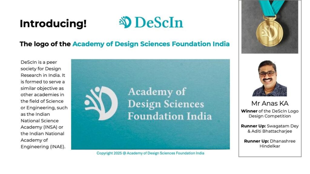
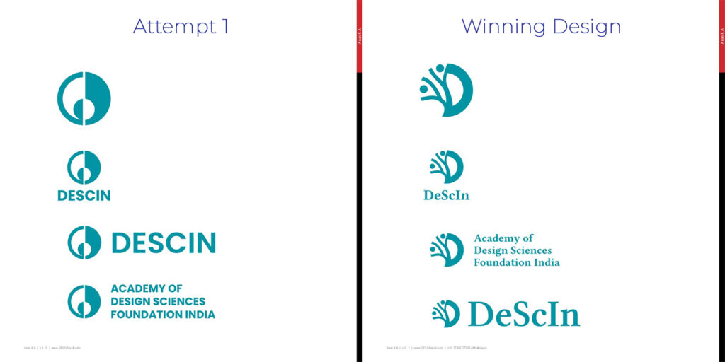
The newly formed Academy of Design Sciences Foundation India (DeScIn) announced a logo design competition. I submitted a design and became one of the four finalists. You can read the story of my first attempt at the DeScIn logo design here. I gave an online presentation to a panel of judges on 31 July 2025. I received valuable feedback. I was then asked to submit another version of the logo addressing the comments from the judging panel.
Judges’ Comments
Following are some of the comments I received during the presentation.
- “Science” aspect is not clear
- “Design” aspect is not clear
- Lack of ‘Indian-ness’
- Similarity with yin and yang
- Similarity with the old logo of International Center of Photography
- Similarity with the old CPDM logo (emergent P on the right and smaller D on the left)
- “DeScIn” needs to be written exactly like that
My New Version of the DeScIn Logo
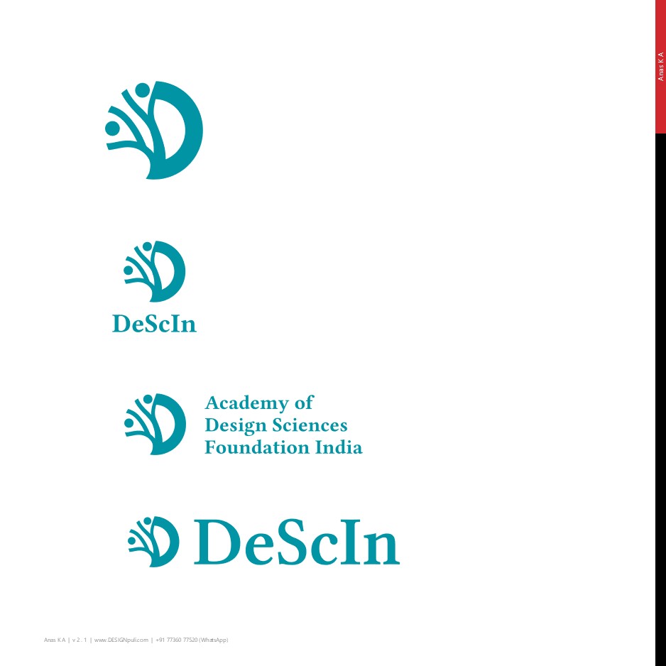
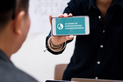
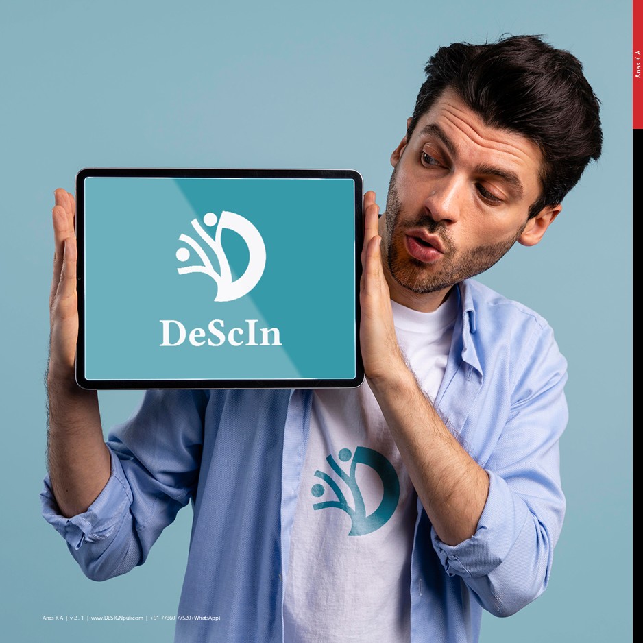
The DeScIn logo now features organic shapes with a simple, minimalist layout. It instantly conveys a human-centered motif. This communicates that the institution or organization values people — whether that’s learners, researchers, or the broader community.
Inspiration and Logo Logic
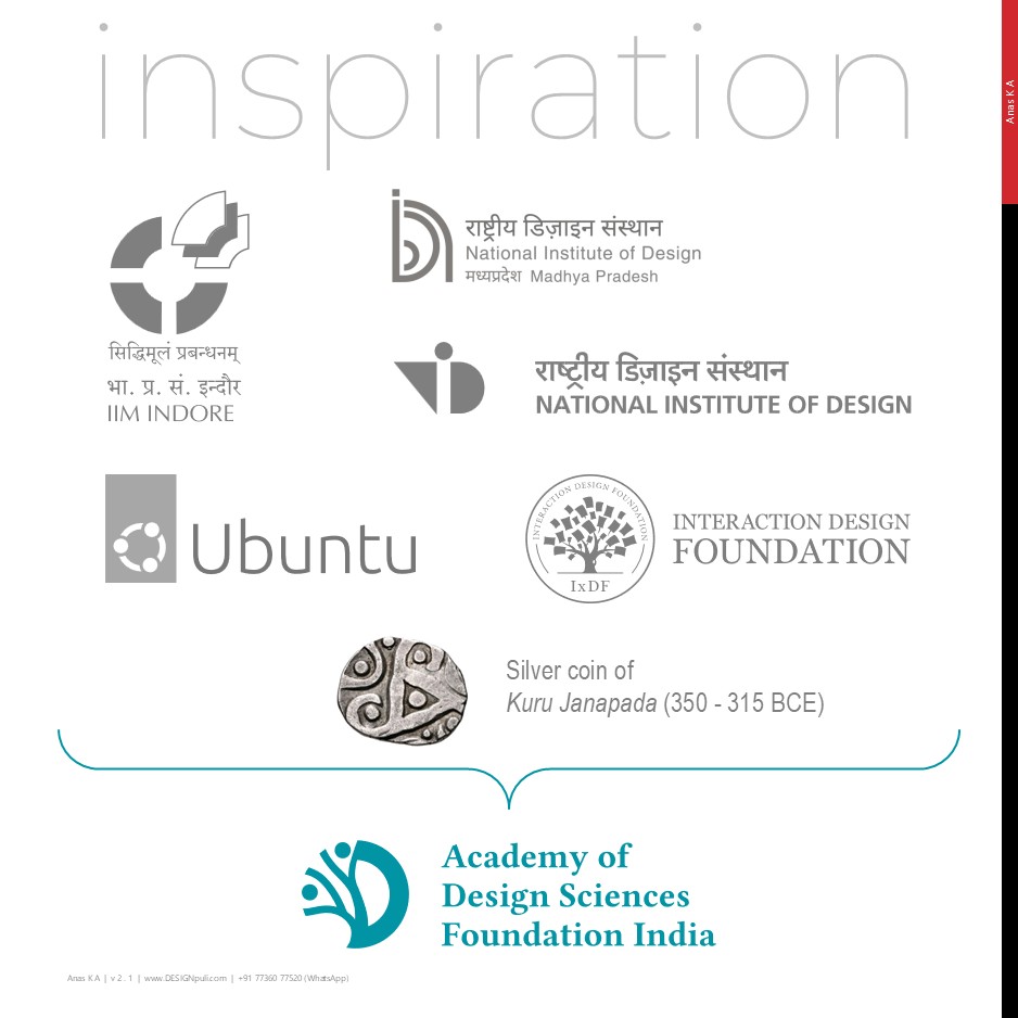
I looked at iconic logos of top Indian educational institutions, many of which are built using basic shapes. The humanity angle draws from the Ubuntu logo. The ‘tree of knowledge’ idea is inspired by the Interaction Design Foundation logo. The silver coin of Kuru Janapada (Delhi, 350 – 315 BCE) has some distinct design elements that helped reinforce the ‘Indian-ness’ I was aiming for.
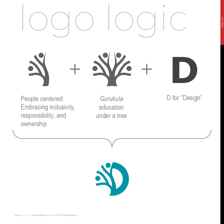
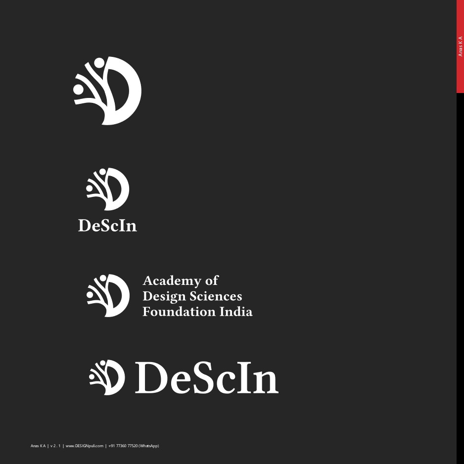
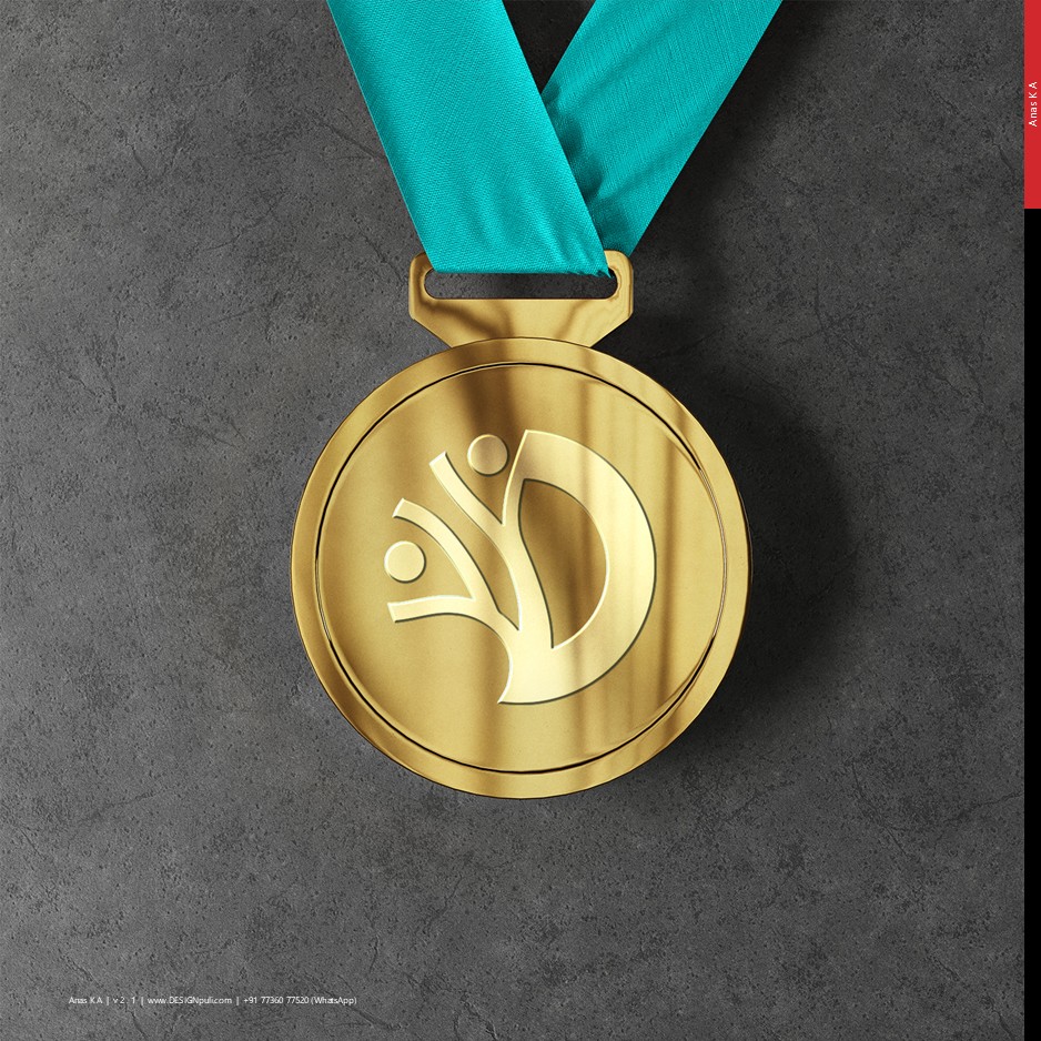
The DeScIn logo shows a human form embracing the principles of inclusivity, responsibility, and ownership. A ‘tree of knowledge’ represents the Gurukula system of education in India. The right half of the logo resembles a stylized ‘D’ for ‘Design.’
Logo and Logotype
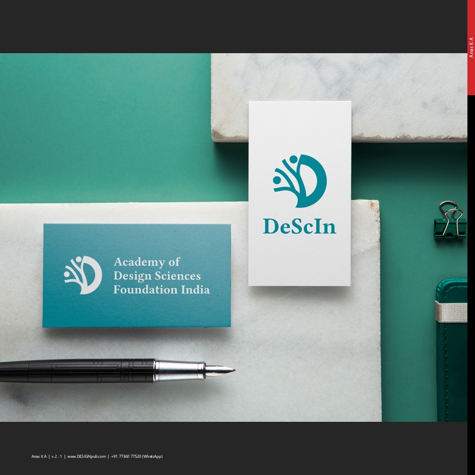
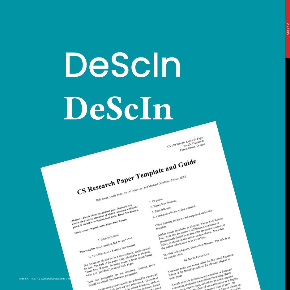
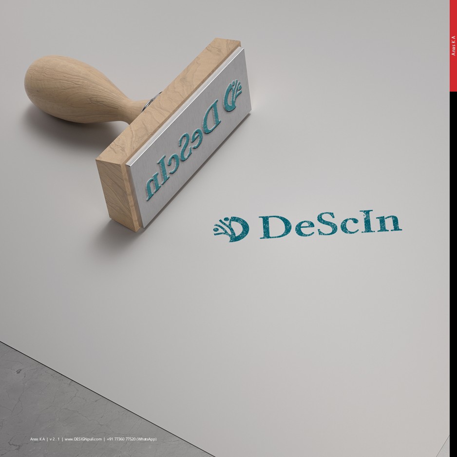
I created both linear and stacked lockup versions for flexible use across websites, social media, and merchandise. ‘DeScIn’ in the stacked version and ‘Academy of Design Sciences Foundation India’ are written using Libertinus Serif in bold weight. ‘DeScIn’ in the linear version has semi-bold weight.
A serif typeface is selected because it aligns with the style used in global research publications.
The primary color is Teal with a hex code of #0194a4. Teal combines the calming properties of blue with the renewal qualities of green. It represents open communication and clarity of thought. Teal’s unique hue stands out against both light and dark backgrounds, making it useful in design for guiding users and creating focal points.
Monochrome and Mixed Media Applications
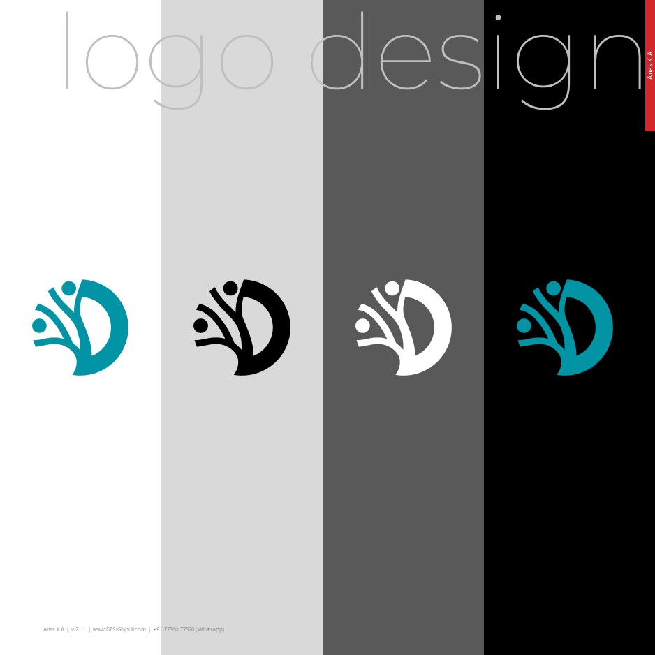
The logo works well in monochrome and also in different sizes.
The logo will also work well on mixed media with gold or silver accents.
The DeScIn logo successfully blends minimalist design with a meaningful, human-centered message, embodying the institution’s values. As DeScIn continues to shape the future of design research in India, I’m confident that its thoughtfully crafted logo will serve as a beacon for its vision and ideals.
UPDATE 27-SEP-2025
I’m declared as the winner of DeScIn Academy Logo Competition! Thank you! 🙂