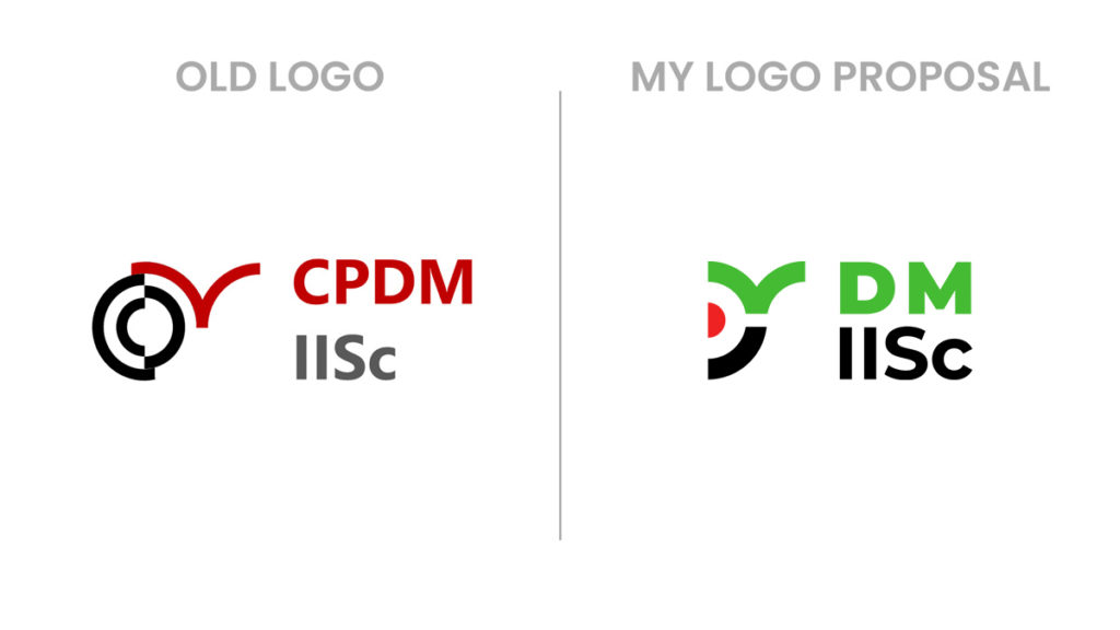
“Professor, who designed our design department logo?”
“Well, it was Neeraj Pal who designed our logo in the year 2000. He did a very good job!”
I had this conversation with Prof. B Gurumoorthy some 15 years ago (2008). I was a new student then at Centre for Product Design and Manufacturing (CPDM), IISc Bangalore. In my widest dreams, I never imagined that I will get a chance to redesign the iconic logo!
This month (January 2024), the department officially changed its name from ‘Centre for Product Design and Manufacturing’ (CPDM) to ‘Department of Design and Manufacturing’ (DM). A logo design contest was announced for the students and alumni by the department and I jumped at the opportunity!
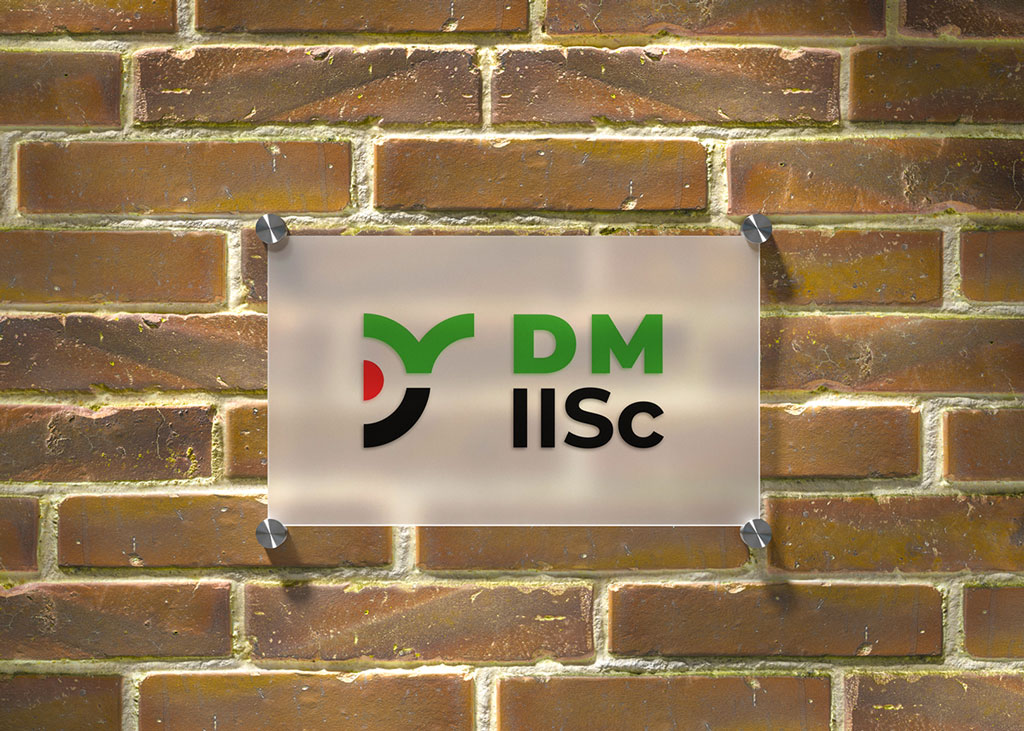
My Logo Design Submission
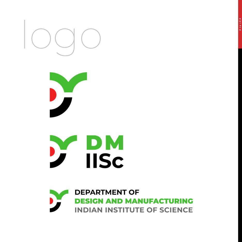
The DM logo is bold, minimalist and is inspired by the CPDM logo that lasted 25 years!
Logo Animation Video
This animation video shows the transformation of the old CPDM logo to a new bolder DM logo. This video is created in Microsoft PowerPoint employing slide transitions like ‘Morph’ and object animations.
My Logo Design Process
Just like most of the real-life design projects, the competition had a very tight deadline! 😅 Fortunately, I was able to come up with a very good idea in a short time. Now let’s see how the DM logo came into fruition.
Logo Design Brief
The logo should reflect the DM vision of “excellence in design and manufacturing for a sustainable future”. The logo should ideally connect with the CPDM old logo and branding. It is recommended that the old logo colors be used, with the addition of a third color, ideally associated with sustainability. However, the color palette is only a recommendation, and we are open to new color palettes if there is a good justification and association with the DM vision. In addition to the color palette, a choice of suitable font and typography is expected.
– DM Logo Competition Requirements
Research and Ideation
Some of the famous design schools in the world are using logos with very bold strokes and logotypes with heavy weights. MIT MAD, Pratt Institute, Carnegie Mellon School of Design… are examples.
I started doodling digitally and played around the ‘D’ and ‘M’ alphabets. A couple of these ideas had the potential of becoming unique identities.
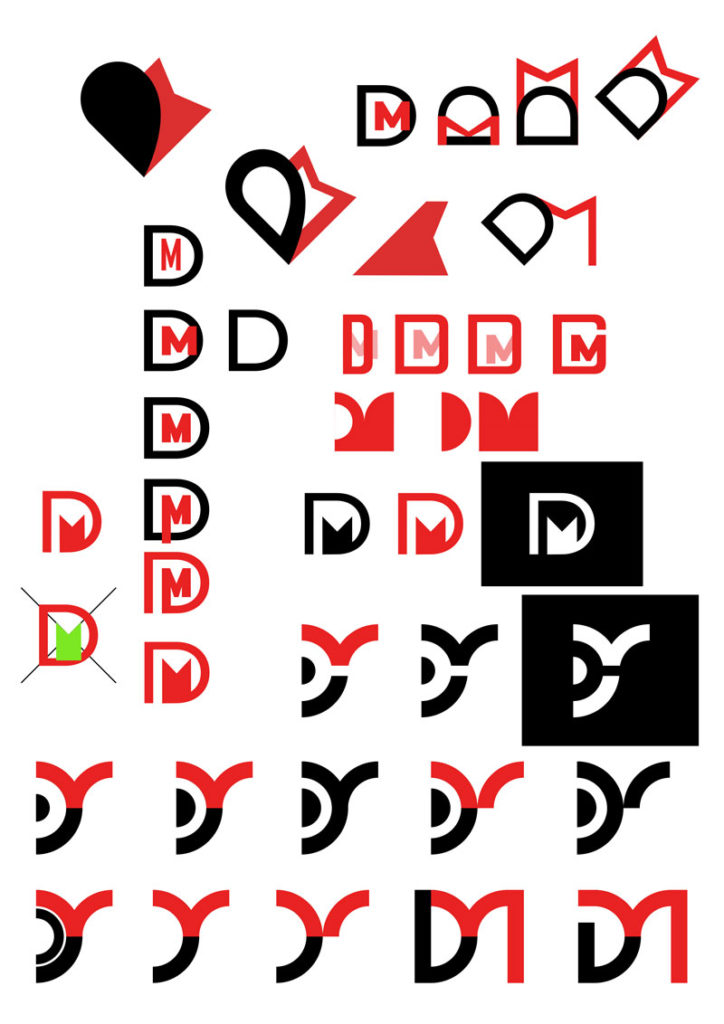
In this stage, I was not much worried about the colors of the logo — hence the above doodles are in black and red colors similar to the original CPDM logo. After a ‘highly unscientific user testing’ with my family members and a few friends, I soon arrived at the present ‘eye of imagination’ concept.
Logo Inspirations
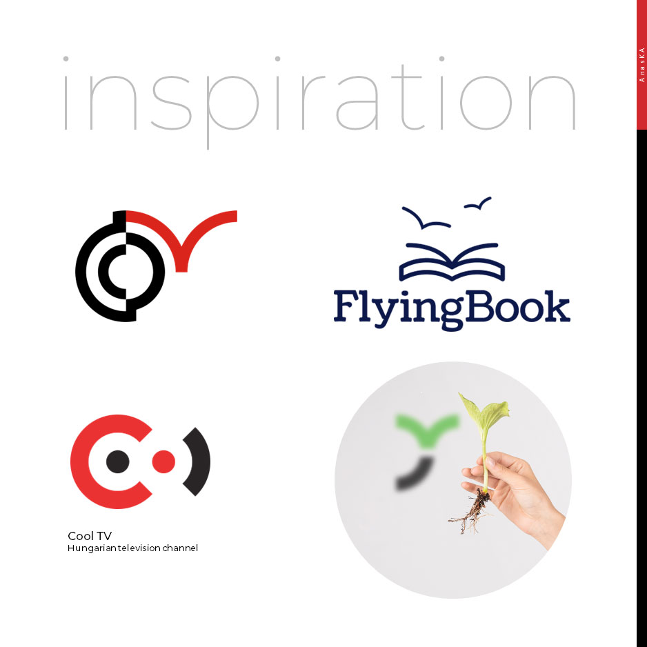
- As stated earlier, the old CPDM logo is a huge inspiration.
- The ‘FlyingBook’ logo, showing pages of a book morphing into imagination taking flight, influenced me and the alphabet ‘M’ in my logo is a nod to this.
- An old logo of ‘Cool TV,’ a Hungarian television channel convinced me to use the negative space as the alphabet ‘D.’
- From a sustainability angle, one of the inspirations were a young plant or sapling with a couple of new green leaves.
Logo Logic
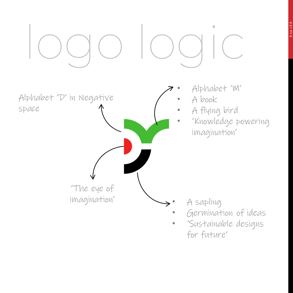
- The alphabet ‘D’ is residing mysteriously in the negative space.
- The alphabet ‘M’ resembles an open book or an idea taking flight. It represents ‘knowledge powering imagination.’
- My logo is also an abstract representation of ‘germination of ideas!’ Did you notice the two young green leaves in the logo? ‘Sustainable designs for the future’ is the underlying message.
- The DM logo has a red focal point which is ‘the eye of imagination.’
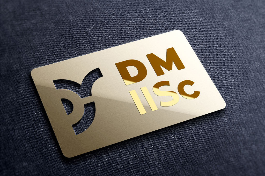
The logo can be laser cut on a metal sheet and it will keep its integrity intact!
Color and Typeface
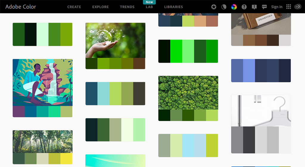
A quick search of the word ‘Sustainability’ on the Adobe Color website resulted in a greener, cooler color palette. To ensure a good contrast on both light and dark backgrounds, a green hue of hex code #44bb33 is selected for the logo.
In my submission for the competition, the logo had only two colors — green and black. The red, half-circle focal point on the current logo was of black color then. During the initial review of my logo by the judging panel, there was a unanimous request to incorporate the red color as well. This will help the new logo to show the lineage of the old logo. So I reworked the logo and now it features all the three colors– red, green and black. The red ‘eye of imagination’ has the hex color code of #ee2222.
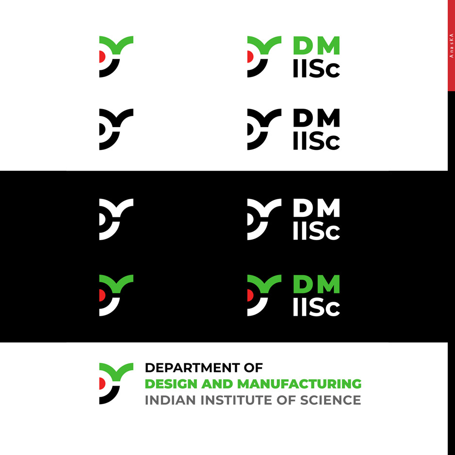
The linear version of the logo with full logotype has the words ‘Indian Institute of Science’ written in a grey color of hex code #666666.
The typeface ‘Montserrat‘ is used with both ‘Black’ and ‘Bold’ weights for the logotype. This works best on digital interfaces as well as on print medium.

DM monogram showing the logo and the text ‘DM IISc’ can be used where space is a constraint. The DM full logotype is the linear version that shows the full name of the department.

The primary color is green and we also have a light version of the green color to be used as a watermark. The hex code of this light green is #cceecc. In website and app designs, the red color can be used for primary action buttons or ‘call to action’ buttons.
Logo Application on Mockups
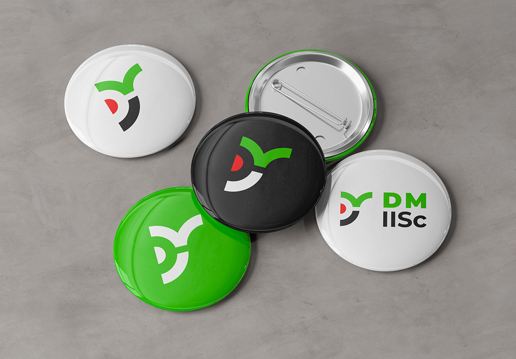
One way to communicate the relevance of the logo is through mock-ups showing real-world applications.


UPDATE 14-Feb-2024
I’m very happy to inform you that my logo won the design competition organized by the Department of Design and Manufacturing! I’m eager to see my creation appearing on signage, websites, mobile apps, and marketing collateral.
I am deeply honored and humbled by the overwhelming love and support extended to me by my teachers, friends, family, and well-wishers…
🙂
Bonus — Alumni Stickers
If you are looking for ‘IISc Alumni,’ ‘CPDM Alumni’ and ‘DM Alumni’ stickers, look no further! Visit this blog post, download the print-ready file and take print-outs on any sticker paper of your choice. Peace!
Resources used in this design
- Acrylic sign mock-up design: Freepik
- Badge pin button isolated on white mockup by sebdeck: Freepik
- Elegant branding stationery set psd mockup by nurfdesigns: Freepik
- Hall screen backdrop mockup by 21studio: Freepik
- luxury golden metal cutout logo mockup by intentfx: Freepik
- Mockup event promo by berlionemore_contributor: Freepik
- Tablet screen with smartphone 14 pro mockup by Akmal Studio: Freepik
- Chic and modern management tool website template by Godelesign: Freepik
- Music– Epic Confident Logo by Ivan_Luzan: Pixabay
- Music– Fashion Intro by Ivan_Luzan: Pixabay

2 Responses
[…] winning the logo design competition by erstwhile Centre for Product Design and Manufacturing (now, Department of Design and Manufacturing), Indian Institute of Science, Bangalore. This was a good opportunity for me to look back at my own […]
[…] with the old CPDM logo (emergent P on the right and smaller D on the […]