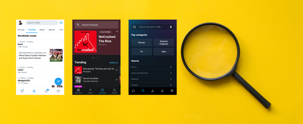
“The UI should be intuitive” is the topmost item in the requirement brief from clients for a mobile app design.
Intuitive [in-too-i-tiv, -tyoo-] (adjective):
Easy to understand or operate without explicit instruction.
– Dictionary.com
So, ‘Intuitive’ means ‘no surprises,’ right?
It is difficult to bring novel interactive elements or ‘pleasant surprises’ or ‘Wow! factors’ in a completely intuitive UI.
What can we do to have the best of both worlds?
Tappable and Non-Tappable Elements
One of the main factors that affect the intuitiveness of an app is how tappable and non-tappable elements are distinguished by design.
In the web world, the moment we see a blue coloured text with an underline, we understand that it is a hyper-link. This happens from our experience with this type of representation style for many years. The cursor changes to a ‘hand’ icon while hovering the hyper-link — another indication that supports our earlier understanding.
On clicking, we expect to be redirected to a new page. Or, we expect a new page to appear in another tab of the browser.
Whenever we see such a visual representation elsewhere, we know that the functionality is going to be the same.
There! I just explained the complex terms of ‘Affordability,’ ‘Expectation‘ and ‘Consistency‘ for you!
If you tried to click on the “link” above, nothing is going to happen — it breaks your experience. Because, ‘Affordability’ is there, but ‘Expectation’ is absent. What will you do if one more blue, underlined text appears? If you learned from the earlier specimen that “all that glitters is not gold,” you are right! I gave you a ‘Consistently’ behaving UI element where hyperlink is not enabled even though the appearance suggests otherwise.
Actionable or Indicative Icon?
In mobile apps, how can we distinguish between a tappable action icon and an indicator icon?
Always give different visual treatment to icons that are tappable and icons that are used to indicate something — non-tappable. Play around with color, size and placement of such icons. Once a system is in place, follow the same throughout your mobile app.
Actionable Text or Body Copy?
iOS Apps clearly distinguish between tappable and non-tappable text by giving a uniform color coding for the tappable text. This can be seen in all Apple apps like Messages, Calendar, Notes, Reminders…
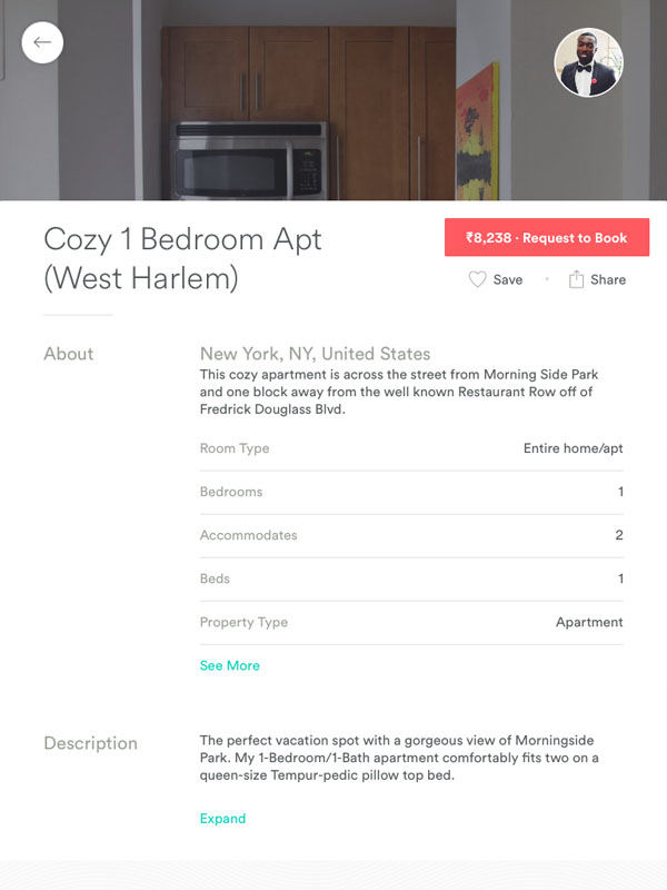
Image Tile or Header Image?
Tap is not enabled on a header image. Usually, the header image appears on top of a page and is of 100% screen width. A tile, on the other hand, is tappable and smaller. Depending on the screen real estate, the tiles are beautifully arranged in columns.
What about a ‘featured’ tile? Featured tile usually appears on the top of a page and can be of 100% screen width. How can we convey to the user that it is tappable?

The solution is to place go-to-action elements (buttons or text) on the tile to indicate that a tap is enabled and it is not a header image.
Discoverability of UI Functions
Everything is new. At least everything is new the first time around.
– Diana Vreeland
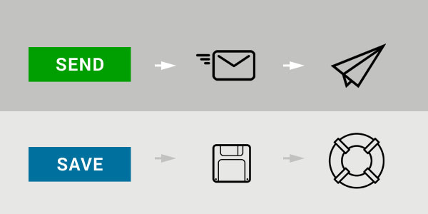
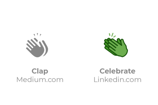
Paper plane icon is now widely considered as the ‘Send’ icon. When it was first introduced, I’m sure that people were perplexed: “What is this paper plane? How is it connected to emails?”
In many applications, the ‘Save’ icon is an extinct floppy disk. A life buoy icon can save the day as ‘Save.’
Once users understand or discover the meaning of a new UI element, it will become ‘intuitive’ the next time onwards.
Now the question is, ‘How to convey the function or meaning of a UI element to a user the first time itself?’
Hand holding for the rescue
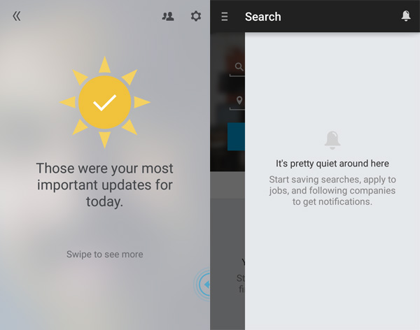
During the first run of the app, try to provide a short walk-through of new functions and interactions to the unsuspecting users. Some apps provide a paginated walk-through with images and animations. Coach marks provide contextual help about a single function as an overlay on the actual screen.
Gmail app displays the inbox messages as a list-view. If you swipe one item to the left or right, that message gets archived. All of us are familiar with this functionality since the app appeared in our devices ‘long ago.’
But when Google introduced the Inbox app, the swipe on an element in the list-view results in new behaviors. This time, right and left swipes trigger different functionality. Inbox app provides a walk-through and coach mark to hand hold the user through the new functions.
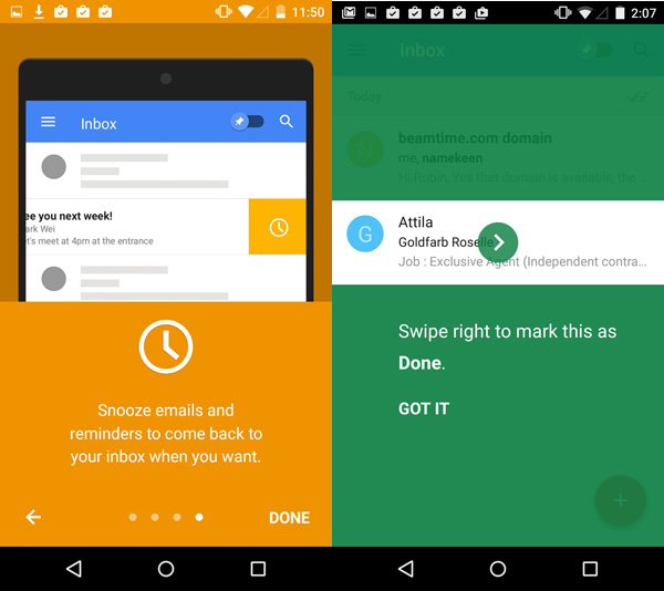
The users understand the new interactions during the first run of the app. The next time onwards, these new interactions begin to be ‘intuitive!’
TL;DR: Conclusion
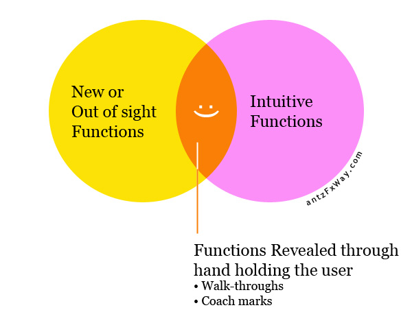
‘Wow! factors’ are pleasant surprises. But ‘intuitive UI’ means no surprises to the user. Are they the two sides of the same coin?
Never forget to hand hold the user through new functions using walk-through and coach marks during the first run. This will help to convert the ‘wow! factors’ to intuitive functions the second time onwards. And, the users stay happy!
Comments? Let us discuss below.


