As a UX designer, I have been told umpteen times by clients or stakeholders to add some ‘Wow! factors’ in the design. There is nothing wrong in this request. But if you ask them to define this ‘Wow! factors,’ probably you will get some fumbling or vague answers. Or, they will mention the name of a recent eye candy app followed by the question, “Why don’t you design our app like that?”
If you identify with my situation, let us try to decode the ‘Wow! Factors’ and publish the results for the greater good of all app designers!
Wow [wou] (noun):
Excitement, interest, great pleasure, or the like
– Dictionary.com
Form Follows Function
Imagine that we have a beautiful and expensive pen. But if it doesn’t write well, probably we will abandon it and go for an ordinary pen that suits our purpose. Since a fancy eye catching design cannot help an ineffective product, always think about designing an experience that pleasantly surprises the user by helping him to achieve the intended task faster and efficiently.
Three Components of ‘Wow! Factor’

Three components constitute the ‘Wow! factor.’ Let’s discuss them in detail with examples.
Static ‘Wow! Factors’ in a Mobile App
Users lay their eyes first on the static ‘Wow! factors’ when they start using an app. A word of caution: If you are supposed to follow the branding guidelines of a client, then your freedom is somewhat limited for achieving the static ‘Wow! factors.’
- Color: A unique color scheme will attract the user’s attention.
 ‘Nike Making‘ app has a unique color theme for each category. This color theme is followed throughout all the drill-down pages of the respective category.
 - Typography: The tag cloud in ‘Reverb‘ app is a bold step in the right direction.
 Who can forget such a unique implementation of the ubiquitous, boring tag cloud?
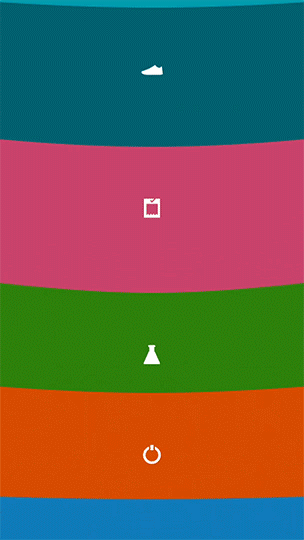
 - Iconography: The meticulously designed icons for various categories in the ‘Epicurious‘ app will prompt the users to browse all of them. See the screenshot on the left.
 On the right side, we have the trophy icons in ‘Dots‘ app. They are doodles on top of a colored dot! These icons bring a smile to the user.
Dynamic ‘Wow! Factors’ in a Mobile App
Dynamic ‘Wow! factors’ depend heavily on the concept from the UX/Visual designer executed well by the programmer.
- Animation: Animations are used in apps for three contexts.


(A) When a user interacts with the elements on a page, like a button or an icon, feedback is given to the user in the form of animation.
I’m sure that all of you have noticed the standard Android animation when you tap on a ‘hamburger menu’ icon.
The menu icon animates to a ‘back’ icon in a seamless way.
(B) Animations can also denote ongoing processes. “Loading…” icons in ‘Airbnb‘ app is one example.
When ‘Shazam‘ app is in the listening mode, the elements around its logo will animate according to the incoming sound level.
Concept by Oleg Turbaba. Refer ‘Shazam‘ app for the actual animation.
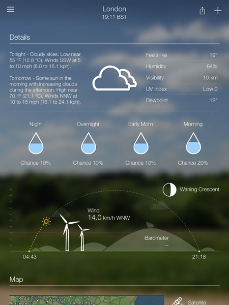
(C) In some apps, animations are added to a static page to spice it up. Let us look at the famous ‘Yahoo! Weather App.’The precipitation level and waning crescent icons are animated based on the page scrolling position. The current position of the sun is animated from the sunrise position on the left. The turbine blades and the subtle cloud icons are also animated depending on the wind speed reading. Amazing!
- Transition: An app can have multiple pages or views. When the user interacts with the app, depending on the workflow, he is taken from one page to the other. The transition effects from one page to the next helps the user to get a sense of direction and the current context of his reach.
The ‘Nike Making‘ app mentioned earlier is an example. Another example is ‘Yummly‘ app.
Notice how the seamless transitions help to improve the user experience of the app.
Functional ‘Wow! Factors’ in a Mobile App
This is where a UX designer can score to improve the user experience of the app. The functional ‘Wow! factors’ are more important than the static and dynamic factors because they create a memorable and pleasurable experience for the user. “Form follows function,” remember?
- Simplified Workflow: Reducing the number of steps of a user journey to achieve a desired functionality will generate a lasting impression in the app user’s mind.
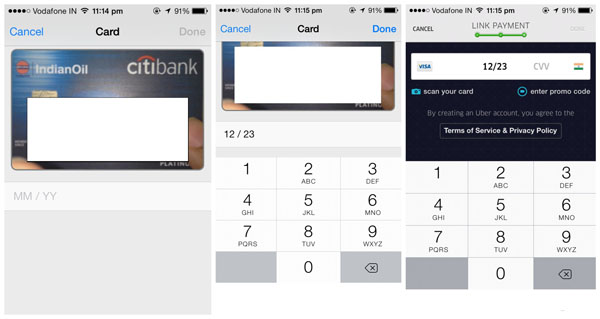
Making a payment using credit card is a pain in mobile phone apps. Entering a 16 digit card number using the native keypad on a mobile phone is always prone to errors. ‘Uber‘ app simplified this number entry process by scanning the credit card using the mobile phone camera.
The ‘Optical Character Recognition’ (OCR) does the trick here. The user saves time and errors are minimized.
- ‘Out of the Box’ Workflow: Instead of simplifying an existing workflow, can we introduce something which no one else has ever thought of? If yes, this will become a USP for the app and users will happily embrace it for the unique experience.
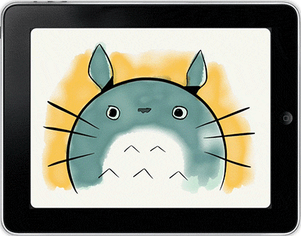

‘Paper by Fifty Three‘ is a popular iPad app for drawing. It uses a “Rewind™” gesture for undo. Place two fingers on the screen and move them in a counter-clockwise circle to do undo.
It is obvious that a clockwise circle gesture will execute the redo action step-by-step.
The shading gesture in ‘Peek Calendar‘ app is another example of this ‘out of the box’ workflow.
Cover the top part of phone like you’re shading it from the sun, and the time quickly fades into view. Hats off to the genius who invented this!
Conclusion
Static and dynamic ‘Wow! factors’ are bells and whistles that can attract a user to the app instantly. But to retain their attention and to make their life easier, we need to tick the column of functional ‘Wow! factors’ in our design.
What do you think about our finding? Would you like to add anything more to this? Kindly drop your thoughts below. Thank you for reading this far.


Well written article, i have come across this wow factor from clients several times, this made the whole thing simplified.
Ha! Good to know this. Do share your experience on matters like this.
This article gives me a very clear picture of ‘wow factor’ in wow way.
Keep writing articles like this.
Thanks for the encouragement. Watch this blog every weekend!