Guest Author Pankaj Upadhyay is a Product Designer from IISc Bangalore. He is also a talented character designer. Thanks to Pankaj for contributing this article. Pankaj is available in Twitter as @PankajDesign |
Let me first start off by thanking antzFx for giving me the honour of being a guest writer at their blog. The blog has been an excellent read and I’ll keep following it till the end of internet. If you are reading this then I suggest that you bookmark this blog, because it will be a gem in your design information arsenal.
When the ‘ant people’ (a.k.a antzFx) approached me for this post, they gave me full freedom to choose my own topic. I chose character design because I am as passionate a character designer as I am a product designer.
The web however, is full of stuff that will teach you how to paint and present an awesome looking piece; these are tutorials that will tell you more on how to work on Photoshop rather than the character design itself. Another thing that always seems to lack is the context. So, here’s what I’ll try to do: I’ll present some steps that I follow, and talk about the workflow of character design. That way we leave enough room for me to write more stuff on the topic, if this post gets the hits. Maybe then the ‘ant people’ will give me some money for all this 🙂
Step 1, Establish a context
By context I actually mean the story of the character. By nature, a story will always have a hero and a villain. Rarely the villain is the hero or vice versa. The main story should reflect on this character. This is true even for the characters that are designed as mascots and logos. A character will always have a story associated with him and the main story will always reflect on him.
Here’s an example:
“The story happens sometime in the future, after the 3rd world war has ravaged the world. Our hero has fought for the losing side, but was known to the enemy as the most worthy opponent and the fiercest warrior. Before the end of the war he was captured by the enemy and tortured. During the time he was in prison he found his long lost faith in god. His faith kept him alive until the enemy declared him dead and used him for a bionic experimentation for creating an elite soldier. All his memory was erased and he was put on a coma. 10 years after the fateful experiment and the end of the war he woke up with no clue as to who he was, or where he was from. He’s sent on a black ops pilot mission to his own country. In the mission he somehow discovered his true identity. Now the people who created this elite soldier have to endure his wrath because there’s only one thing on his mind – Revenge”
Step2, Reflect the story onto the character
Reflect the story onto the character, easy peasey.
Well ain’t I being a smug… what I said there is actually easier said than done. How exactly does the story or the past/present/future of the character reflect on him? I found a good workaround for this in a morphological chart. The name sounds gut wrenching but what it’s in essence is just a Microsoft Excel Sheet. ^_^
Here’s how to do it, write down keywords and attributes form the story that may reflect onto the character. Make this the 1st column. Now in the rows write down the physical characteristics that may reflect this. This can be as elaborate as you want it to be.
E.g:


Step 3, Thumbnails, thumbnails, thumbnails
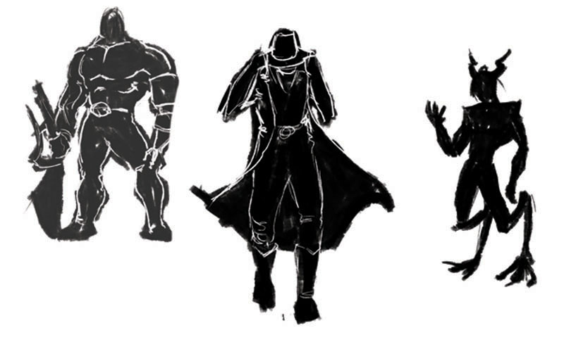
This step is the most fun, sit down on the table with pencils, markers, water colour, India ink and most importantly paper. You can use digital media as well.
Remember the excel sheet we just created? Well forget it. By the time you made that you have already subconsciously decided the look of the character. Now, start putting the guy on paper. When you think you are out of juice, search the keywords on the internet and make some more thumbnails. Stop when you think that your head is going to explode, after all, no character is worth blowing your head off right? WRONG, make some more thumbnails. Stop when your head explodes.
Here are some of the worst ones that I made; I am not showing you the better ones because sometime later, maybe one of those will end up becoming another cool character. Remember, your thumbnails are probably one of your most valuable resources. Try your best not to give them away 😉
Step 4, making the final look
For this you would need the internet and if you choose you can switch to the digital media.
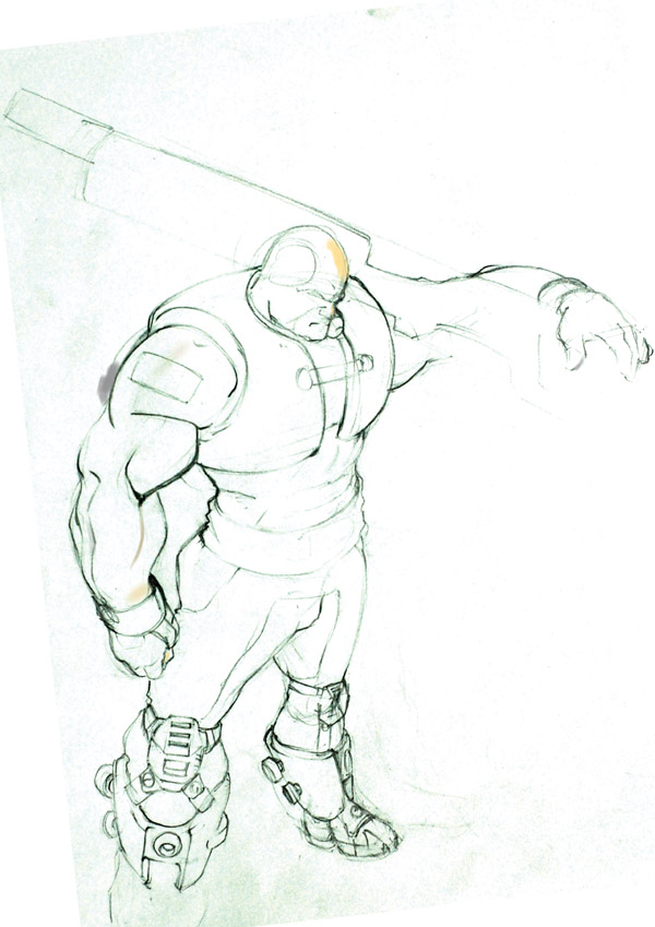
Select a thumbnail or a set that has impressed you the most. Now start making a neat line art from the ideas in the thumbnails. Put in features and accessories that may go with the character. For the character we are discussing, I chose a hefty body type with a huge gun. I generally start with pencil and paper and use that drawing for my line art in Photoshop. My pencil sketch seldom has all the necessary details. Here’s what my sketch looked like:
Step 4.1, Filling in the colours and Stuff
If we want then this subtopic itself can be elaborated and made into another tutorial, which would actually be a good successor to this post *wink wink*. But if you don’t want to wait for another post or something like that, you could check out some of the tutorials available on the internet, you’ll find plenty.
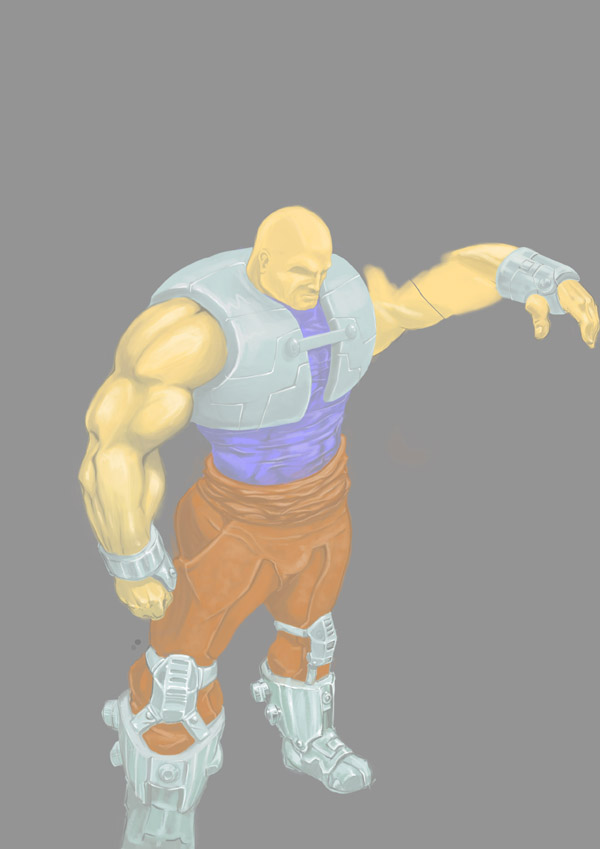
Ok so next what I did was chose a colour scheme for the character. I wanted him to be a more like a comic book hero so I chose colours that would pop out, red and blue (+shades) looked cool as well as American :). I tried to stay true to my pencil sketch as much as possible. Here’s what I got:
The colours were not as bright as I expected them to be, but this will do for now. There are enough Photoshop tricks to rectify it. The thing to note here is that the difference in tonal values of the colours is good and giving the desired effect of cloth, metal etc.
Step 4.2, Giving the character a ‘character’
This is the step that will bring our hero closer to the story. Remember the Excel sheet that you forgot? Well now you can choose the accessories that will go with the character.
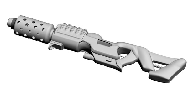
First comes the gun: I made some basic thumbnails for the gun, and chose a futuristic heavy weapon for the character. The problem however is getting the perspective right for such a device. Here’s when your knowledge of a 3D package will come in handy. I made a basic model in 3D studio max and rendered it with the default material with a whitish colour. This step is actually not as difficult as it sounds. You model does not need to be accurate in terms of modelling; after all you’re not going to animate it. Just make sure it looks good from the angle you want.
Colour correction: Believe it or not it was all done just by adjusting the curves in Photoshop. (Image->adjustments->curves or Ctrl+M).
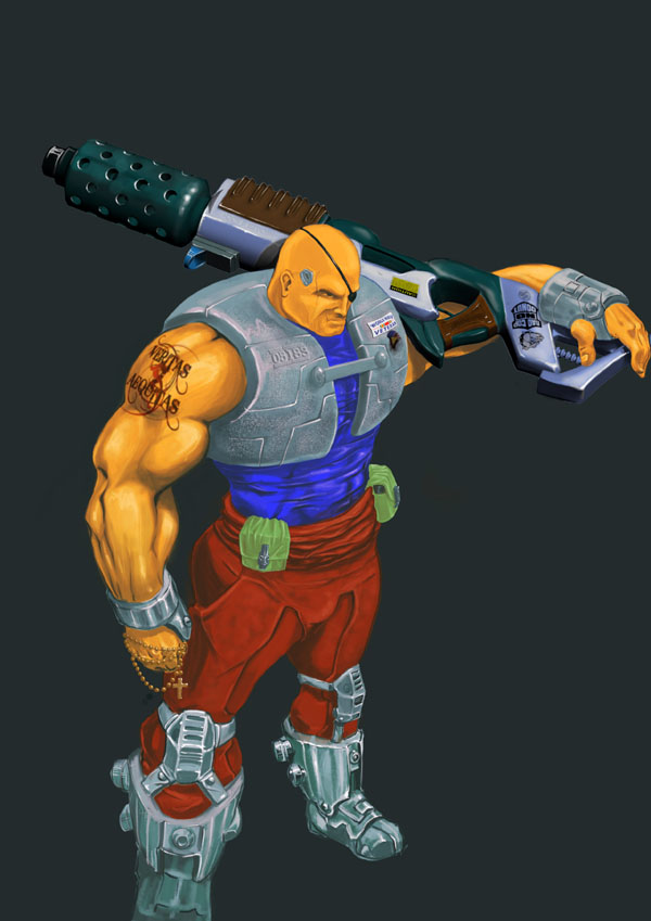
Painting the Gun, Ammo box, eye patch, rosary, Usb connector etc.: This is relatively easy because you don’t have to worry about the perspective of the Gun. With the colours finalized I painted in the accessories that would go with the character. The decals are one of the most fun things to put in, choose things that are cool and pertain to the character. Here for example, a tattoo that may suggest something about his nature (this is a free image from photo bucket by gorerotted666, thanks a lot to him). After all that the character was done and this is what I got:
Step 5, making the presentation and Finishing off
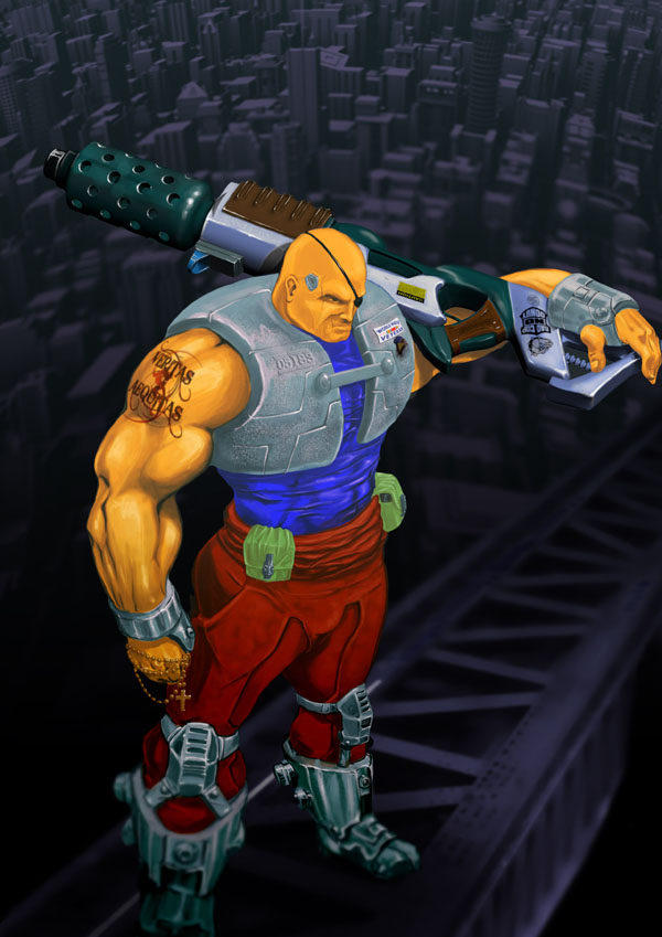
Placing the character in the right environment will give a sense of realism to the character. Right now our hero is just a guy standing with a big a** gun. The rest of the story can be depicted as a well thought of environment. I wasn’t really sure what I’d want for this particular piece, so I sought help of my friends and I liked one particular suggestion very much. Our hero could be standing at a high altitude on some construction equipment above a city like Manhattan. So I looked around and found pictures form the angle that I wanted. I had to do some cut paste, erase, clone stamp, liquefy and colour correction to a couple of pictures to get a single background. After placing the character onto the background it is just a matter of small tweaks to merge our hero correctly. Here’s what I had in the end:
I added some text on top of the piece just to have an interesting picture. You can choose not to do anything like that, for me I somehow loved the name ‘MADDOG’; it’s got a mean ring to it, so here’s what I ended up with:
Epilogue
The idea that I was trying drive home in this post was about the workflow that I take and some simple tips and tricks for my readers, I hope I have been successful in that. Of course, I don’t, in anyway consider myself an expert in character design. I am still in the process of learning, but I think I have taught myself just enough to talk about how I do things. So if you have read this post and liked it (or disliked it), please leave your comments. Please feel free to critique the tutorial, the artwork and the writing. It will help me in so many ways. Once again I thank the ‘ant people’ for giving me the honour; I’d also like to thank the academy, my mother and father and…
Have a good time folks, hope to see you again.
acter in the right environment will give a sense of realism to the character. Right now our hero is just a guy standing with a big a** gun. The rest of the story can be depicted as a well thought of environment. I wasn’t really sure what I’d want for this particular piece, so I sought help of my friends and I liked one particular suggestion very much. Our hero could be standing at a high altitude on some construction equipment above a city like Manhattan. So I looked around and found pictures form the angle that I wanted. I had to do some cut paste, erase, clone stamp, liquefy and colour correction to a couple of pictures to get a single background. After placing the character onto the background it is just a matter of small tweaks to merge our hero correctly. Here’s what I had in the end:





1 Response
[…] of this blog in style. First time ever, we have roped in two guest authors to write about Character Designing and Product Photography. First time ever, we are posting four blog entries on a single […]