Have you ever designed anything for designers? Recently I got a chance to design a placement brochure for our batch of Product Design Students of CPDM, Indian Institute of Science, Bangalore.
Click here to download the CPDM Placement Brochure 2010 (PDF, 426KB) »
The task was challenging, as design is highly subjective. Everybody had ideas on how the brochure should look like and selling my idea to them was difficult. It was a great learning experience because some observations made by my design friends helped me to see areas that I overlooked.
Here are the design decisions I made while designing this brochure.
Requirements
Following are the requirements I fixed for the brochure.
- The look and feel of the brochure should be formal. Because it will be sent to corporate companies and they should not take us lightly as a bunch of kids who know drawing.
- There should be a subtle touch of playfulness. This is the main reason for using a doodle logo on the front page as opposed to the official version. One of the inside pages features a character illustration by a fellow student.
- Samples of student work – 10 designs — are featured on all the 12 pages including cover. This will be a temptation for visiting the student portfolios.
- CPDM is a younger department in IISc and many people don’t know the existence of this Master in Design Course in Product Design. So, an introduction to the department, M.Des. Course Structure, Faculty Profile, Student profile of 2010 Batch… are added to the brochure.
- A very clean and structured layout is used for the brochure.
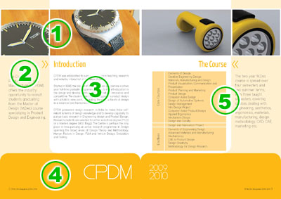
The Layout
- Picture band – One student work is featured per page.
- Sidebar – Sentences that need immediate attention are featured here. Font size is larger than the body text. A lighter version of the main color palette is used as the background.
- Body text area – The title and descriptions run here.
- Footer – This area is practically empty and features the main color palette. Various shades of grey, a dull flesh colored brown were tried before fixing the present fresh yellow color.
- The facing page also features the same layout, but the features are mirrored to give a sense of equilibrium and stability.
Featured Works
Following are the works that are featured in this brochure.
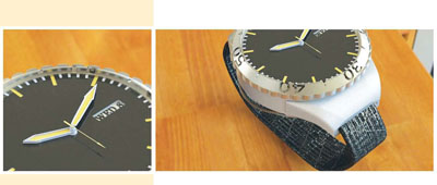
The watch — Sharath Kumar
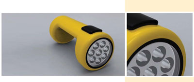
The Torch — Pavan Sridharan & AnasKA
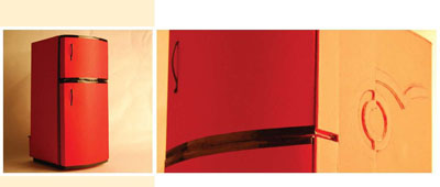
The Refrigerator — Renjith Koshy John & Urvesh Avinash Bharambe
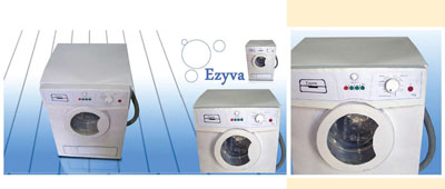
The Washing Machine — Sharath Kumar & AnasKA
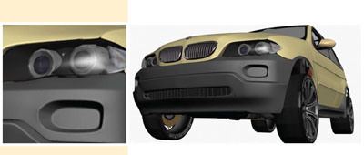
BMW — Renjith Koshy John (A wireframe of this model also feature on the front cover).
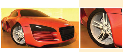
Audi — Pankaj Upadhyay (A wireframe of this model also feature on the back cover).
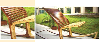
The Bamboo Chair — Pankaj Upadhyay
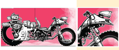
Highway Mohawks — Pankaj Upadhyay
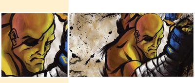
‘Sagat’ The Super Hero — Pankaj Upadhyay

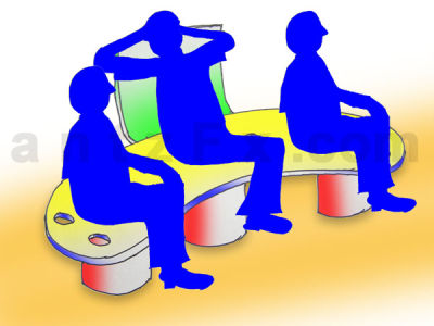
‘I am in Love with design’ — AnasKA
I hope that all the 17 students of 2010 Batch will find good jobs with design studios and corporate companies.
Software: Adobe InDesign
Design Date: 07-Aug-2009



Nice Design