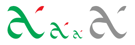
“Why you design guys don’t have a logo?”
“…”
The Necessity
After hearing this question for the ‘n’th time, we finally decided to design a logo for the unavoidable ‘shameless self promotion.’
Frankly, it is not easy. The beauty of a design is very subjective. When you work with a client, the thrill lies in figuring out a design that appeals to him. The challenge is to satisfy the client with the least iteration of the design.
Requirements
When you are your own customer, well, everything gets tough. After a lot of brainstorming, the constraints that we set for our logo are:
- The logo should be fitted into a square. This ensures that we can easily make a 16X16 pixels favicon.
- The logo should be simple. Otherwise, the details may be lost while it is sized down and used in applications like business cards.
- It should be dynamic – a sense of movement should be there.
- The number of colors should be a maximum of three. It should not lose its identity when printed in greyscale.
- Only basic colors need to be considered.


From initial sketches to the final version
We decided to represent ‘antzFx’ by the letters ‘a,’ ‘f’ and ‘x.’ The logo should have elements of these letters.
As you know, this is our new logo.
The design was entirely created in Adobe Illustrator. This logo satisfies all the requirements set by us.

Animation
We are planning to do an animated version of this logo. The idea is to show a bright sunny day, blue sky and a vast expanse of grass land full of waves caused by the breeze. Occasionally, in the breeze, some petals of red flowers fly across the screen from right to left. Then the camera proceeds to a tight shot of a couple of grass blades heaving towards the left in the wind. These blades soon morph into the green part of our logo. A flying red petal freezes and forms the red speck on the logo.
Do you like the idea?
Yes, sure, we will let you know when we make this.
Software: Adobe Illustrator
Design date: 14-Mar-2009
UPDATE: 09 September 2021
After 12 years of the existence of the logo, it underwent an update in 2021. The red petal of the original logo is made prominent and elongated to give a visual balance.

It is decided to feature the logo prominently in anaska.in and antzfx.com websites from now onwards. It is also used in the footers of all websites associated with me.


4 Responses
[…] we redesigned our business card to include the new logo of antzFx.com. In this article, we are sharing a few specifications for a business card design. Also, you can […]
[…] to tie all communications on behalf of the designer in social media and personal websites/blogs. I did try to design one for myself years ago but it is rarely used […]
[…] part of a branding exercise, the ‘antzFx’ logo and the new “anas k a” logotype in ‘Baloo Chetan 2’ typeface are sitting on […]
[…] slide features antzFx logo, DESIGNpuli logo and AI&ML […]