‘CPDM Illustrated’ is a news letter that was started to showcase the creative work of Master in Design (M.Des.) students of my class. The first issue came out in February 2009. I got the opportunity to design the second issue that came out in November 2009. This post is about the design process of ‘CPDM Illustrated: Issue +2.’
Download the ‘CPDM Illustrated’ newsletter from here (PDF, 2.3MB).
Download the High Quality Version of the same from here (PDF, 11.3MB).
The three generations
It is decided to devote pages for three batches of M.Des. Students with contact information.
- 2007-2009 Batch who are no longer in the institute and have started their career in various organizations. The farewell group photo of this batch is included.
- 2008-2010 Batch (Final year students) has done summer internship in different reputed companies. Their internship work is featured in the news letter.
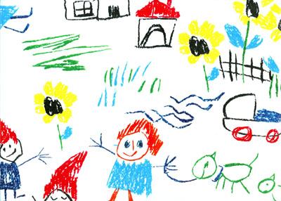
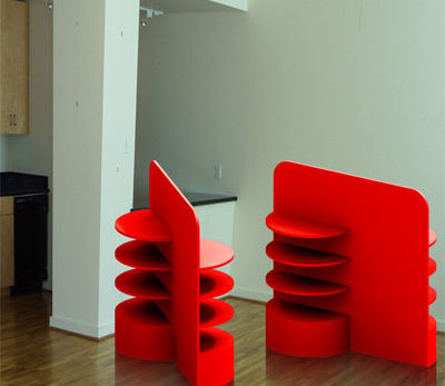
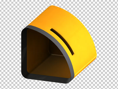
- 2009-2011 Batch (First Year Students): Since they are the newcomers, I asked them to e-mail me any work they have done in the past. So I got a lot of good works like photographs, drawings, paintings, collages…

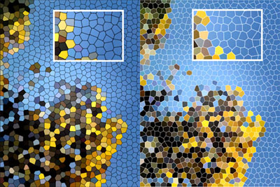

The cover
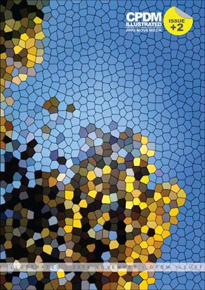
I started the layout pixel by pixel and word by word. In the cover, I wanted to showcase the idea of ‘pixel’ as a basic building block. This led me to choose a photograph of a yellow flowered tree in our campus (Photo: Urvesh Bharambe). The image was rotated 90 degrees clockwise and the ‘stained glass’ filter is applied. Two versions are made by using white and black as the cell wall colour. I finally chose the black cell wall color.
The font of ‘CPDM Illustrated’ was retained from the first issue of the news letter (Designer: Arunkumar Francis). CPDM logo was dropped from the design and a round post-it sticker is used to denote ‘Issue +2.’ A transparent ‘Seal King’ like band was added to make the newsletter look unopened.
Page Layout
A clear heading and subheading are present on almost all the pages. Images are surrounded by a halftone patterned frame in grey and light yellow. The contents of the pages have 5 degrees of tilt. This tilt and the presence of ample white space in a page favour marginalia. As footer, a small band of single layered cells of the stained glass pattern is placed. Full page photographs are used to separate the three sections.
Software: InDesign, Photoshop
Design Date: 11-Nov-2009

