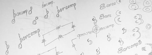
Are you able to spot the ‘eight?’
They all started as doodles on the last page of my notebook. It was an afternoon, I had a heavy meal, I was attending a lecture and I felt sleepy. To scare away the sleep, I started drawing the logo ideas concentrating on ‘8.’
Now, a happy news
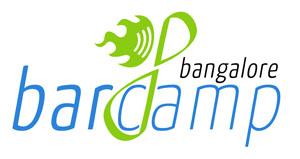
Barcamp Bangalore 8 (also known as ‘BCB8’) is happening on 7th and 8th of March 2009. As usual, they organised a logo competition. After 25 days of online voting, I am fortunate to get 27 votes from netizens and emerged as the winner.
This ‘Mobius’ logo (Ver.2.1) is selected as the official logo of BCB8. What follows now is a detailed description about its evolution.

The ‘Mirror’ Work
Out of some five doodle concepts in my notebook, I selected two. The first one is ‘Mirror.’
When we mirror an uppercase ‘B,’ it resembles the numeral ‘8.’ This idea materialised into the above logo (Ver.1.0).


After uploading this logo in the Barcamp website, I received some comments regarding the absence of the city name ‘Bangalore’ from the logo. I changed the mirrored ‘barcamp’ into a mirrored ‘bangalore.’ Another comment was about the remotely placed Barcamp logo. So, the barcamp logo is brought to the centre and served as the background for the mirrored ‘B’ or ‘8.’
Barcamp officials did not select this logo (Ver.1.1). The reason for this may be the difficulty in including such a big logo in T-shirts. Steiner is the font used in the ‘Mirror’ design.
The Matrix connection
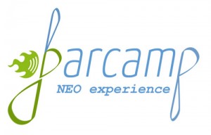
By some strange reason, the film ‘The Matrix’ was featured in Barcamp Bangalore webpage about BCB8 when the competition was announced. That prompted me to use ‘NEO experience’ as the tagline.
It is ‘Mobius;’ not Morpheus
An influence of Mobius Strip is there in this second design that finally got selected. The way it coils to form an ‘8’ adds to the purpose. To get the feel of italics font, a tweaking of 10 degrees is given to all the elements including the Barcamp logo. The following is Ver.1.0 of the logo.
As discussed earlier, ‘Bangalore’ was added to the logo. The modified logo is shown below (Ver.1.1).
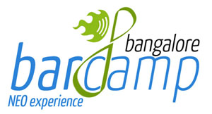
More comments followed and the curious looking ‘b’ and ‘p’ alphabets are reverted to the normal font. The Mobius ‘8’ is positioned at the centre encircling the alphabet ‘c.’ The ‘sidelined’ barcamp logo is also shifted to the centre to allude a symmetry. The modified logo is shown below (Ver.2.0).
The final iteration came when I was asked to drop the ‘Neo Experience’ tagline as it can be misleading. This version (2.1) is now declared as the official BCB8 Logo. Yanone Kaffeesatz is the font used in this ‘Mobius’ design.
Photoshop or Illustrator?
Mobius Ver.2.1 is entirely created in Adobe Illustrator while all the other versions are in Adobe Photoshop. Why? I am much faster in Photoshop than Illustrator. So the conversion of an ‘itching’ doodle idea into soft copy is easier in Photoshop. Once an idea is finalized and the final product needs to be delivered for printing, vector format (read as Adobe Illustrator) is the best bet. GIMP comes handy in changing the PNG image sizes to make small badges for the event publicity.
Glimpses of the Event
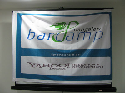
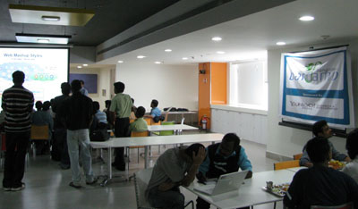


Day 2 of BCB8 (08-Mar-2009); Photo courtesy: fullFx
Flash back
I tried my luck at BCB7 some months back, but I didn’t win. You may read the related blog post here.
Sign off
We would like to dedicate this achievement to all the people who commented or criticized our work and thus helped to improve. Thank you, the BCB8 people!
Softwares: Adobe Photoshop, Adobe Illustrator, GIMP
Design dates:
Ver.1.0 — 04-Feb-2009
Ver.1.1 — 23-Feb-2009
Ver.2.0 — 24-Feb-2009
Ver.2.1 — 28-Feb-2009


Hi Anaskan,
Great Logo with wonderful innovation!!!!!!!!!!!!!!
Thats a wonderful logo. good work dude…
Great work bhai…..
How is PD life going.
Nice logo. 😀