“BEUNI” — “Bed to Uni” — “Condensed travel”
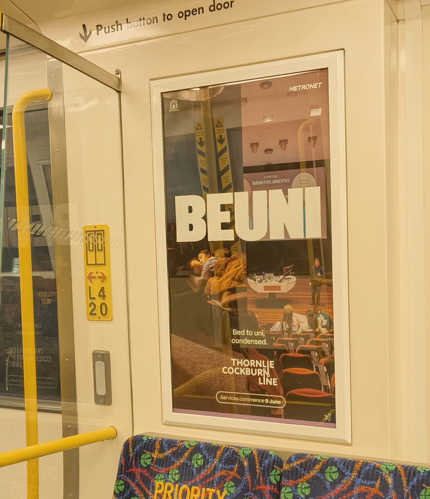
I was traveling in a Transperth train and saw this poster announcing the start of a new railway line between Thornlie and Cockburn Central stations. I really loved the work! Half of the poster showed a girl sleeping in her bedroom and the other half had her point of view of a university lecture hall. The wordmark of ‘Thornlie Cockburn Line’ was a genius touch showing a mechanical linkage found on classic train wheels/a link between two places on a metro railway map. I started thinking about how I could make it better. Then an idea struck me!
Reimagined ‘BEUNI’ Poster

The original ‘Thornlie Cockburn Line’ campaign is conceived and executed by Moonsail, according to WA Campaign Brief. Just like ‘BEUNI’ (Bed to Uni), there are other posters highlighting wordplay such as ‘WOME’ (Work to Home), ‘SHOUNGE’ (Shop to Lounge), ‘THORNDURAH’ (Thornlie to Mandurah), ‘BURSWINGVALE’ (Burswood to Canning Vale), ‘FREVEL’ (Free Travel on Sundays)…
This is the video for ‘BEUNI’ campaign created by Moonsail / Sundeck Productions.
The Line in the Middle
I felt that the contrast between place A (bedroom) and place B (university lecture hall) on the original poster is not highlighted well for the “condensed travel” theme to work. So I wanted to extend and use the line on the fantastic ‘Thornlie Cockburn Line’ wordmark as a border between the places A and B.
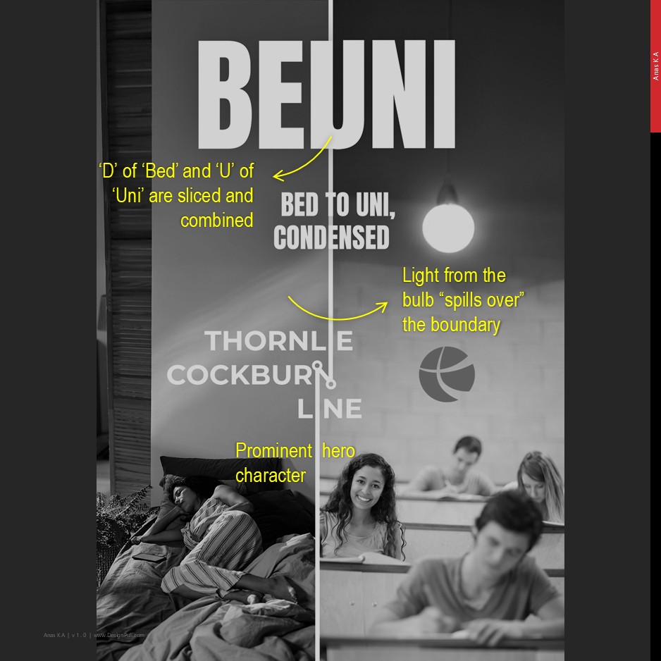
I used stock images from Freepik and a lot of Photoshop generative background fill went into my version of the poster. I added a hanging light in the lecture hall on the right so that light spillover could be ‘justified’ on the bedroom wall on the left. The hero, the girl student, is more prominent in my version and a second-person point of view is used. A warm color tone for the bedroom and a neutral color for the lecture hall highlight the contrast between the places.
Blurring the Lines
When I uploaded my poster design on social media, an interesting perspective came from a user ‘produrp.’ According to them, the campaign brief might have been about blurring the lines between place A and place B — resulting in an “amalgamation” or “hybridizing” of the transition from place A to place B (‘bed to uni’ or ‘work to home’). That’s why the original poster design has a uniform warm color palette and more visual elements.
This perspective makes sense to me. Unless we hear from Moonsail, we will never know about the brief, ideation, design variations submitted to the client, and the feedback from Public Transport Authority of WA/Metronet.
Moonsail, if you are reading this, I would like to know ‘behind the scenes’ of this campaign. And why you never upload these gems on your social media? I couldn’t find a digital copy of the posters online, so I had to take photos of the framed posters inside Transperth buses and trains battling the crazy reflections from the glass.