“We know that it is very difficult to design a logo for a bunch of accessibility enthusiasts. But the result has come out very well!”
– Perth Digital A11y Group
I have been attending Perth Digital A11y Group’s (erstwhile Perth Web Accessibility Meetup Group) events for two years and for almost a year I have been helping them with social media designs. In an effort to unify the various activities (including a popular annual conference) under a single identity, a rebranding effort was kicked off. And, I wanted this branding in my portfolio very badly!
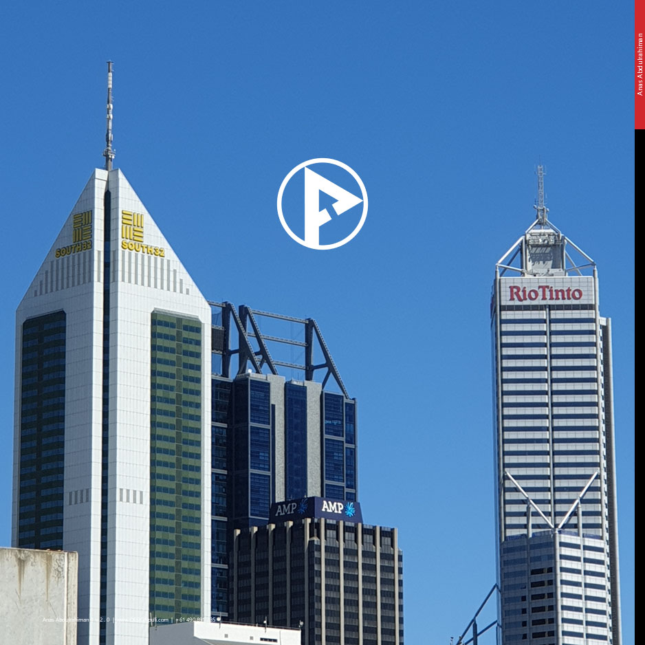
Introducing the New PDAG Logo
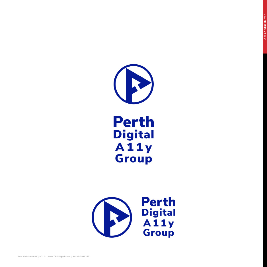
If you can see a “P” and a ‘mouse pointer/cursor’ on the logo, I’m a happy man. If you happen to see a tilted “A” (representing A11y — Accessibility) as well, YOU are a legend!
This logo animation video explains the thoughts behind the design. This video is created using Microsoft PowerPoint, employing ‘Morph’ transitions and animations. Let’s dive into more details.
Inspiration
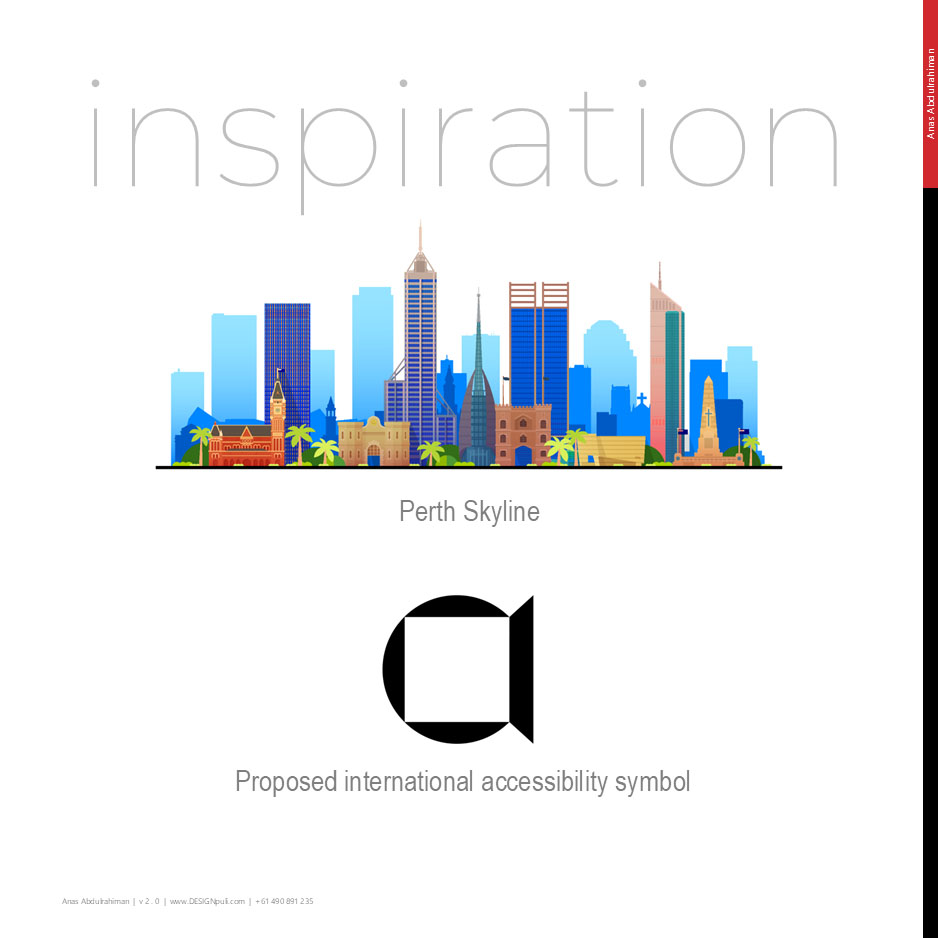
I set out to design a logo representing ‘A11y’ (Accessibility) first. Then I stumbled onto this result page of the International Accessibility Symbol Design Competition. I was also told to give importance to “Perth,” changing my drawings from a stylized “A” to a “P” so that I could use it in the logotype itself.
Evolution of the Logo
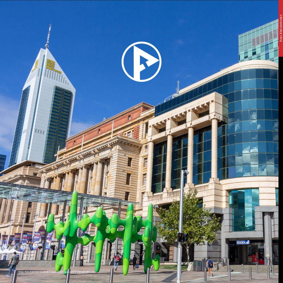
Perth city skyline (let me add NOR — North of the Swan River) has some interesting architectural gems. If you look at option (A) above, the negative space between the “P” and “E” looks similar to a particular Perth landmark.
All caps words are difficult to read for people with print disabilities. So I tried to retain “PERTH” in all caps and convert the rest to camel case (option B). After more discussions, all the words on the logotype were converted to camel case (option C). Then it was discovered that some Optical Character Recognition (OCR) tools and screen readers used by visually challenged people are either not recognizing the “P” or read it as “F” because of the discontinuity caused by the placement of the mouse pointer.
So I decided to separate the “P” from the logotype and make it as a standalone logo. This allowed me to bring back the negative space below the “P” to the forefront again!
Logo and Logotype Variations
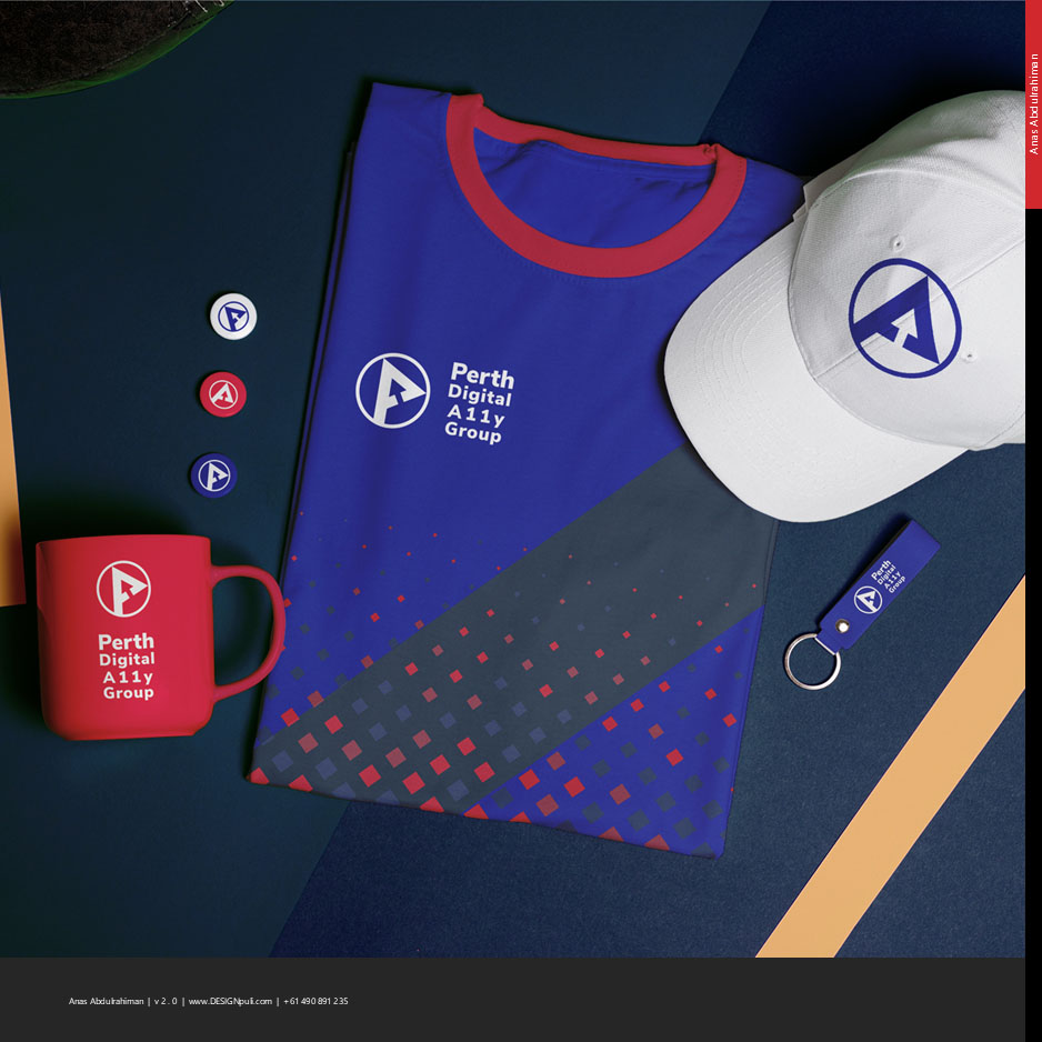
Linear lockup and stacked lockup versions of the logo + logotype are created to be used in narrower and wider spaces on website, social media, and merchandise.
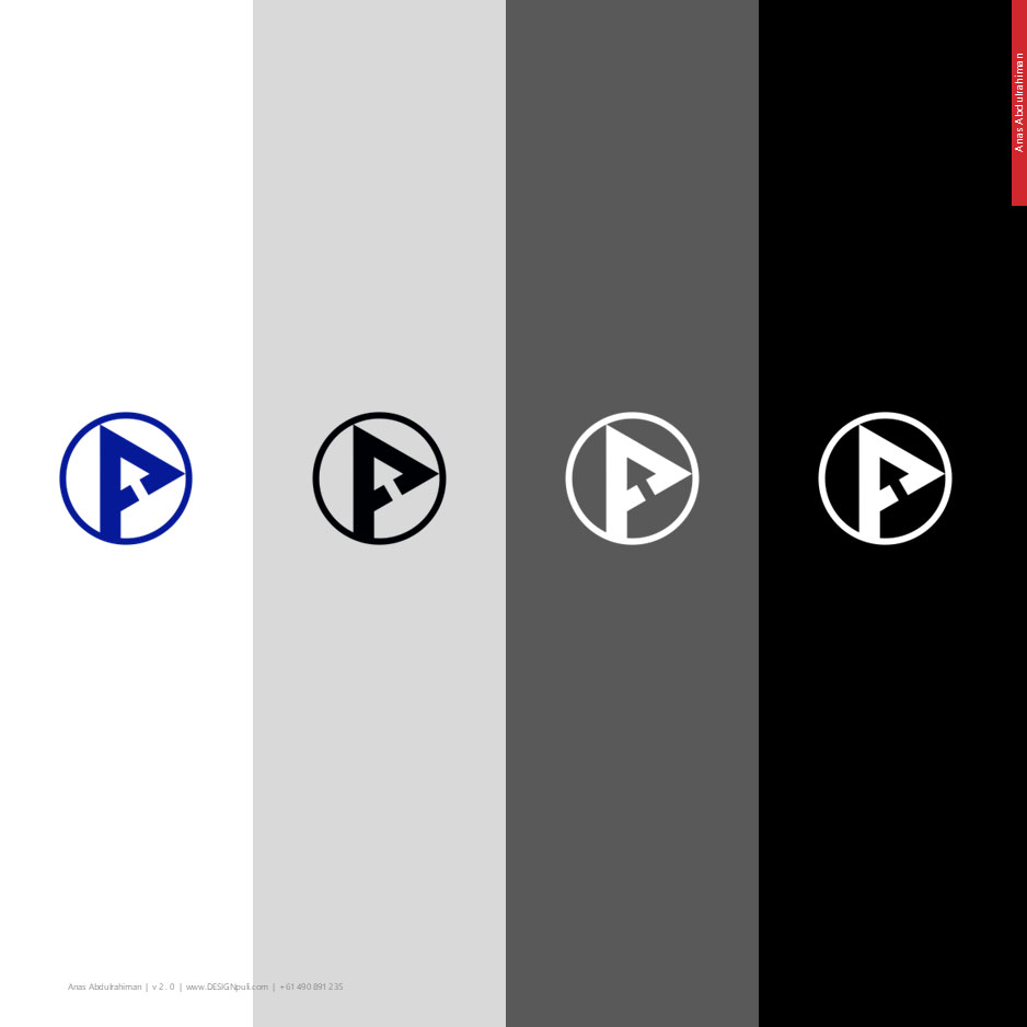
Nunito Sans typeface in ‘Black’ weight is used for the logotype. The primary color is fixed at #061a97. Other color variations are also created to be used on different backgrounds of varying shades.
What Next?
A website redesign of Perth Digital A11y Group is underway and the new branding has already appeared on social media channels. Upcoming conference (February, 2026) organized by Perth Digital A11y Group will feature the new branding outside of the digital space, and I’m looking forward to it!
Acknowledgements
I would like to thank Amanda Mace, Dr. Scott Hollier, Vithya Vijayakumare, David Vosnacos, and Claudia De Los Rios from Perth Digital A11y Group for their support during this design.
Resources used in this design
- Photo of Albert Facey House, Perth
- Photo of Perth skyline
- Perth skyline vector 1 and vector 2 by Sky and Glass: Freepik
- Signage Billboard Displayed on Brick Wall in a Train Station by febdwithart: Freepik
- Superbowl merchandising mockup: Freepik
- Music: Flute Synth by WaffleMusic: Pixabay
- Sound effect: Mouse click by MatthewVakaliuk73627: Pixabay