You are not considered as a ‘complete’ UX designer till you publish your views on the “≡” alias “hamburger menu,” alias Side Drawer Menu!
The recent update of the YouTube Android app by Google prompted me to jump on the bandwagon and express my thoughts on this interesting UI pattern.
“≡” is called a “hamburger menu” for its resemblance to a hamburger, the top and bottom lines representing the bun and its middle line representing the hamburger filling.
– Wikipedia
Is Google Moving to Tabs?
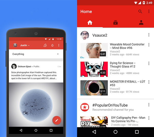
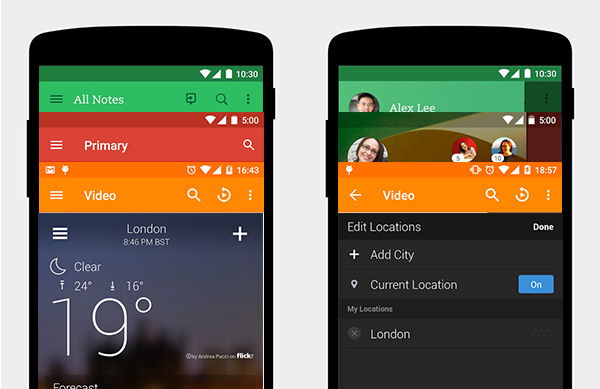
Google+ and YouTube apps were following the Hamburger Menu pattern initially. Google+ moved over to a dropdown based menu in May, 2014. Now, YouTube app update of July 2015 dropped the Hamburger Menu and adopted a tab based style.
There and Back Again!
Let us see who else did the earlier switch to Hamburger Menu and came back with alternative navigation.
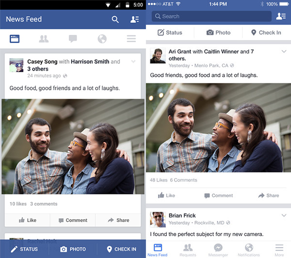
Facebook still uses the Hamburger Menu icon renamed as a right corner “More…” icon. True to the Android vs. iOS guidelines, the tab bar is placed either on the top (Android) or bottom with labels (iOS).
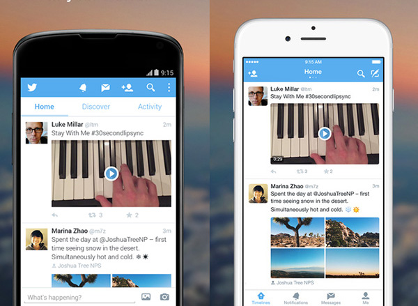
The ‘Notifications,’ ‘Messages…’ icons on the Android action bar (app bar) is shown as the tab bar in iOS. Android groups the action icons from the Twitter app icon by placing it right-aligned. The ‘Home,’ ‘Discover…’ tabs on the top of Android app is shown using pagination dots in iOS.
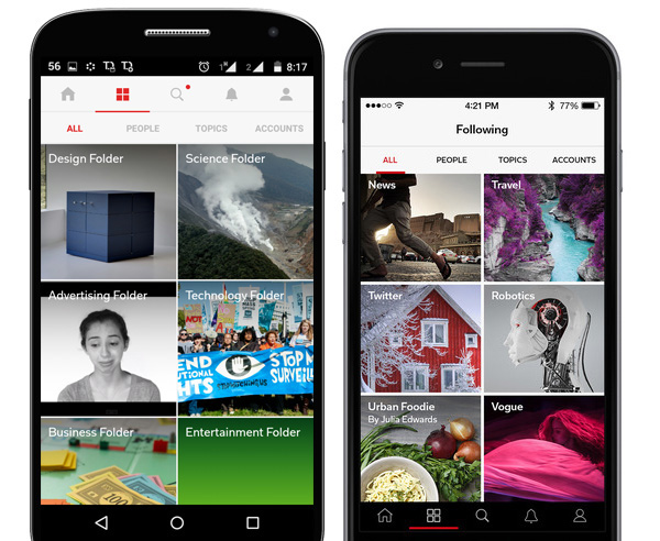
‘Nested tabs’ in the Android version. Did you spot the page title ‘Following’ in iOS? The tab icon serves the same purpose in the Android app.
The action icons on Android action bar are grouped into two, with a left alignment. The iOS tab bar doesn’t support grouping.
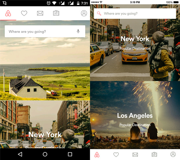
This is interesting! Have you ever seen a tab bar in Android app, complete with labels, just like the iOS standard? Also, the Hamburger Menu icon is passed off as ‘More’ as in Facebook.
‘Back’ button on Home page!
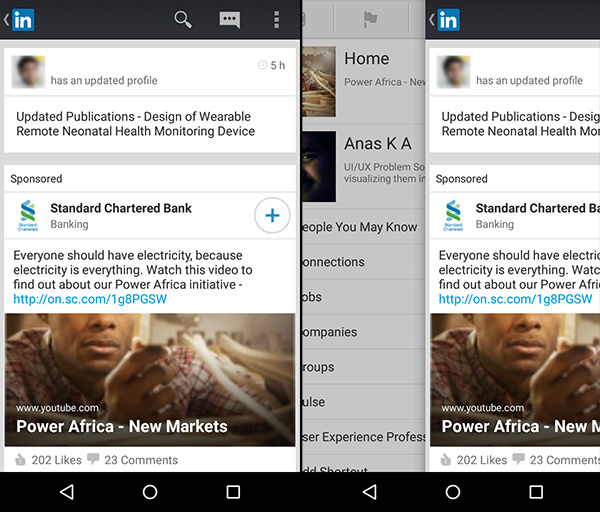
Because of reasons unknown to humans, the LinkedIn Android app simply replaced the Hamburger menu icon with a ‘Back’ icon.
It is probably a clever trick to fool the user. I feel that this implementation improves the chance of discovering the items in the drawer menu while a user tries desperately to ‘go back’ to a home screen.
Right is Right!
Majority of apps have the Hamburger icon placed on the left corner. This creates an inconvenience if you are trying to access the menu while inside a drilled down page, deep in the hierarchy. Because, you will often see a back icon on the left corner instead of the Hamburger icon.
Is there a solution?
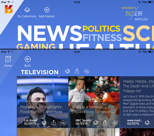
Reverb News iPad app displays the ‘home’ icon always on the left corner. If you are inside a section, the ‘back’ button is placed right next to the ‘home.’ This will not be practical in phones as the user may mis-tap the home icon instead of ‘back.’
Moving the Hamburger Menu icon to the right corner helps us to display the ‘back’ and ‘menu’ icons together in a single screen. Jamie Oliver’s Recipes iOS app and Epicurious iPhone app are examples.
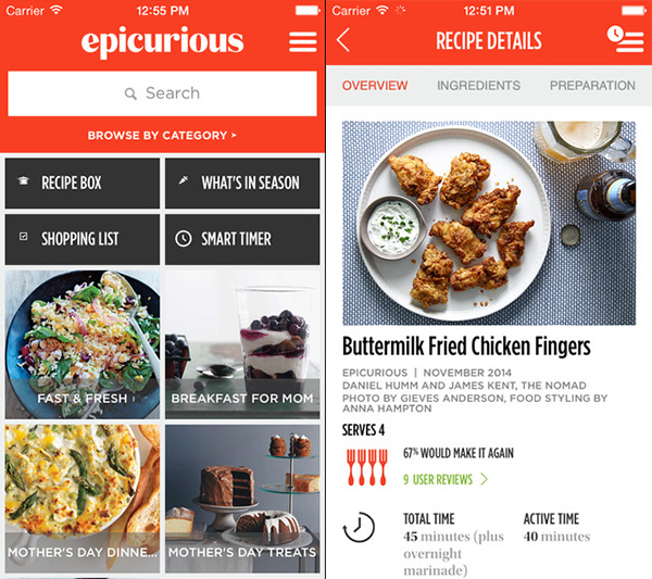
Interestingly, both the above examples are from ‘cooking’ category!
To use, or not to use, that is the question!
A Hamburger Menu saves space on the screen where the content gets more room. It is argued that discoverability issues are there if a hamburger icon is used instead of tabs.
On the other hand, if you have more items in your tab bar, you are forced to use a hambuger-look-a-like ‘More…’ icon.
The best path forward is to use a combination of tabs and a hamburger menu (‘More…’ icon) placed on the right corner.
Users will instantly know where they are, where they can go and discover more functions under the ‘More…’ icon.
What do you think about my observation on the Hamburger Menu? What will you do the next time while designing an app? Share your thoughts below.


Thanks Anas ka. Why the menu is called “hamburger?” Is there any story behind this?
According to Wikipedia, ≡ is called a “hamburger button” for its resemblance to a hamburger, the top and bottom lines representing the bun and its middle line representing the hamburger filling.
Also see:
A Brief History of the Hamburger Icon
Who Designed the Hamburger Icon?
May be we can also call it as a drawer menu, as it looks like a drawer 🙂