“+1 Neat one. Definitely. But, may be aesthetically a bit too big on the T-shirt!”
“+1 For fitting entire idea to one theme.”
“+1 It says everything about Barcamp. Looks new and fresh”
A designer tries to convey an idea through a design. If others are connecting to the same idea, the design is a success. As a designer, I am very happy after seeing the above comments for my logo design from people who are strangers to me.
Introduction
BarCamp is an international network of user generated conferences — open, participatory workshop-events, whose content is provided by participants — often focusing on early-stage web applications, and related open source technologies, social protocols, and open data formats. The original logo is created by Eris Stassi.
Barcamp has an arm in Bangalore, India. They are conducting a technology workshop this week (13 and 14 September) and this is its seventh edition. A contest was organised by Barcamp to design a logo for the event that will eventually appear in posters, banners and t-shirts. When I came to know about the contest from my brother, I decided to take the plunge.
Inspiration
“When I’m creating a logo, I always like to embed a clever little idea into the design — even if it’s just a word mark, or an icon, it’s got to have some kind of little creative element, some extra layer of meaning.”
These are the words from Richard Scott, a well-known designer. Inspired by his words, I decided to use a ‘Bar,’ a ‘Camp,’ and a ’Seven’ in the logo. But how?
Thought Process
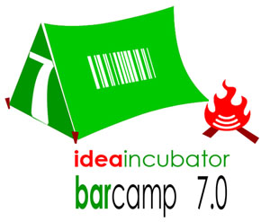
The official Barcamp logo looks like a ‘fire’ if rotated 90 degrees clockwise. Can I use it as a ‘camp fire?’ Suddenly, the picture became clearer. I will make a camp fire out of the official logo, the digit ‘7’ can be the fire wood, a camp with a door that looks like the digit ‘7’ and a window that looks like a bar code. Red color for the fire and I thought a green color is apt for the camp as it merges with the surrounding trees.
I need a tagline for the logo. Since I have pictured a camp fire and the Barcamp people are meeting to create new ideas or improving the existing ideas, the word ‘incubator’ appears to convey the right meaning.
This is my creation:
Did I win?
The selection was based on voting. The spirit was ‘let the best man win and all that!’ There were many logo submissions. I really liked three other logos submitted by some creative design wizards.
I didn’t win the contest.
If you voted for me or left a comment, thank you very much for your time!
Software: Adobe Photoshop CS3
Design date: 03-Sep-2008


Good thinking
Puliyanalle !
Ok,how is design life @ CPDM