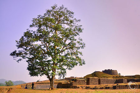
Which photo do you like better – the top one or the bottom one?

When I posed the same question to my Facebook friends, majority of them preferred the top one better than the bottom one. Given below are some of the explanations I received.
“For me the bottom one looks more interesting. the top one is left heavy and keep my eyes on the left only. May be because of the arrow shape of the tree. But in the bottom one there is plenty of room to enter the picture and explore everything step by step. First the fort, then the tree and then in the end you end up noticing the tiny 2 people and then exit the frame with the arrow shaped tree. But the top picture is somehow very confusing, not letting the gaze to settle nor to move in one direction.” (sic)
“Top one because my vision on this pic goes from left to right and I find the primary subject ,the tree, first followed by the wall !” (sic)
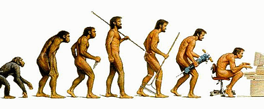
“We are accustomed to see things from left to right. As we read in the same way” (sic)
“For me the bottom one, because it stops me to go out from the frame.” (sic)
In reality, the bottom picture is the original shot. I flipped the picture horizontally to get the top photo. To me, it appeared better.
What do you think? Let us know in the comments.
PS: When I revealed that I had flipped the picture, I received an interesting comment.
“Dont flip nature atleast in photos.” (sic)

Heya! Its probably true like you said, that people read from left to right and hence find the first picture more appealing, because I liked the first one. 😉
In the first one, it looks like the tiny people just entered the frame, spending some time under the tree and then heading to the far away fort. To me this story appealed so hence the picture. 🙂